3.3 Reading Function Graphs
In this section we determine graphs that correspond to stories and stories that correspond to graphs. The focus is not as much on the points and numbers on the graph but rather the general shape of the graph, how it changes and what this means in terms of the story scenarios. This is a skill that is very useful for elementary school students to get a broader understanding of functional relationships.
Let us start with the lesson below from Everyday Mathematics for the fifth grade.
3.3 Examples
Example 3.3.1
Consider the graphs below

Match each scenario below with a graph above and be ready to explain your answers.
- A burrito is removed from the freezer. It is cooked in a microwave oven. Then it is placed on the table.
Which graph shows the temperature of the dinner at different times?
- Sarya runs water into his bathtub. He steps into the tub, sits down, and bathes. He gets out of the tub and drains the water.
Which graph shows the height of water in the tub at different times?
- A water balloon is thrown straight up in the air.
a) Which graph shows the height of the water balloon from the time it is thrown until the time it hits the ground?
b) Which graph shows the speed of the water balloon at different times?
Example 3.3.2
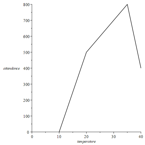
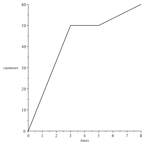
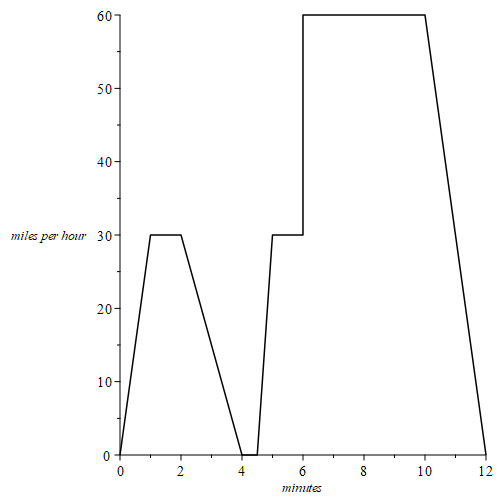
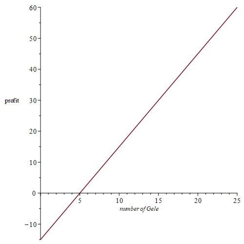
Write a story to go along with each of the following graphs. In your stories, address changes in slope, where the graph intersects the axes, high and low points and where the graph is going up, going down and staying flat.
a) Attendance at a beach in Saudi Arabia
b) Customers served at an Indian restaurant
c) Driving home from school
d) Profit earned from the sale of Gele (African head wraps)
Example 3.3.3
For the sketches below, you do not have to put numbers on your graphs.
a) Halfway from your English class to your math class, you realize that you left your math book in the classroom. You retrieve the book, then walk to your math class. Graph the distance between you and your English classroom as a function of time, from the moment you originally leave the English classroom until you reach the math classroom.
b) Toni drives from home to meet her friend at the gym, which is halfway between their homes. They work out together at the gym; then they both go to the friend’s home for a snack. Finally, Toni drives home. Graph the distance between Toni and her home as a function of time, from the moment she leaves home until she returns.
c) Forrest leaves his house to go to school. For each of the following situations, sketch a possible graph of Forrest’s distance from home as a function of time.
i. Forrest walks at a constant speed until he reaches the bus stop.
ii. Forrest walks at a constant speed until he reaches the bus stop; then he waits until the bus arrives.
iii. Forrest walks at a constant speed until he reaches the bus stop, waits until the bus arrives, then the bus drives him to school at a constant speed.
Concavity
Illustration
Consider the two functions described below in part (a) and (b). Both functions are increasing, but in different ways.
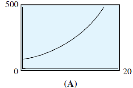
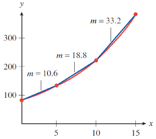
a) The number of flu cases reported at a city medical center during an epidemic is an increasing function of time, and it is growing at a faster and faster rate.
The number of flu cases is increasing more and more as time goes on. We can see this by computing the rate of change over successive time intervals as shown below
| x | 0 | 2 | 5 | 10 | 15 |
|---|---|---|---|---|---|
| y | 70 | 89 | 123 | 217 | 383 |
[latex]x=0[/latex] to [latex]x=5[/latex]: [latex]m=\frac{\Delta{y}}{\Delta{x}}=\frac{123-70}{5-0}=10.6[/latex]
[latex]x=5[/latex] to [latex]x=10[/latex]: [latex]m=\frac{\Delta{y}}{\Delta{x}}=\frac{217-123}{10-5}=18.8[/latex]
[latex]x=10[/latex] to [latex]x=15[/latex]: [latex]m=\frac{\Delta{y}}{\Delta{x}}=\frac{383-217}{15-10}=33.2[/latex]
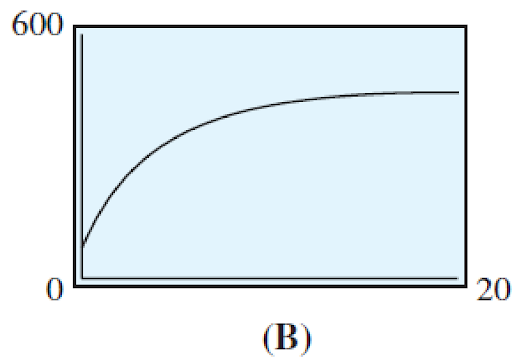
b) The temperature of a potato placed in a hot oven increases rapidly at first, then more slowly as it approaches the temperature of the oven.
The temperature of the potato is increasing less and less as time goes on. We can see this by computing the rate of change over successive time intervals as shown below
| x | 0 | 2 | 5 | 10 | 15 |
|---|---|---|---|---|---|
| y | 70 | 219 | 341 | 419 | 441 |
[latex]x=0[/latex] to [latex]x=5[/latex]: [latex]m=\frac{\Delta{y}}{\Delta{x}}=\frac{341-70}{5-0}=10.6[/latex]
[latex]x=5[/latex] to [latex]x=10[/latex]: [latex]m=\frac{\Delta{y}}{\Delta{x}}=\frac{419-341}{10-5}=18.8[/latex]
[latex]x=10[/latex] to [latex]x=15[/latex]: [latex]m=\frac{\Delta{y}}{\Delta{x}}=\frac{441-419}{15-10}=33.2[/latex]
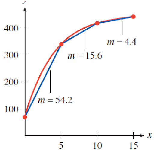
In the illustration we see that the slopes of the graph are changing as time goes on. This is why the graph is curved. In contrast, when we are looking at a straight line, the slope is always the same. Later chapters address linear and nonlinear functions more formally.
For now we focus on the rate of change implications of curved functions.
In general…
A graph (or portion of a graph) is concave up if it curves upward like a bowl or half bowl shape. This means that the function is increasing at an increasing rate (i.e. increasing faster and faster) or decreasing at a decreasing rate (i.e. decreasing slower and slower). Both situations are illustrated below.
Increasing at an increasing rate:
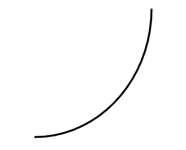
Decreasing at a decreasing rate:
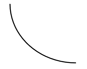
A graph (or portion of a graph) is concave down if it curves downward like an upside down bowl or half bowl shape. This means that the function is increasing at a decreasing rate (i.e. increasing slower and slower) or decreasing at an increasing rate (i.e. decreasing faster and faster). Both situations are illustrated below.
Increasing at a decreasing rate:
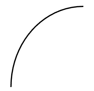
Decreasing at an increasing rate:
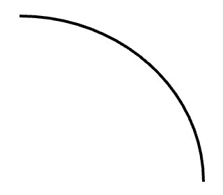
The implications of these types of curves should be addressed when reading graphs or writing stories for graphs with such curves.
Example 3.3.4
Sketch a possible graph to illustrate the height above the ground of a rubber ball dropped from the top of a 10-foot ladder, as a function of time. Show at least 4 bounces. Label your axes appropriately.
Example 3.3.5
David turns on the oven and it heats up steadily until the proper baking temperature is reached. The oven maintains that temperature during the time David bakes a pot roast. When he turns the oven off, David leaves the oven door open for a few minutes, and the temperature drops fairly rapidly during that time. After David closes the door, the temperature continues to drop, but at a much slower rate. Graph the temperature of the oven as a function of time, from the moment David first turns on the oven until shortly after David closes the door when the oven is cooling.
A relationship between a set of input values and a set of output values, such that each input value is matched to EXACTLY ONE output value.
The slope of a function from one input value to another input value is the change in corresponding output values divided by the change in the given input values (often known as the change in y divided by the change in x or "rise over run"). Graphically, the slope gives the steepness of the line through the two corresponding points.
A function is concave up where its graph lies above its tangent lines. This occurs when the output (y) values are either increasing at an increasing rate as input (x) values increase or output (y) values are decreasing at a decreasing rate as input (x) values increase. This gives the graph a bowl or half bowl like shape.
A function is concave down where its graph lies below its tangent lines. This occurs when the output (y) values are either increasing at an decreasing rate as input (x) values increase or output (y) values are decreasing at an increasing rate as input (x) values increase. This gives the graph an upside-down bowl or half bowl like shape.

