6.2 Exercises
- Consider the following “Gift Wrap Fundraiser” problem from Bridges in Mathematics grade 3, unit 2. Answer the questions in the problem itself plus the additional “teacher questions” that follow.
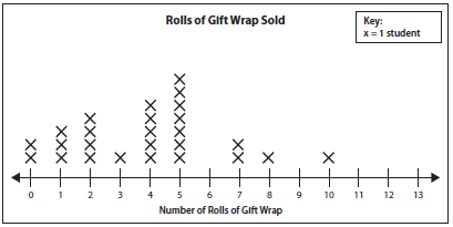
a) How many students are in the class? Explain how you know.
b) How many students sold 7 rolls of gift wrap?
c) How many rolls of gift wrap did most of the students sell?
d) Sarah sold more gift wrap than anyone else. How many rolls did she sell?
e) How many rolls of gift wrap were sold in all? Show your work below.
Teacher Questions:
a) Explain why a child might give the answer of “5” to question 2 about how many students sold 7 rolls of gift wrap.
b) Explain why a child might give the answer of “7” to question 4 about how many rolls of gift wrap Sarah sold.
c) Explain as if to a student, why the answer to question 5 is NOT the total number of Xs on the dot plot (line/frequency plot)
- Amelia recorded the amount of milk she uses in 14 different desserts (see below). Draw a line plot (frequency plot) and answer the questions below.
Amount of milk
1 ½ cups
2 ¼ cups
3 cups
2 ¼ cups
2 cups
2 cups
1 ½ cups
1 cups
1 ½ cups
3 cups
2 cups
2 ¼ cups
1 ½ cups
2 ¾ cups
a) How many recipes used more than 2 cups of milk?
b) How many more recipes used 2 ¼ cups than used 3 cups?
c) How many cups did she use in total? (do this without a calculator)
- This graph shows lengths of the wings of houseflies from the Quantitative Environmental Learning Project. (Original data from Sokal, R.R. and P.E. Hunter. 1955. A morphometric analysis of DDT-resistant and non-resistant housefly strains Ann. Entomol. Soc. Amer. 48: 499-507)
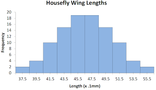
a) Approximately how many flies were measured for this study? Show and explain your work below.
b) About what percent of the flies have wing length smaller than 5 mm. Show and explain your work below.
c) Make up a good question to ask an elementary school child about this data set.
- Watch the following video to learn how to use excel to create bar graphs, pie charts, and line graphs: Creating pie, bar and line charts. Then, use excel to create such graphs using data from one or more of the problems in this section. Be prepared to share your graphs in class.
- The ages of employees at a bank are listed below. Make a stem and leaf plot (with key) of the data.
22, 31, 43, 33, 51, 25, 37, 45, 29, 38, 41, 25, 44, 28, 50, 32, 25
- Dan got a job selling smoothies during his summer vacation. His earnings (in dollars) each day are recorded in the stem and leaf plot below.
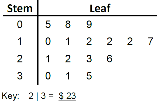
a) How much money did he earn on his best day?
b) How many days did he earn less than 20 dollars?
- The stem and leaf plot below shows the number of pages of a book read by each student in an hour.
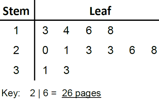
a) How many students are in the plot?
b) How many students read the same number of pages?
- The daily high temperatures for Gotham City in the month of January were recorded and graphed below. Use the graph to answer the questions that follow.
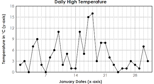
a) What was the approximate high temperature in Gotham City on January 10?
b) On which days was Gotham City’s high temperature 7 degrees?
c) On which day did Gotham have the highest temperature?
- Create a line graph for the following data on Houda’s sleep schedule over one week.
| Day | Hours of sleep |
| Monday | 7.2 |
| Tuesday | 6.5 |
| Wednesday | 6 |
| Thursday | 8.4 |
| Friday | 9.2 |
| Saturday | 9.1 |
| Sunday | 5.8 |
- Create 3 types of line graph problems for elementary students as follows.
a) Given a line graph and 3 questions.
b) Given data and labeled axes for them to graph on.
c) Given data for them to make a line graph for.
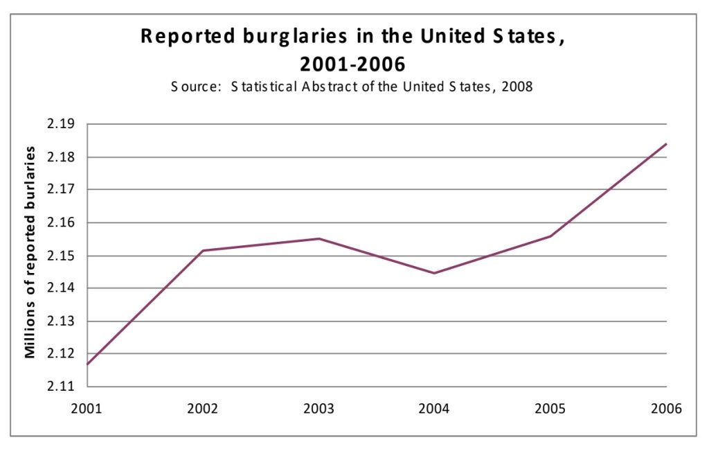
- Consider the line graph below that was used to claim that there was a national ‘crime wave’ during the given time period. Does the graph provide compelling evidence of this claim? Explain why or why not.
Extra (pedagogical) exercises
1) Review the following lesson plan from Bridges in Mathematics
Data Analysis: Bar Graphs (grade 1)
Create a similar activity appropriate for 1st grade students. It should include materials needed and detailed instructions. Use a separate piece of paper.
2) Review the following lesson from Bridges in Mathematics
Complete Independent Worksheets 1 and 2
3) Review the following lesson plan from Bridges in Mathematics
Measurement and Data: Line Plots (grade 3)
Create a similar activity appropriate for 1st grade students. It should include materials needed and detailed instructions. Use a separate piece of paper.
4) Review the following lesson from Bridges in Mathematics
Data Analysis: Line Plots (grade 4)
Complete Independent Worksheets 1 and 2
A pictorial representation of data which tallies up the frequency of each distinct data value using x's or some other symbol. These are also referred to as line plots or dot plots. Note the frequency of a value is the number of times it appears in the data.
A graphical representation of data in which bars are used show the frequency of the corresponding category (or value) within a set of data. The height of each bar equals the frequency of the corresponding data value.
A graphical representation of data points with the following components:
Horizontal axis: This axis typically represents the span of dates, days, or times for which the data is collected.
Vertical axis: This axis shows the span of values collected over time.
Points (ordered pairs): First number represents time and second number represents the value at that time.
Line: Each pair of consecutive points on the graph is connected by a straight line segment.
A representation of the data (typically) arranged by place value where each stem value is paired with corresponding leaf values.

