6.2 Graphing Data
The following quote from the National Council of Teachers of Mathematics Principles and Standards for School Mathematics, p.176 provides a good motive for this section.
Instructional programs from prekindergarten through grade 12 should enable students to formulate questions that can be addressed with data and collect, organize, and display relevant data to answer them.
Graphing data is not only useful in mathematics, but may also be used in other subjects, for example science, to investigate a hypothesis by plotting the findings in a graph.
Pre-Class Work
- Watch the video and complete the ‘test yourself’ exercises at the following link https://studyjams.scholastic.com/studyjams/jams/math/data-analysis/line-plots.htm
- Watch the video and complete the ‘test yourself’ exercises at the following link https://studyjams.scholastic.com/studyjams/jams/math/data-analysis/bar-graphs.htm
It is important that children not only learn to display data but also learn to make sense of charts and graphs they find in books and other media and to be critical of misleading displays. Children in elementary school learn to make and interpret pictograms, frequency plots (sometimes called line or dot plots), bar graphs, and pie charts. Each type of data display has its own benefit. No matter what type of display we use, titles and labels will be very important. Let us distinguish among these types of displays through an example.
The data below show how children in Mr. Jensen’s class travel to school.
| Student | Transportation |
| Abby | Bus |
| Winton | Bicycle |
| Dexter | Car |
| Trevor | Car |
| Audrey | Car |
| Mavis | Foot |
| Kate | Foot |
| Lim | Bicycle |
| Sasha | Foot |
| Lucy | Bus |
| Joe | Car |
| Aiden | Bus |
| Justin | Foot |
| Campbell | Car |
| Sonja | Car |
| Jen | Bus |
| Xia | Foot |
| Kim | Foot |
| Ben | Car |
| Leah | Car |
| Jeffery | Foot |
| Queztal | Car |
| Cheyenne | Bicycle |
| Steve | Bicycle |
As was illustrated in the pre-class work, representing data with pictures is a good starting point for elementary school students to organize data.
A pictogram or pictograph or picture graph represents each value as a meaningful icon. The display can be oriented either vertically or horizontally. We illustrate this using the transportation data as follows:
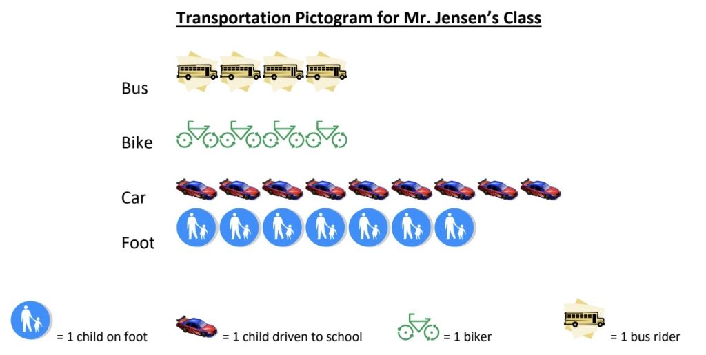
Notice how the graph is carefully labeled and that a key is provided for the icons. Make sure to help children get in the habit of labeling and defining their symbols. Also, stress that it is important that all the icons be about the same size or the graph could be misleading. A pictogram can be understood by children as young as those in kindergarten.
A frequency plot of the same data is shown below. In elementary school such graphs are often called line plots or dot plots (using dots instead of x’s). Note that this plot displays the frequency of responses in a more abstract manner than does the pictogram but is easier to create.
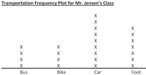
In a frequency plot the number of x’s above each category (or value in a numerical data set) equals the number of times that category (or value) appears in the data set. A frequency plot provides a stepping stone to the next level of abstraction: a bar graph.
A bar graph uses bars (as illustrated below) to show the frequency of data in each category.
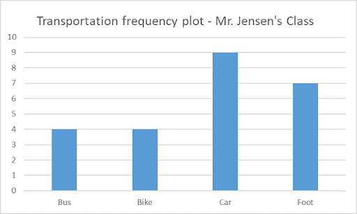
In a bar graph the height of the bar equals the frequency of the corresponding category (or value) within a set of data.
Question: Why might one want to use a bar graph instead of a frequency graph? Discuss and write your thoughts below.
Last but not least, we show a pie chart for the same data below.
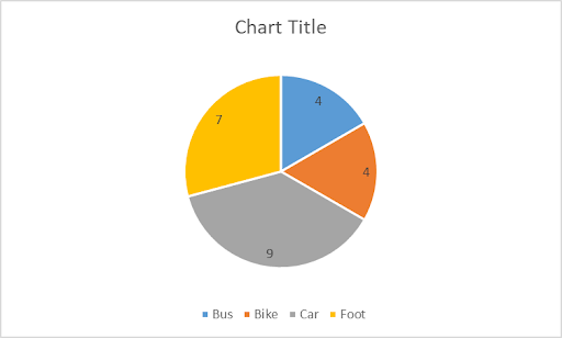
The size of each slice in a pie chart is determined by viewing each (frequency) number as a percentage of the total and pie charts are often displayed with these percentages as shown in the following chart.

Discuss how each of the percentages in the pie chart above was calculated. Record your calculations/explanations below.
The following interactive video illustrates an example of a situation in which a pie chart is the best choice to represent the data: https://studyjams.scholastic.com/studyjams/jams/math/data-analysis/correct-graph.htm
6.2 Examples
Example 6.2.1
Below is a table of data showing the pets owned by children in Mr. Sanchez’s third grade class.
| Student | Pets in the House |
| Anna | None |
| James | 1 cat and 1 dog |
| Cleo | 3 dogs |
| Violet | 1 cat |
| Andre | 6 fish |
| Jose | 7 fish, 1 dog, 2 cats |
| Aidos | None |
| Yvonne | None |
| Tyrise | 1 hamster |
| Ellen | 2 dogs |
| Tomas | 1 dog |
| Yani | 3 fish and 2 cats |
| Owen | None |
| Audrey | 1 cat |
a) Make a frequency plot (dot/line plot) with ‘number of pets’ on the horizontal axis.
b) Make a bar graph of these data with ‘number of pets’ on the horizontal axis.
c) Make a pie chart of these data.
d) What problems might children encounter in trying to represent these data in the above ways?
Example 6.2.2
Kenya claims that the children in her kindergarten class like cats more than dogs. She has made the following graph of her classmates’ pet preferences to support her claim. Why is this pictogram misleading? Explain. What would you say to this child?

Example 6.2.3
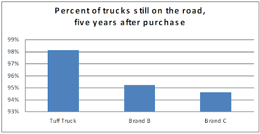
Tuff Truck Company claims that their trucks are the most reliable and shows the below graph to make their case. Why is this bar graph misleading? Explain.
Stem and Leaf Plots
Pre-Class Work
- Watch the video on stem and leaf plots below
- Consider the following stem and leaf plot representing geometry exam scores.
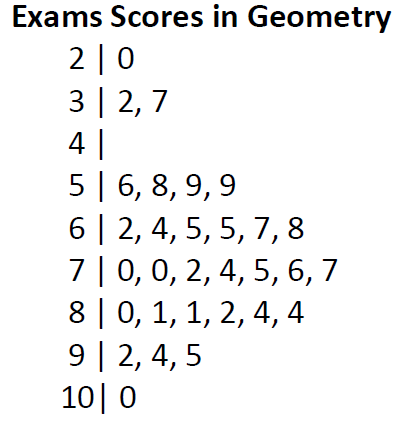
a) Make a “key” for this stem and leaf plot.
b) List all the data values corresponding to this stem and leaf plot.
c) Create three questions that you could ask elementary students about this stem and leaf plot.
- Think about how stem and leaf plots may be created for 3 or more digit numbers, for decimals, for fractions. Be prepared to discuss this in class.
A stem and leaf plot (or simply stemplot) is a representation of the data (typically) arranged by place value where each stem value is paired with corresponding leaf values. The goal of stemplots is to display data (with common place values) in a more concise way, making it easier to answer questions about the data.
Question: For what types of data sets would stem and leaf plots be impractical?
Example 6.2.4
Make a stem and leaf plot for the following. Include a key.
a) Scores from grade 4 English tests:
12, 31, 29, 52, 47, 20, 58, 43, 46, 23, 51, 14, 55, 34, 23, 35
b) A bowler’s score for her 10 games in a competition:
209, 191, 218, 228, 106, 218, 213, 227, 218, 207
Line graphs
Pre-Class Work
Watch the following videos and respond to the prompts:
Line graphs (early elementary)
Line graphs (late elementary)
Prompts for pre-class work
Prompt 1: For what type of data are line graphs useful?
Prompt 2: Think of some points that are stressed in the late elementary video but not in the early elementary video. Be ready to discuss in class.
Children begin interpreting simple picture graphs from kindergarten onwards, and they are likely to study line graphs in third grade. Line graphs help with representing a value over time, not to be confused with line plots which we already covered.
Components of a line graph are as follows:
Title: This appears above the graph and should be a very concise description of the data represented.
Horizontal axis: This axis typically represents the span of dates, days, or times for which the data are collected.
Vertical axis: This axis shows the span of values collected over time.
Important notes regarding axes:
- All measurements on axes should be split equally (same scale) as stressed in the 2nd video in the pre class work.
- Each mark on the axes should be labeled with the corresponding time (horizontal axis) or value (vertical axis).
- Each axis should have a label briefly describing what the axis represents.
Points (ordered pairs): First number represents time and second number represents the value at that time. These are plotted on the axes as shown in the pre class work videos.
Line: Each pair of consecutive points is connected by a straight line segment.
Elementary students first learn to read line graphs before creating them.
The following example is a good type of problem to start with.
Example 6.2.5
The graph below shows the number of hours Shiloh worked each day of the week. Use the graph to answer the questions that follow.
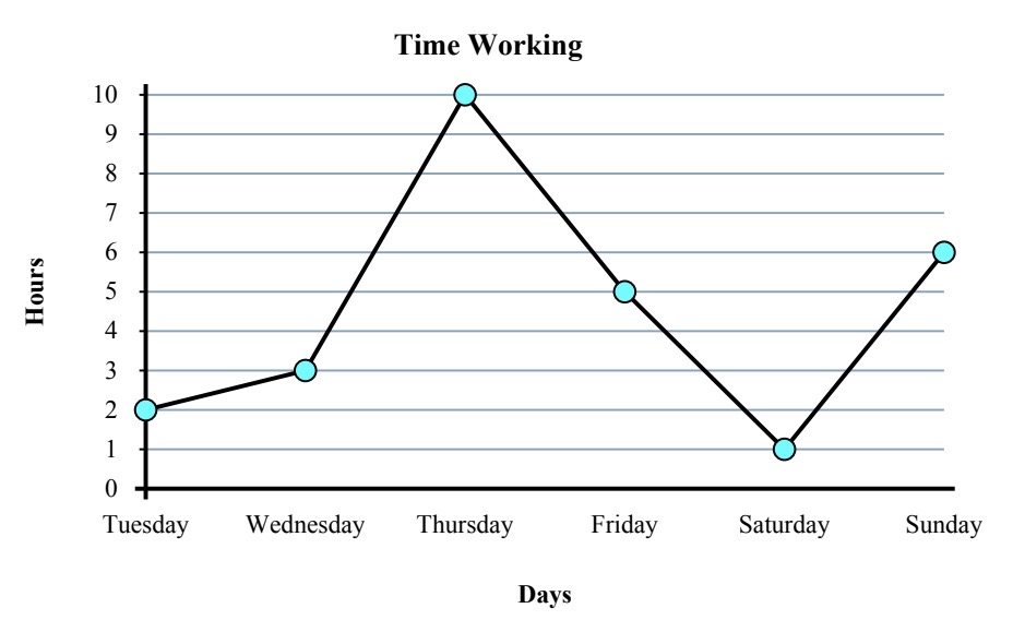
a) How many hours did Shiloh work on Sunday?
b) Which day did they work the least?
c) What is the total number of hours Shiloh worked for the week?
d) What is the difference in the number of hours they worked on Tuesday and the number of hours they worked on Friday?
When showing elementary students how to plot line graphs, we may start with examples that provide labeled axes as illustrated below.
Illustration
(from K5 Learning)
A zoo has a record of the number of their visitors for five days. Draw a line graph using the given data.
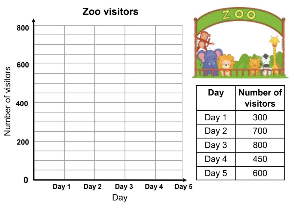
These types of problems will help prepare them to create their own line graphs in later grades.
The following example illustrates the next step toward creating line graphs. It provides the axes and places for labels but everything else is left to the student.
Example 6.2.6
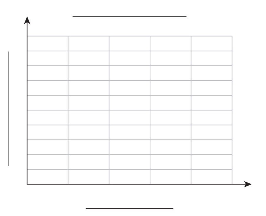
The number of absences from grade 1 to 5 at a school in a month are given below. Make an appropriate scale and draw a line graph. Also label the axes and write a title for the graph.
| Grade | Number of Students |
| Grade 1 | 15 |
| Grade 2 | 6 |
| Grade 3 | 18 |
| Grade 4 | 6 |
| Grade 5 | 9 |
Extension activity: Research “double line graphs” before next class and come to class with an example to share.
A pictorial representation of data which tallies up the frequency of each distinct data value using x's or some other symbol. These are also referred to as line plots or dot plots. Note the frequency of a value is the number of times it appears in the data.
Data as a numerical measurement.
A graphical representation of data in which bars are used show the frequency of the corresponding category (or value) within a set of data. The height of each bar equals the frequency of the corresponding data value.
A representation of the data (typically) arranged by place value where each stem value is paired with corresponding leaf values.
A graphical representation of data points with the following components:
Horizontal axis: This axis typically represents the span of dates, days, or times for which the data is collected.
Vertical axis: This axis shows the span of values collected over time.
Points (ordered pairs): First number represents time and second number represents the value at that time.
Line: Each pair of consecutive points on the graph is connected by a straight line segment.

