
6.2 How to Analyze Visual Texts
Learning Objectives
- Dissect and analyze visual texts, recognizing the components and techniques used in visual rhetoric, including the use of color, arrangement, perspective, and modality, and apply this understanding to various genres such as videos and advertisements.
- Interpret the contextual landscape of visual texts, including the historical, political, and social factors that influence their meaning, and connect these insights to the overall purpose and effectiveness of the visual in communicating its intended message.
- Critically assess the relationship between text and image in visual rhetoric, understanding how font, arrangement, social distance, mood, and lighting contribute to the overall meaning, and how these elements can be manipulated to create specific effects or appeal to particular audiences.
Let’s start by reviewing what we mean by analysis. Imagine that your old car has broken down and your Uncle Bob has announced that he will fix it for you. The next day, you go to Uncle Bob’s garage and find the engine of your car in pieces all over the driveway; you are further greeted with a vision of your hapless uncle greasily jabbing at the radiator with a screwdriver. Uncle Bob (whom you may never speak to again) has broken the car engine down into its component parts to try and figure out how your poor old car works and what is wrong with it.
Happy days are ahead, however. Despite the shock and horror that the scene above inspires, there is a method to Uncle Bob’s madness. Amid the wreckage, he finds out how your car works and what is wrong with it, so he can fix it and put it back together.
Likewise, analyzing entails breaking down a text or an image into component parts (like your engine). And while analyzing doesn’t entail fixing per se, it does allow you to figure out how a text or image works to convey the message it is trying to communicate. What constitutes the component parts of an image? How might we analyze a visual? What should we be looking for? To a certain extent we can analyze visuals in the same way we analyze written language; we break down a written text into component parts to figure out just what the creator’s agenda might be and what effect the text might have on its readers.
When we analyze visuals we do take into account the same sorts of things we do when we analyze written texts, with some added features.
Please watch “Visual Rhetoric: How to Analyze Images”:
Genres that use visuals tell us a lot about what we can and can’t do with them. Coming to terms with genre is rather like learning a new dance—certain moves, or conventions, are expected that dictate what kind of dance you have to learn. If you’re asked to moonwalk, for instance, you know you have to glide backwards across the floor like Michael Jackson. It’s sort of the same with visuals and texts; certain moves, or conventions, are expected that dictate what the genre allows and doesn’t allow.
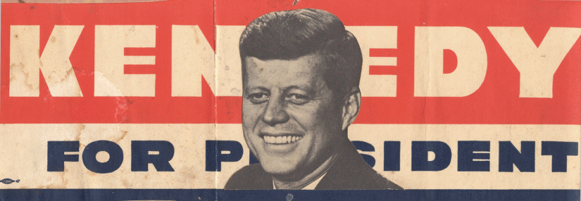
Below is a wonderful old bumper sticker from the 1960s. A bumper sticker, as we will discover, is a genre that involves specific conventions.
Bumper stickers today look quite a bit different, but the amount of space that a sticker’s creator has to work with hasn’t really changed. Bumper stickers demand that their creators come up with short phrases that are contextually understandable and accompanied by images that are easily readable—a photograph of an oil painting trying to squeeze itself on a bumper sticker would just be incomprehensible. In short, bumper stickers are an argument in a rush!
A bumper sticker calls for an analysis of images and words working together to create an argument. As for their rhetorical content, bumper stickers can demand that we vote a certain way, pay attention to a problem, act as part of a solution, or even recognize the affiliations of the driver of the car the sticker is stuck to. But their very success, given that their content is minimal, depends wholly on our understanding of the words and the symbols that accompany them in context.
The procedure for doing a rhetorical analysis of a visual text is essentially the same as for a spoken/written text.
Step 1: Read the Text
In the case of a visual text, there might be words or there might not. If there are no words, “read” the image and think about what the creator of the image is trying to portray. Rather than a summary of the text, you might write a description of the image, including what you believe the author’s main intent is. In this case, your description might be fairly short:
In the center of the bumper sticker is an image of JFK, Jr.’s smiling face. The background consists of three horizontal stripes of red, white, and blue. The red stripe is the widest and contains the word “Kennedy” in blue, all capital block letters. Below the red stripe is a slightly narrower white stripe containing the words “For President” all in blue, all capital block letters, but in slightly smaller font. The image of JFK covers up the “res” in President. At the very bottom of the image is a thin blue line. The bumper sticker is clearly a promotional item from JFK’s presidential campaign.
Step 2: Define the Rhetorical Situation
Again, this step is very similar to what you would do for a written/spoken text. Simply answer the same questions about the visual text. Remember the acronym SOAP:
Speaker
In this case, the speaker isn’t as clear as it might be in a spoken or written text. In general, a speech is made by a specific person, and a written text has an author. In some cases, determining the origin of a visual text could be difficult. In this case, we can presume that the bumper sticker was made by the Democratic Party as a campaign effort.
Occasion/Context
Thinking about context is crucial when we are analyzing visuals, as it is with analyzing writing. We need to understand the political, social, economic, or historical situations from which the visual emerges. Moreover, we have to remember that the meaning of images change as time passes. For instance, what do we have to understand about the context from which the Kennedy sticker emerged in order to grasp its meaning? Furthermore, how has its meaning changed in the past 50 years?
First, to read the bumper sticker at face value, we have to know that a man named Kennedy is running for president. But the president of what? Maybe that’s obvious, but then again, how many know who the Australian prime minister was 50 years ago, or, for that matter, the leading official in China? Of course, we should know that the face on the bumper sticker belongs to John F. Kennedy, a US Democrat, who ran against the Republican nominee Richard Nixon, and who won the US presidential election in 1960. (We hope you know that anyway.)
Now think how someone seeing this bumper sticker and the image of Kennedy on it today would react differently than someone in 1960 would have. Since his election, JFK’s status has transformed from American president into an icon of American history. We remember his historic debate with Nixon, the first televised presidential debate.
One wonders how much of a role this event played in his election, given that the TV, a visual medium, turned a political underdog into a celebrity. We also remember Kennedy for his part in the Cuban missile crisis, his integral role in the Civil Rights Movement, and, tragically, we remember his assassination in 1963. In other words, after the passage of 50 years, we might read the face on the bumper sticker quite differently than we might have in 1960.
While we examine this “text” from 50 years ago, it reminds us that the images we are surrounded by now change in meaning all the time. For instance, we are all familiar with the Apple logo. The image itself, on its own terms, is simply a silhouette of an apple with a bite taken out of it. But, the visual does not now evoke the nourishment of a Granny Smith or a Golden Delicious. Instead, the logo is globally recognized as an icon of computer technology.
Audience and Medium
In their book Picturing Texts, Lester Faigley et al. claim that, when determining the audience for a visual, we must “think about how an author might expect the audience to receive the work.”[1] Medium, then, dominates an audience’s reception of an image. For instance, Faigley states that readers will most likely accept a photograph in a newspaper as news—unless, of course, one thinks that pictures in the tabloids of alien babies impersonating Elvis constitute news. Alien babies aside, readers of the news would expect that the picture on the front page of the New York Times, for instance, is a “faithful representation of something that actually happened.”[2] An audience for a political cartoon in the newspaper, on the other hand, would know that the pictures they see in cartoons are not faithful representations of the news but opinions about current events and their participants, caricatured by a cartoonist. The expectations of the audience in terms of medium, then, determine much about how the visual is received.
As for our bumper sticker then, we might argue that the image of JFK speeding down the highway on the bumper of a spiffy new Ford Falcon would be persuasive to those who put their faith in the efficacy of bumper stickers, as well as the image of the man on the bumper sticker. Moreover, given that the Falcon is speeding by, we might assume that the bumper sticker would mostly appeal to those folks who are already thinking of voting for JFK—otherwise, there’s a chance that the Falcon’s driver would be the recipient of some 1960s-style road rage.
Today, the audience for our bumper sticker has changed considerably. We might find it in a library collection. Or we might find it collecting bids on eBay. Once again, the audience for this example of images and words working together rhetorically depends largely on its contextual landscape.
Purpose
Words and images can work together to present a point of view. But, in terms of visuals, that point of view often relies on what isn’t explicit—what, as we noted above, is tacit.
The words on the sticker say quite simply, “Kennedy For President.” We know now that this simple statement reveals that John F. Kennedy ran for president in 1960. But what was its rhetorical value back then? What did the bumper sticker want us to do with its message? After all, taken literally, it doesn’t really tell us to do anything.
For now, let’s cheat and jump the gun and guess that the bumper sticker’s argument in 1960 was “Vote to Elect John F Kennedy for United States President.”
Okay. So knowing what we know from history, we can accept that the sticker is urging us to vote for Kennedy. It’s trying to persuade us to do something. And the reason we know what we know about it is because we know how to read its genre and we comprehend its social, political, and historical context. But in order to be persuaded by its purpose, we need to know why voting for JFK is a good thing. We need to understand that its underlying message, “Vote for JFK,” is that voting for JFK is a good thing for the future of the United States.
So, to be persuaded by the bumper sticker, we must agree with the reasons why voting for JFK is a good thing. But the bumper sticker doesn’t give us any. Instead, it relies on what we are supposed to know about why we should vote for Kennedy. For instance, if we were present for the campaign, we would know that JFK campaigned on a platform of liberal reform as well as increased spending for the military and space travel technology. Moreover, we would be aware of the evidence for why we should vote that way. Consequently, if we voted for JFK, we accepted the above claim, reasons, and evidence driving the bumper sticker’s purpose without being told any of it by the bumper sticker. The claim, reasons, and evidence are all tacit.
What about the image itself? How does that further the bumper sticker’s purpose? We see that the image of JFK’s smiling face is projected on top of the words “Kennedy for President.” The image is not placed off to the side; it is right in the middle of the bumper sticker. So, for this bumper sticker to be visually persuasive, we need to agree that JFK, here represented by his smiling face, located right in the middle of the bumper sticker on a backdrop of red, white, and blue, signifies a person we can trust to run the country.
Nowadays, JFK’s face on the bumper sticker—or in any other genre, for that matter —might underscore a different purpose. It might encompass nostalgia for an era gone by, or it might be used as a resemblance argument in order to compare President Kennedy with President Obama, for example.
Overall, then, when we see a visual used for rhetorical purposes, we must first determine the argument (claim, reasons, evidence) from which the visual is situated and then try to grasp why the visual is being used to further its purpose.
To these, we will add one more element – Style – making our acronym SOAPS.
Style
When analyzing visual texts, the style in which the text is created is important. In rhetorical analysis, you should consider why this particular style was chosen–why use a bumper sticker or a billboard instead of writing an article in the newspaper?
Consider what format or medium the text being made: image? written essay? speech? song? protest sign? meme? sculpture?
- What is gained by having a text composed in a particular format/medium?
- What limitations does that format/medium have?
- What opportunities for expression does that format/medium have (that perhaps other formats do not have?)
Step 3. Identify Rhetorical Strategies
Think through how the creator of the text uses ethos, pathos, logos, and kairos to portray the message. While you might see some rhetorical devices being employed, they might not play as large a role in visual texts. The elements of Design will play a much larger role in a visual analysis. Design actually involves several factors.
Arrangement
Designers are trained to emphasize certain features of a visual text. And they are also trained to compose images that are balanced and harmonized. Faigley et al suggest that we look at a text that uses images (with or without words) and think about where our eyes are drawn first.[3] Moreover, in Western cultures, we are trained to read from left to right and top to bottom—a pattern that often has an impact on what text or image is accentuated in a visual arrangement.
Other arrangements that Faigley et al discuss are closed and open forms.[4] A closed-form image means that, like our bumper sticker, everything we need to know about the image is enclosed within its frame. An open form, on the other hand, suggests that the visual’s narrative continues outside the frame of the visual. Many sports ads employ open-frame visuals that suggest the dynamic of physical movement.
Another method of arrangement that is well known to designers is the rule of thirds. Here’s an example of that rule in action:

Note how the image above has been cordoned off into 9 sections. The flower coincides with these lines. The rule of thirds dictates that this compositional method allows for an interesting and dynamic arrangement as opposed to one that is static. Now, unfortunately, our bumper sticker above doesn’t really obey that rule. Nevertheless, our eyes are still drawn to the image of JFK’s head. Many modern bumper stickers do, however, obey the rule of thirds. Next time you see a bumper sticker on a parked car, check if the artist has paid attention to this rule. Or, seek out some landscape photography. The rule of thirds is the golden rule in landscape art and photography and is more or less a comprehensive way to analyze arrangement in design circles because of its focus on where one’s eye is drawn.
Rhetorically speaking, what is accentuated in a visual is the most important thing to remember about arrangement. As far as professional design is concerned, it is never haphazard. Even a great photo, which might seem to be the result of serendipity, can be cropped to highlight what a newspaper editor, for instance, wants to be highlighted.
Texts and Image in Play
Is the visual supported by words? How do the words support the visual? What is gained by the words, and what would be lost if they weren’t in accompaniment? What if we were to remove the words “Kennedy for President” from our bumper sticker? Would the sticker have the same rhetorical effect?
Moreover, when examining visual rhetoric, we should pinpoint how fonts emphasize language. How does font render things more or less important, for instance? Is the font playful, like Comic Sans MS, or formal, like Arial? Is the font blocked, large, or small? What difference does the font make to the overall meaning of the visual? Imagine that our JFK bumper sticker was composed with a swirly-curly font. It probably wouldn’t send the desired message. Why not, do you think?
Alternately, think about the default font in Microsoft Word. What does it look like and why? What happens to the font if it is bolded or enlarged? Does it maintain a sense of continuity with the rest of the text? If you scroll through the different fonts available to you on your computer, which do you think are most appropriate for essay writing, website design, or the poster you may have to compose?
Lastly, even the use of white (or negative) space in relation to text deserves attention in terms of arrangement. The mismanagement of the relation of space to text and/or visual can result in visual overload! For instance, in an essay, double spacing is often advised because it is easier on the reader’s eye. In other words, the blank spaces between the lines of text render reading more manageable than would dense bricks of text. Similarly, one might arrange text and image against the blank space to create a balanced arrangement of both.
While in some situations the arrangement of text and visual (or white space) might not seem rhetorical (in an essay, for example), one could make the argument that cluttering one’s work is not especially rhetorically effective. After all, if you are trying to persuade your instructor to give you an ‘A’, making your essay effortlessly readable seems like a good place to start.
Visual Figures
Faigley et al also ask us to consider the use of figures in a visual argument.[5] Figurative language is highly rhetorical, as are figurative images. For instance, visual metaphors abound in visual rhetoric, especially advertising.[6] A visual metaphor is at play when you encounter an image that signifies something other than its literal meaning. For instance, think of your favorite cereal: which cartoon character on the cereal box makes you salivate in anticipation of breakfast time? Next time, when you see a cartoon gnome, and your tummy starts to rumble in anticipation of chocolate-covered rice puffs, you’ll know that the design folks down at ACME cereals have done their job. Let’s hope, however, that you don’t want to chow down on the nearest short fat fellow in a red cap that comes your way.
Visual rhetoric also relies on synecdoche, a trope in which a part of something represents the whole. In England, for instance, a crown is used to represent the British monarchy. The image of JFK’s face on the bumper sticker, then, might suggest his competency to head up the country.
Color

Colors are loaded with rhetorical meaning, both in terms of the values and emotions associated with them and their contextual background. Gunther Kress and Theo Van Leeuwen show how the use of color is as contextually bound as writing and images themselves. For instance, they write,
“red is for danger, green for hope. In most parts of Europe, black is for mourning, though in northern parts of Portugal, and perhaps elsewhere in Europe as well, brides wear black gowns for their wedding day. In China, and other parts of East Asia, white is the color of mourning; in most of Europe, it is the color of purity, worn by the bride at her wedding. Contrasts like these shake our confidence in the security of meaning of color and color terms.”[7]
So, what colors have seemingly unshakeable meaning in the US? How about red, white, and blue? Red and blue are two out of the three primary colors. They evoke a sense of sturdiness. After all, they are the base colors from which others are formed.
The combined colors of the American flag have come to signal patriotism and American values. But even American values, reflected in the appearance of the red, white, and blue, change in different contexts. To prompt further thought, Faigley shows us that the flag has been used to lend different meanings to a variety of magazine covers—from American Vogue (fashion) to Fortune magazine (money).[8] An image of the red, white, and blue on the cover lends a particularly American flavor to each magazine. And this can change the theme of each magazine. For instance, with what would you acquaint a picture of the American flag on the cover of Bon Appétit or Rolling Stone? Hot dogs and Bruce Springsteen perhaps?
What then does the red, white, and blue lend our bumper sticker? A distinctly patriotic flavor, for sure. Politically patriotic. And that can mean different things to different people. Thus, given that meanings change in a variety of contexts, we can see that the meaning of color can actually be more fluid than we might have originally thought.
Alternatively, if our JFK sticker colors were anything other than red, white, and blue, we might read it very differently; indeed, it might seem extremely odd to us.
Modality
Kress and Van Leeuwen ask us to consider the modality in which an image is composed. Very simply, this means, how “real” does the image look? And what does this “realness” contribute to its persuasiveness? They write, “Visuals can represent people, places, and things as though they are real, as though they actually exist in this way . . . or as though they do not.”[9] Photographs are thus considered a more naturalistic representation of the world than clip art, for instance.

We expect photographs to give us a representation of reality. Thus, when a photograph is manipulated to signify something fantastic, like a unicorn or a dinosaur, we marvel at its ability to construct something that looks “real.” And when a visual shifts from one modality to another, it takes on additional meaning.
For instance, how might we read a cartoon version of JFK compared to the photograph that we see on our bumper sticker? Would the cartoon render the bumper sticker less formal? Less significant perhaps? Would a cartoon, given its associative meanings, somehow lessen the authenticity of the sticker’s purpose? Or the authority of its subject?
Perspective/Point of View
Imagine standing beneath a wind turbine. Intimidating? Impressive Overwhelming? Now envision that you are flying over it in an airplane. That very enormous thing seems rather insignificant now—a wind turbine in Toyland.

Now imagine the same proportions depicted in a photograph. One might get the same sense of power if the photo was taken from the bottom of the turbine, the lens pointed heavenward. Then again, an aerial photograph might offer us a different perspective. If the landscape presents us with an endless array of turbines stretching into the distance, we might get a sense that they are infinite—as infinite as wind energy.
Our Kennedy sticker offers neither of the above-described senses of perspective. Coming face to face with Kennedy, we neither feel overwhelmed nor superior. In fact, it’s as if Kennedy’s gaze is meeting ours at our own level. The artist is still using his powers of perspective; it’s just that our gaze meets Kennedy’s face to face. Consequently, Kennedy is portrayed as friendly and approachable.
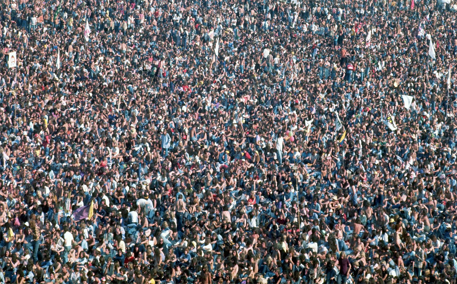
Social distance
Jewitt and Van Leeuwen include social distance in the components of design. Social distance accounts for the “psychology of people’s use of space.”[10] In short, a visual artist can exploit social distance to create a certain psychological effect between a person in an image and the image’s audience.
To illustrate, imagine a photograph of a handsome man and a pretty woman, head and shoulders only, smiling straight at you with warm eyes.

“Look at me,” both seem to say, “buy this product; we invite you.” Likewise, Kennedy smiles into the camera. “Vote for me,” he encourages. “I’m a nice guy.” Depicting head and shoulders only, we are given a sense of what Van Leeuwen and Carey Jewitt call “Close Personal Distance.” The result is one of intimacy.
Alternatively, a visual of several people, or a crowd, would suggest far less intimacy.

Mood and Lighting
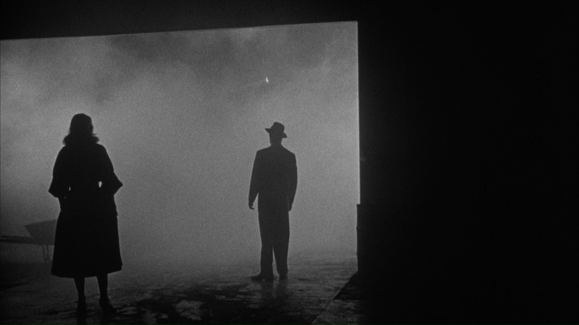
Have you ever put a flashlight under your chin and lit your face from underneath? Maybe we aren’t all budding scary movie makers, but jump out of the closet on a dark night with all the lights turned off and the flashlight propped under your chin and you’re sure to give at least the cat a fright. What you have experimented with is mood and lighting. In short, the lighting as described eerily captures facial features that aren’t usually accentuated. It can be quite off-putting. Thus the position of the light has created a creepy face; it’s created a visual mood. And, the mood combines with other elements of the visual to create an effect, which of course is rhetorical.
The next time you watch a movie, note how the filmmaker has played with lighting to create a mood. In the illustration below, we can see how Film Noir, for instance, capitalizes on techniques of mood and lighting to create an uncanny effect.

Step 4. Connect the Text to the Purpose
Think about how the author’s purpose connects to the visual text. Do they match up? Has the author’s feelings or desire for creativity interfered with the message?
Case Study: Tracking Memes in the Wild: Visual Rhetoric and Image Circulation in Environmental Communication[11]
The Lorax
Since the publication of Dr. Seuss’s The Lorax in 1971, the book’s titular character has become an icon and has been remixed over time, across genres and been interpreted through numerous lenses. Many of Dr. Seuss’s characters remain culturally relevant, but none more than the Lorax, who plays a prominent role in environmentalist subculture. The Lorax is an environmental icon for its ability to stand alone and be recognized as an environmental message. Since its initial publication, there have been more than 200 million copies sold, and the illustration has circulated through numerous media, including protest signs, t-shirts, and a 2012 Universal Pictures animated movie.[12] The original illustration and meme renditions remain dominant in many subcultures today.
Written one year after the first Earth Day in 1970 and at the beginning of the environmental movement, The Lorax provided several takeaway messages for a budding environmentalism. Dr. Seuss painted the fictional world of Thneedville with words and images of fertile land with thriving ecosystems and smiling animals that starkly contrast the antagonists, the Once-ler’s, desire for profit that eventually leaves the land dark and barren. Warnings of a post-apocalyptic world, messages on environmental degradation, a nod toward the dangers of capitalism, and an individual character with determination to save trees are interwoven throughout the book. Environmentalists identify with the Lorax’s representation of being an environmental crusader. The Lorax is met with resistance and stubbornness from the Once-ler just as today’s environmentalists are met with resistance from corporations and capitalism. The Lorax, representing today’s activists fighting against corporations, is captured perfectly in the political image of the Lorax wearing a t-shirt of Exxon, Pepsico, and Doritos, common corporations that environmentalists identify as the antagonist.
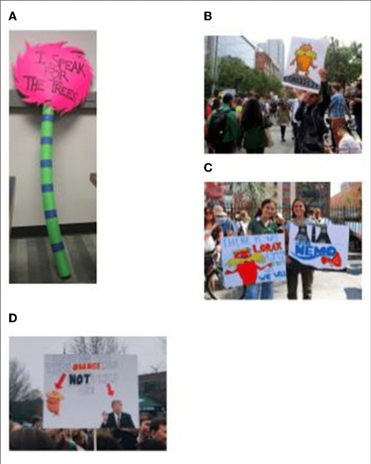
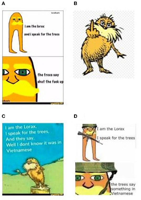
Environmentalists have taken to the streets with force with the Lorax held high above their heads on protest signs. A sign in the shape of a single truffula tree (Figure 9A[13]) points to the famous line from The Lorax and shows how a mere few words can make a potent statement. Similarly, a protester holds up a hand-drawn sign with an image of the Lorax with the word “UNLESS.” The simplicity of this sign invites us to recall another famous line: “Unless someone like you cares a whole awful lot, nothing is going to get better. It’s not” (Figure 9B[14]). Another protest sign says, “There is no Lorax 2 speak for the trees so… We Will” (Figure 9C[15]). These signs show how well-understood and widely known the Lorax is as he delivers a message with little context. Across all of the signs, whether hand-drawn or clipped from the animation, the Lorax’s orange color stands strong. In one sign, the Lorax is compared to Donald Trump (Figure9D[16]). This sign refers to Donald Trump’s orange coloration from his excessive use of self-tanner and suggests that we listen to the Lorax, another orange figure, instead of Trump. This political sign appeals to environmental politics while criticizing Trump for his use of cosmetics by indexing the two through ethos, ultimately claiming that a fictional character is more trustworthy than the president.
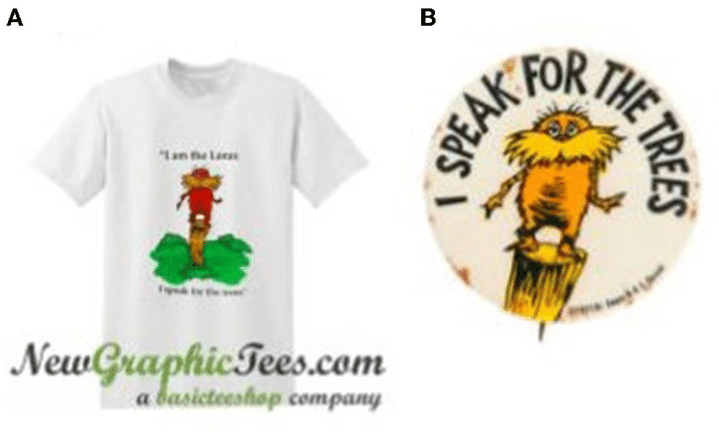
Images and quotes from The Lorax have been transformed into t-shirts) (Figure 10A[17]), buttons (Figure 10B[18]), and even tattoos. These paraphernalia and permanent body markings show that Lorax is here to be heard on many more occasions than just at a rally. Wearing the Lorax also shows the significance of the character and its message to the environmentalists as they are willing to let it be portrayed on their physical identity as clothing temporarily or as a tattoo forever. The performative nature of the Lorax does not seem to have bounds.
Results
The original illustration (Figure 11A[19]) was published in the book. The 2012 animation (Figure 11B[20]) and the Lorax television show (Figures 11C[21] and 11D[22]) characters have been modified with advanced illustration technology. Across all versions, there is room for interpretation of what the Lorax could be saying, and it is often remixed with words placed in the background behind him to connect his presence with a thought or speech bubble. The original illustration appears remixed more frequently in memes, signs, and other paraphernalia than the 2012 animation and the television character (Figure 11F[23]).
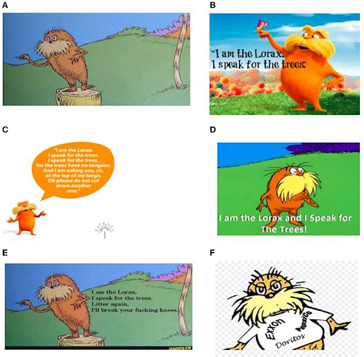
Some popular memes took advantage of overlaying text on the screen to remix what the Lorax was saying with a more vulgar rendition. One of the most popular memes uses the same rhyme structure that Dr. Seuss is famous for and changes the second line from “for the trees have no tongues. And I am asking you, sir, at the top of my lungs. Oh please do not cut down another one.” to “Litter again, I’ll break your fucking knees” (Figure 11E[24]). Political caricature renditions of the Lorax have been made that exaggerate the Lorax beyond his original environmental iconography. The remixes that make the Lorax political also enable the Lorax to be a very popular sign among protestors. From the quotes “I speak for the trees” and “Unless someone like you cares a whole awful lot, nothing is going to get better. It’s not.” to the truffula tree, to a simple Lorax character, to a comparison of the Lorax to Donald Trump (Figure 9D), there are a plethora of memes of the Lorax being used to be a call to action. The Lorax has also been used for a variety of paraphernalia, including t-shirts (Figure 10A), buttons (Figure 10B), and tattoos. Most of this paraphernalia includes a near approximation of the original Lorax and his sayings rather than a remixed or meme version.
Beyond these popular parodies, other memes include a simple image of the Lorax that is identifiable by his orange color and yellow mustache (Figure 12A[25]). These memes employ the same strategy of adding text next to the character to imply what the Lorax is saying. Another remixed meme of the Lorax shows the Lorax giving a middle finger (Figure 12B[26]). Another popular meme was first developed by substituting text that says, “and they say, well, I do not know it was in Vietnamese” (Figure 12C[27]). This meme has since been modified to still resemble the Lorax at the most basic level with the orange body and yellow mustache but adding military apparel and guns (Figure 12D[28]). Among the most popular uses of the Lorax, the image associated with the phrase “I speak for the trees” brings up over 200,000 Google search results. The Google Trend search for “I speak for the trees,” “Lorax,” and “truffula” spiked in March of 2012, upon the release of the film, and gained traction steadily from 2015, peaking in the spring of each year around Earth Day.
Discussion
The original illustration of the Lorax tends to be the most commonly used in circulation and across remixes, followed by the 2012 animation image. However, since 2012, there have been a growing number of renditions of the animated character over the original. A newer iteration of the Lorax, the most simplified yet, consists of a simple-shaped, orange body and minimal features. It is used most commonly in satirical memes (Figure 12A). This is a common meme strategy-amplify how iconic a character is by stripping it to its most basic features.
Tone Variations
This remix became a popular meme on Pinterest and Reddit with the added text “Litter again, I’ll break your fucking knees” (Figure 11E). This meme adds a vulgar, threatening rhyme to employ the same call to action. As environmentalists have felt unheard since the start of the movement, this meme captures their anger and the threatening tone they wish was effective in enacting political change. Contrary to the message-driven tone in the original book, this meme targets individual acts of littering instead of large corporations.
Another meme that is only suitable for adults remixed the Lorax to give the middle finger (Figure 12B). This “f-you” can be inferred as what the trees may be saying to the Once-ler for cutting them down and can be used today to relay the same message to corporations. A grouping of memes has cut down the Lorax character to a simple body that is only recognizable because it has been crafted with the same orange color and yellow mustache (Figure 12A). These parodies of the Lorax take on a more satirical and vulgar tone as they poke fun at the original saying, “I speak for the trees,” by adding, “The trees say shut the fuck up.” Unlike the middle finger meme, this meme claims that the trees do not care about being spoken for and wish that the Lorax would quiet himself.
In a publication for Nature, Emma Marris described the Lorax character as a “parody of a misanthropic ecologist,” meaning that his unsocial and reclusive nature was what led him to be unsuccessful.[29] Similarly, the Lorax matches the criticisms of being an alarmist and anti-progress. The Once-ler describes the Lorax as “shortish and oldish and sharpish and bossy.”[30] Since environmentalists identify themselves with the Lorax, they can be easily mocked with these same criticisms. Many environmentalists are also criticized for being “woo-woo” or “hippies.” The Lorax comes in and out of a tree and is illustrated and animated with lightning bolts around him as if he has some sort of spiritual authority.[31] This plays into commonplace critiques of environmentalism as being rooted in a false spirituality.
A Dark Turn
Other memes point to unexpected places like war history. The memes that remix the Lorax to be saying, “Well I don’t know it was in Vietnamese” and “the trees say something in Vietnamese” are references to the Vietnam War, when American soldiers often claimed they could hear the jungle speak Vietnamese as the soldiers were about to attack (see Figures 12C,D).[32] Visually, this reference to the Vietnam War has been made in the original illustration with the addition of text and the crudely drawn figure of the Lorax with the addition of a helmet and machine gun. These memes merge the two ideas of what the Lorax hears from the trees and how Vietnamese soldiers would hide in the trees before an ambush during the war. The analysis of this meme has gone beyond a war history meme and into ecofascism. Ecofascism is a political ideology where the community advocates to decrease the world’s population to avoid environmental disasters.[33] Whether or not this was the illustrator’s original intention, this meme is successful within the community of ecofascists because it reflects the success of the Vietnamese soldiers by killing Americans and dwindling the population. This meme now brings the Lorax into a dark side of environmentalism subcultures.
Dr. Seuss is facing recent criticisms of racist and insensitive imagery that portrays people in hurtful ways as his work has been under a critical lens for the way he portrays Blacks, Asians, and other minoritized/marginalized communities. With these growing critiques of Dr. Seuss’s work, books are being pulled from the shelves of schools and removed from murals.[34] This removal and cancellation of Dr. Seuss’s work could lead to an unknown future of the Lorax as an environmental icon. Since the meme exists within the world of environmentalists who often overlap with those of social justice communities, it is unclear if the Lorax visual and memes will still succeed. From our analysis of the Lorax through iconographic tracking thus far, we understand how a children’s book character can become so prevalent in popular culture today and this same method will enable us to investigate how the Lorax will circulate in the future.
Key Takeaways
- It’s important to break down visuals into component parts, similar to analyzing written language, to understand how images and texts convey messages, using techniques like arrangement, color, modality, and perspective.
- Recognizing the conventions and limitations of different genres, such as bumper stickers, and understanding the historical and social context of visuals, are essential for interpreting their meaning and rhetorical content.
- There is an intricate relationship between text and image in visual rhetoric, detailing how font, arrangement, social distance, mood, and lighting work together with visuals to create a cohesive and persuasive message and how these elements can be manipulated to achieve specific effects.
Exercises
- How do the elements of design, such as color, arrangement, and perspective, influence the interpretation of a visual message? Provide examples from current media to support your analysis.
- Select a film trailer and analyze it using the concepts of visual rhetoric discussed in the text. Focus on aspects like arrangement, text and image interplay, modality, and social distance. Write a detailed analysis of how these elements work together to be persuasive.
- Consider the concept of “modality,” as discussed in the text, where the “realness” of an image affects its persuasiveness. How might this concept apply to modern digital media, where images can be easily manipulated? Reflect on the ethical implications of using highly manipulated images in advertising or political campaigns.
Media Attributions
- Kennedy campaign sticker © Wikipedia is licensed under a Public Domain license
- Flower is at an intersection © John Watson via. Flickr is licensed under a CC BY-SA (Attribution ShareAlike) license
- Color diagram © Wikipedia is licensed under a Public Domain license
- Photo vs clip art © Dr. Karen Palmer is licensed under a CC BY-NC-SA (Attribution NonCommercial ShareAlike) license
- Wind turbines in a field © J.J. Sylvia and MidJourney is licensed under a CC BY-NC-SA (Attribution NonCommercial ShareAlike) license
- Multi-racial couple smiling © J.J. Sylvia IV and MidJourney is licensed under a CC BY-NC-SA (Attribution NonCommercial ShareAlike) license
- Crowd at Rolling_Stones 1976 © Wikipedia is licensed under a CC BY-SA (Attribution ShareAlike) license
- Big Combo trailer © Wikipedia is licensed under a Public Domain license
- The Lorax protests and posters © Image by Jones et al. via. frontier communication is licensed under a CC BY-NC-SA (Attribution NonCommercial ShareAlike) license
- The Lorax paraphernalia A-T-shirt design © Image by Jones et al. via. frontier communication is licensed under a CC BY-NC-SA (Attribution NonCommercial ShareAlike) license
- Lorax characters A Original illustration © Image by Jones et al. via. frontier communication is licensed under a CC BY-NC-SA (Attribution NonCommercial ShareAlike) license
- Other memes © Image by Jones et al. via. frontier communication is licensed under a CC BY-NC-SA (Attribution NonCommercial ShareAlike) license
- Faigley, Lester, Diana George, Anna Palchik, and Cynthia Selfe. Picturing Texts. London: Norton, 2004. Print. p. 104 ↵
- Faigley, Lester, Diana George, Anna Palchik, and Cynthia Selfe. Picturing Texts. London: Norton, 2004. Print. p. 105 ↵
- Faigley, Lester, Diana George, Anna Palchik and Cynthia Selfe. Picturing Texts. London: Norton, 2004. Print. p. 34 ↵
- Faigley, Lester, Diana George, Anna Palchik and Cynthia Selfe. Picturing Texts. London: Norton, 2004. Print. p. 105 ↵
- Faigley, Lester, Diana George, Anna Palchik and Cynthia Selfe. Picturing Texts. London: Norton, 2004. Print. p. 32 ↵
- Faigley, Lester, Diana George, Anna Palchik and Cynthia Selfe. Picturing Texts. London: Norton, 2004. Print. p. 32 ↵
- Kress, Gunther, and Theo Van Leeuwen: “Colour as a Semiotic Mode: Notes for a Grammar or Colour.” Visual Communication 1.3 (2002): 343. ↵
- Faigley, Lester, Diana George, Anna Palchik and Cynthia Selfe. Picturing Texts. London: Norton, 2004. Print. p. 91 ↵
- Kress, Gunther and Theo Van Leeuwen. Reading Images. London: Routledge, 1996. Print. p. 161 ↵
- Van Leeuwen, Theo and Carey Jewitt. The Handbook of Visual Analysis. Thousand Oaks: Sage, 2003. Print. p. 29 ↵
- Case study adapted from: Jones, M., Beveridge, A., Garrison, J. R., Greene, A., & MacDonald, H. (2022). Tracking Memes in the Wild: Visual Rhetoric and Image Circulation in Environmental Communication. Frontiers in Communication, 7. https://www.frontiersin.org/articles/10.3389/fcomm.2022.883278 ↵
- Dailey, D. (2012). Five Interpretations of the Lorax. Available online at: https://www.bbc.com/news/magazine-17224775. ↵
- Schuenemann, K. (n.d.). Lorax Trees. Available online at: https://www.pinterest.com/pin/100205160440752443/. ↵
- Daretoeatapeach (2017). The 35 Best Protest Signs From the San Francisco Science March. Available online at: https://web.archive.org/web/20170429214518/https://futureisfiction.com/35-best-protest-signs-san-francisco-science-march/. ↵
- Salinas, I. (2019). Pop Culture for Change. Available online at: https://sundial.csun.edu/154553/arts-entertainment/pop-culture-for-change/ ↵
- Funny Video Memes, Funny Memes, Good Jokes (n.d.). Available online at: https://www.pinterest.fr/pin/858991328908257165/ ↵
- I am the Lorax I speak for the trees T shirt (2021). https://newgraphictees.com/product/i-am-the-lorax-i-speak-for-the-trees-t-shirt/ ↵
- Hake's Dr. Seuss designed rare “I SPEAK FOR THE TREES” Ecology-themed button featuring The Lorax. (2013). https://www.hakes.com/Auction/ItemDetail/79599/DR-SEUSS-DESIGNED-RARE-I-SPEAK-FOR-THE-TREES-ECOLOGY-THEMED-BUTTON-FEATURING-THE-LORAX ↵
- Kimmel, E. (2019). 10 Lessons in Quotes From the Lorax (Dr. Seuss's Classic). Available online at: https://greenglobaltravel.com/lessons-quotes-from-the-lorax/ ↵
- Morye, K. (2020). “I am the Lorax. I Speak for the Trees!” - Amidst the Quarantine, There Is Hope for Climate Action. Available online at: https://medium.com/@kimayamorye/i-am-the-lorax-i-speak-for-the-trees-amidst-the-quarantine-there-is-hope-for-climate-action-c9f0d93bda8a ↵
- Misli. (n.d.). https://www.pinterest.com/pin/428053139554374889/ ↵
- I am the Lorax and I Speak for the trees! (n.d.). https://imgur.com/gallery/9pvVx1w ↵
- The Lorax YouTube Clip Art - Lorax Dr Seuss Characters - Png Download (n.d.). https://www.pinclipart.com/pindetail/ibTTbih_the-lorax-youtube-clip-art-lorax-dr-seuss/ ↵
- Picture memes 78vlLnMq6 - iFunny (n.d.). https://www.pinterest.co.kr/pin/627055948099310315/?amp_client_id=CLIENT_ID(_)&mweb_unauth_id=&from_amp_pin_page=true ↵
- I am the Lorax I speak for the trees - I am the Lorax, I., and speak for the trees (2020). https://knowyourmeme.com/photos/1038793-i-am-the-lorax-i-speak-for-the-trees ↵
- PNGEgg. “YouTube Once-Ler Aunt Grizelda Animation Character, Dr Seuss, Child, Carnivoran Png” Accessed April 1, 2024. https://www.pngegg.com/en/png-yiicp. ↵
- I am the Lorax, I speak for the trees, and they say, Well I don't know it was in Vietnamese (n.d.). https://www.pngegg.com/en/png-yiicp ↵
- The trees!: Really funny memes, history jokes, stupid funny memes. (n.d.). https://www.pinterest.com/pin/819936675887264406/ ↵
- Marris, E. (2011). In retrospect: the lorax. Nature 476, 148–149. doi: 10.1038/476148a ↵
- GradeSaver (2021). The Lorax Imagery. Available online at: https://www.gradesaver.com/the-lorax/study-guide/imagery ↵
- ibid ↵
- u/paradoX1995. (2019). What Is Up With Vietnamese Speaking Trees? Available online at: https://www.reddit.com/r/OutOfTheLoop/comments/a9dwua/what_is_up_with_vietnamese_speaking_trees/ ↵
- Krzeminski, J. (2019). Whose Utopia? American ECOFASCISM Since the 1880s. Available online at: https://edgeeffects.net/ecofascism/ ↵
- Pratt, M. (2021). 6 Dr. Seuss Books Won't Be Published for Racist Images. Available online at: https://apnews.com/article/dr-seuss-books-racist-images-d8ed18335c03319d72f443594c174513 ↵
