
1.2 Data Sampling
Problem 1
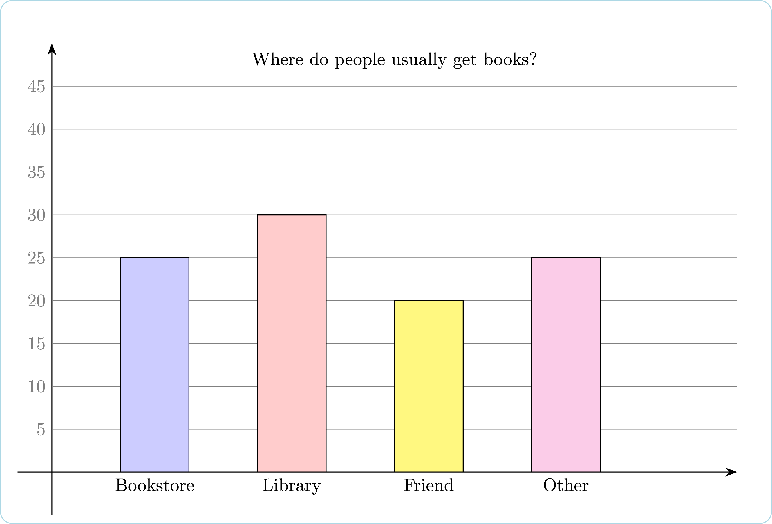
Use the bar graph above to fill in the blanks.
- _ people said that they get books in a bookstore or a library.
- _ more people said that they get books from the library than said that they get books from a friend.
- _ people in the survey did not get their books from the library.
Solution
To tell how many people usually got books from the library, look at the bar above the word “Library”. Its height can be found from seeing where the line at the top of the bar would hit the y-axis (if we continued it leftward) since the heights are marked there. That height is the number of people who got books from the library and in this
case, the answer is 30.
To determine how many more people get books from a library than a friend, subtract the bar height of the friend bar from the bar height of the library bar or 30 − 20 = 10.
The ways to find out how many people did not get their books from the library is to subtract the number who got their books from the library from 100. In this case, the answer is 70.
Correct Answers
- 55
- 10
- 70
Problem 2
This table shows the results of polls taken during the four months preceding an election between two candidates – Lopez and Ye.
| July | Aug. | Sept. | Oct. |
| 20 | 40 | 50 | 55 |
Ye published this graph in a newspaper.
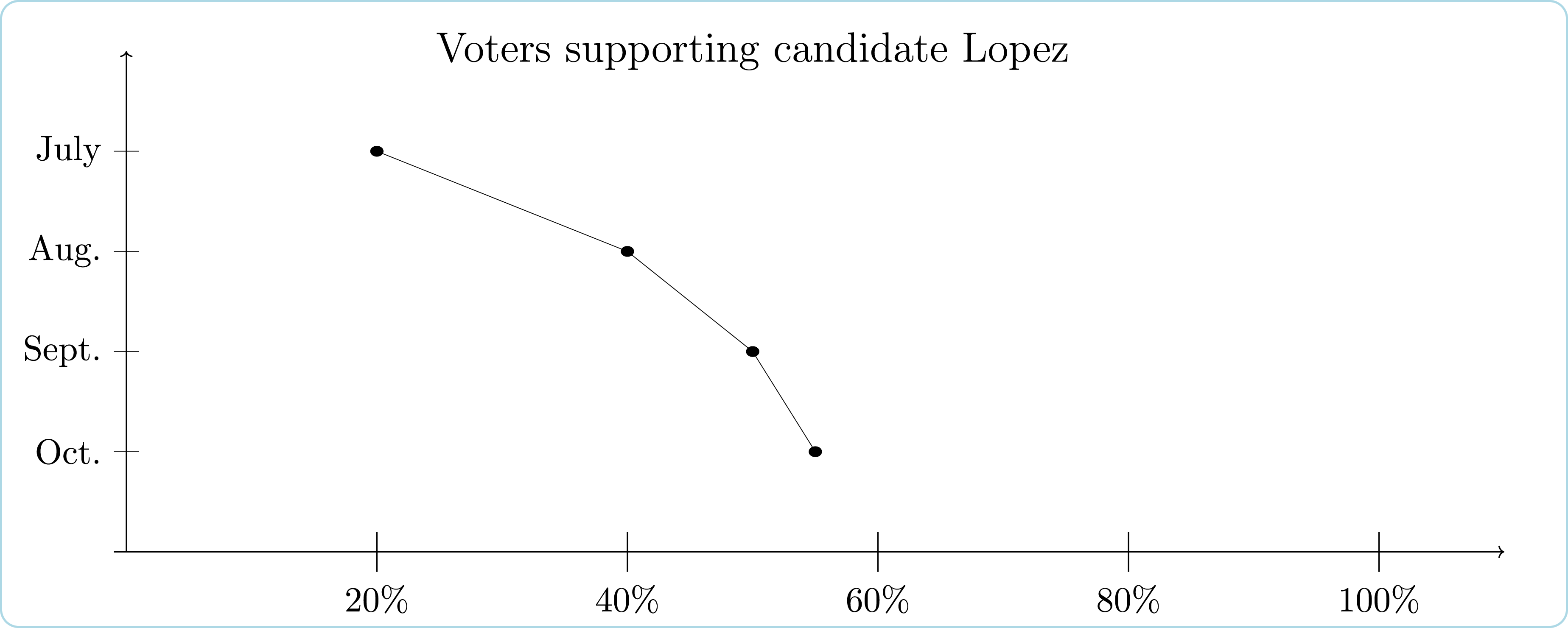
How could this graph be misleading about popularity?
- The graph gives the impression that popularity is changing at a constant rate.
- The graph does not show the number of voters polled each month.
- The graph does not show the percent of voters who chose Ye.
- The graph gives the impression that popularity is decreasing
Solution
While all of the choices state facts that are correct, the one unusual thing that would not be expected by the readers is that a line with negative slope would indicate increasing popularity. A person who did not look carefully would assume that a negative slope would indicate decreasing popularity. That is: the graph gives the impression that Lopez’s popularity is decreasing.
Correct Answers
D
Problem 3
A simple random sample of 30 residents from Seattle is taken to estimate the median income of all Seattle residents.
Is this study
- REPRESENTATIVE?
- NON-REPRESENTATIVE?
A simple random sample of people over age 18 is taken to estimate the mean weight of all adults.
Is this study
- REPRESENTATIVE?
- NON-REPRESENTATIVE?
A telephone survey is conducted during the day in order to determine the chances of a certain candidate winning an election.
Is this study
- REPRESENTATIVE?
- NON-REPRESENTATIVE?
Using a sample of 40 patients from a local hospital, researchers measured cholesterol level in an attempt to estimate the mean cholesterol level of U.S. citizens.
Is this study
- REPRESENTATIVE?
- NON-REPRESENTATIVE?
Correct Answers
A
A
B
B
