2.1, 2.2 Graphs and Percentages
Problem 1
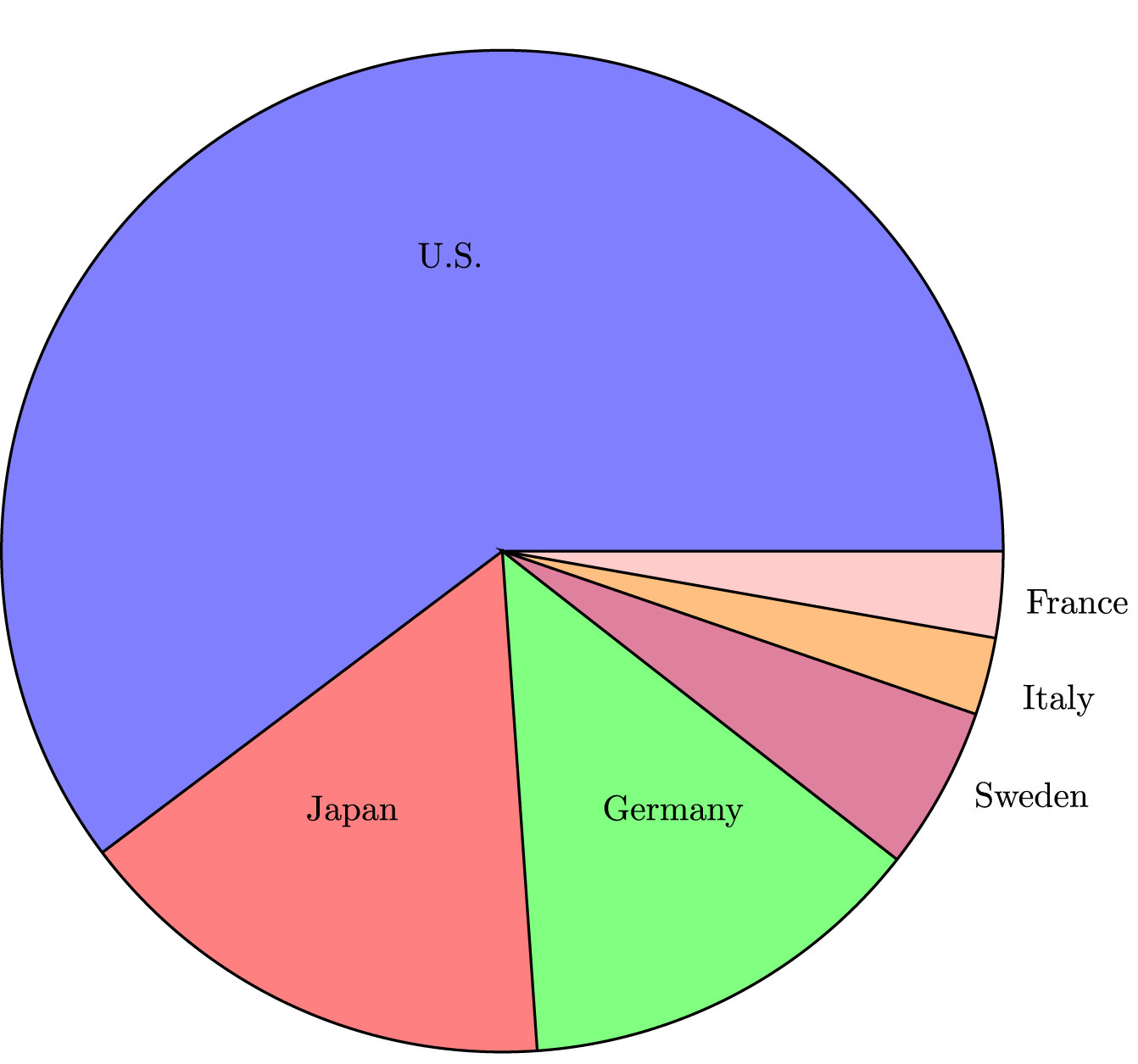
Consumers Union measured the gas mileage in miles per gallon of 38 1978-79 model automobiles on a special test track. The pie chart below provides information about the country of manufacture of the model cars used by Consumers Union.

1. A pie chart is equivalent to a
- timeplot
- histogram.
- bar chart.
- scatter plot.
- None of the above.
2. Based on this pie chart, we may conclude that
- more than half of the cars in the study were from the United States.
- Swedish cars get gas mileages that are between those of Japanese and American cars.
- German luxury cars made by Mercedes Benz, Audi, Porsche, and BMW represent approximately one quarter of the cars tested.
- Japanese cars get significantly lower gas mileage than cars of other countries. This is because their slice of the pie is at the bottom of the chart.
- None of the above.
Correct Answers
1. C
2. A
Problem 2
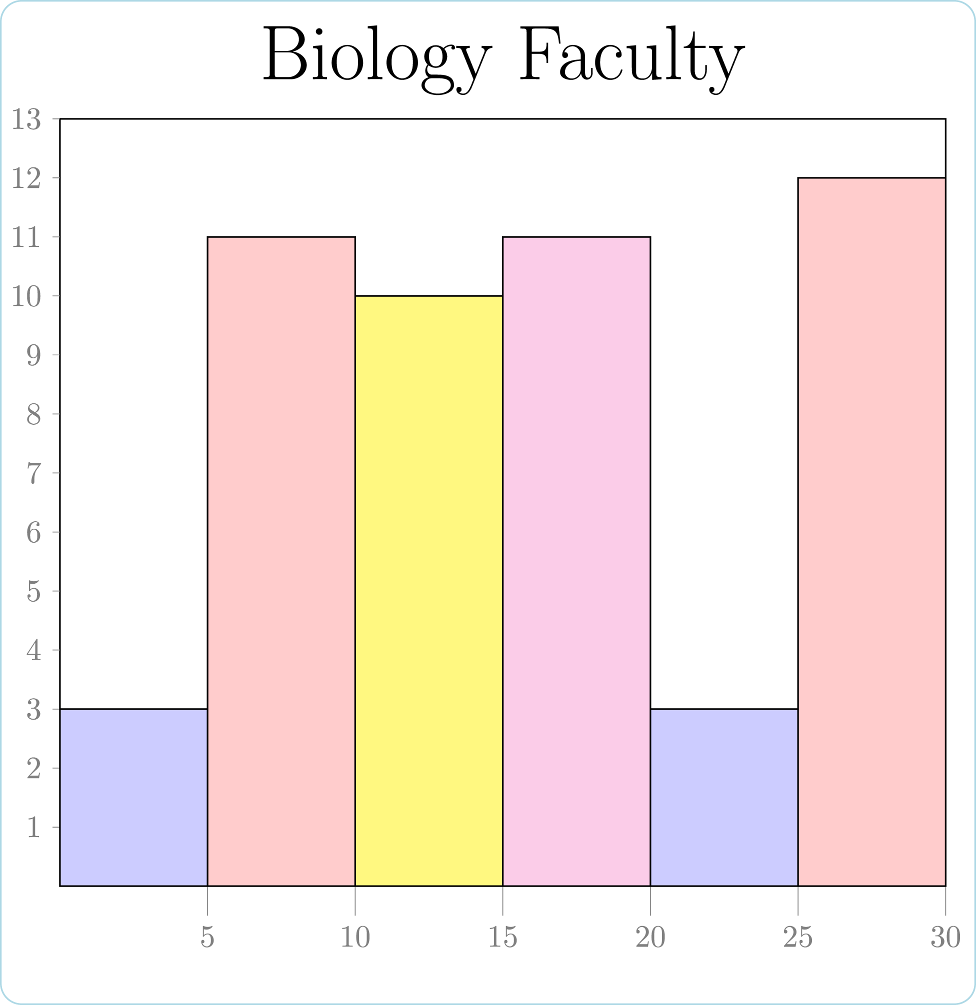
The histogram below gives the length of service of members of the Department of Biology at a particular university. The horizontal axis represents years of service in intervals 0 to 4.9, 5 to 9.9, etc., and the vertical axis represents the number of faculty.

What percent of the department faculty have less than 10 years of service?
Correct Answers
28

