
6 Correlation and Regression Analysis
Learning Outcomes
- Inferential Analysis: A Recap
- Correlation Analysis
- Constructing a Scatter Plot
- Correlation is Not the Same as Causation
- Regression Analysis
- Dependent vs. Independent Variables
We are all guilty of jumping to conclusions from time to time. It is easy to jump to inaccurate conclusions at work, with our families and friends, in relationships, and even when we first hear something on the news. When we do this, we are essentially generalizing, but what if we could make these generalizations more accurate?

A case in point is when I first heard on the news about the recent U.S. Supreme Court landmark decision on June 29, 2023[1]. The June 29th ruling makes it unlawful for colleges to take race into consideration as a specific factor in admissions. The Court’s conservative-liberal split effectively overturned cases reaching back 45 years in invalidating admission plans at Harvard University and the University of North Carolina, the nation’s oldest private and public colleges, respectively.
Besides feeling disappointed but not surprised, my initial reaction was that it was a blow to institutions of higher education, especially those who work diligently and authentically to achieve diverse student bodies. After delving more into the issue, I learned that the Court’s decision is not just limited to the educational system but to the health care system as well. I had not thought about its ripple effect on the medical profession and how it would exacerbate health disparities among people of color, as discussed below.
Impact of Affirmative Action Ruling on the Health Care System:
Applying an Equity Lens
With fewer Blacks and Latinos attending medical school, experts say that medical schools will be even less diverse after the affirmative action ruling. Justice Sonia Sotomayor, a Latina, wrote in her powerful dissenting opinion that “…increasing the number of students from underrepresented backgrounds who join the ranks of medical professionals improves healthcare access and health outcomes in medically underserved communities.”
The Association of American Medical Colleges (AAMC)[2] underscores Justice Sotomayor’s point. The AAMC, along with 45 health professional and educational organizations, submitted prior to the ruling an amicus curiae brief to the U.S. Supreme Court emphasizing (1) there is an ongoing underrepresentation of certain racial and ethnic groups in medicine; (2) studies have repeatedly shown that racially and ethnically diverse health care teams produce better and more equitable outcomes for patients; and (3) physicians who train and work alongside racially or ethnically diverse peers have higher cultural competence and are able to help eliminate socio-cultural barriers to care and avoid stereotypes about patients from different backgrounds.[3]
After the ruling, the AAMC stated, “Today’s decision demonstrates a lack of understanding of the critical benefits of racial and ethnic diversity in educational settings and a failure to recognize the urgent need to address health inequities in our country.”[4]
Dr. Uche Blackstock, Founder & CEO of Advancing Health Equity, is a second-generation Black female physician. Dr. Blackstock adds, “There are only 5% of physicians who are Black, while Blacks represent 13% of the population. We have copious amounts of data and research that outcomes improve for Black patients when there is a diverse healthcare workforce. This ruling is going to have detrimental consequences, meaning life or death for Black communities. We already have the shortest life expectancy of any demographic group. We are more likely to die from a pregnancy-related complication. Black infants are twice as likely to die in their first year compared to White infants. We are in a crisis right now, and this ruling is going to exacerbate that crisis…and it’s going to happen for generations and generations to come. We need people to connect the dots. It is not about the success of one person getting into medical school. It is about the ripple effect of what happens when we admit a diverse medical student body which has serious implications for communities of color, in particular.”[5]
6.1. Inferential Analysis: A Recap
Inferential analysis is simply what we use to try to infer from a sample of data what the population might think or show. It is a method that is used to draw conclusions, that is, to infer or conclude trends about a larger population based on the samples analyzed.
In previous chapters, we learned that we could go about this in basically two ways:
- Estimating Parameters: Taking a statistic from a sample of data (like the sample mean) and using it to describe the population (population mean). The sample is used to estimate a value that describes the entire population, in addition to a confidence interval. Then, the estimate is created.
- Hypothesis Tests: Data is used to determine if it is strong enough to support or reject an assumption.
Inferential analysis allows us to study the relationship between variables within a sample, allowing for conclusions and generalizations that accurately represent the population. There are many types of inferential analysis tests in the field of statistics. We will review the two most common methods: correlation analysis and linear regression analysis (prediction and forecasting). They are the most commonly used techniques for investigating the relationship between two quantitative variables. Both methods are used quite frequently in disciplines such as economics, healthcare, engineering, physical engineering, and the social sciences.
6.2 Correlation Analysis
Correlation is a statistical measure that expresses the extent to which two variables are linearly related (meaning they change together at a constant rate). It is a common tool for describing simple relationships without making a statement about cause and effect. Correlation does not imply causation!
Using the affirmative action ruling, we might say that we have noticed a correlation between where a Supreme Court Justice is on the ideological spectrum (i.e., their political leanings) and whether they are a Conservative, Moderate, or Liberal.[6] A growing body of academic research has confirmed this understanding, as scholars have found that the Justices largely vote in consonance with their perceived values. The simplest way to approximate the ideological leanings of the Supreme Court Justices is by the political party of the Presidents who appointed them.[7]
However, in statistical terms, we use correlation to denote the association between two (or more) quantitative variables, that is, variables that can be “measured”. The association is linear, fundamentally based on the assumption of a straight-line [linear] relationship between the quantitative variables. Besides direction, correlation also looks at the strength of the relationship between the variables.
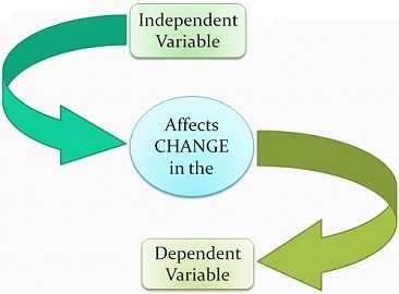
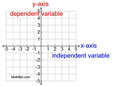
The data can be represented by the ordered pairs (x,y) where x is the independent (or explanatory variable and y is the dependent (or response variable). A response variable measures the outcome of a study. An explanatory variable may explain or influence changes in a response variable, as revealed in the graph below. However, a cause-and-effect relationship is not necessary for the distinction between explanatory and response variables.
In Figure 1 below, the independent variable belongs on the x-axis (horizontal line) of the graph and the dependent variable belongs on the y-axis (vertical line). The x- and y-axes cross at a point referred to as the origin, where the coordinates are (0,0).
6.2(a). Constructing a Scatter Plot
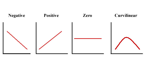
The most useful graph for displaying the relationship between two quantitative variables is a scatter plot. A scatter plot can be used to determine whether a linear (straight line) correlation exists between two variables. Each individual data appears as the point in the plot fixed by the values of both variables for that individual. The scatter plot below in Figure 2 shows several types of correlation.
A positive correlation exists when two variables operate in unison so that when one variable rises or falls, the other does the same. A negative correlation exists when two variables move in opposition to one another so that when one variable rises, the other falls.
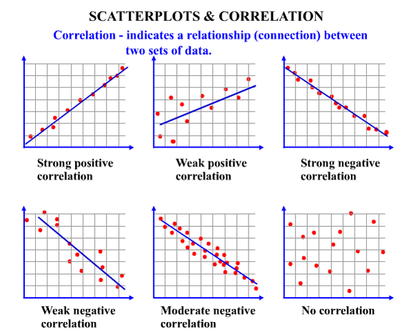
Curvilinear Relationships: As shown in Figure 3, it is important to note that not all relationships between x and y can be a straight line. There are many curvilinear relationships indicating that one variable increases as the other variable increases until the relationship reverses itself so that one variable finally decreases while the other continues to increase (Levin & Fox 2006).
Now Try It Yourself
How to Examine a Scatter Plot
As suggested by Moore, Notz & Fligner (2013), in any graph of data, look for the overall pattern and for striking deviations. The overall pattern of a scatter plot can be described by the direction, form, and strength of the relationship. An important kind of deviation is an outlier, an individual value that falls outside the overall pattern of the relationship.
You interpret a scatterplot by looking for trends in the data as you go from left to right: If the data show an uphill pattern as you move from left to right, this indicates a positive relationship between x and y. As the x-values increase (move right), the y-values tend to increase (move up).
6.2(b). Correlation Coefficient
A scatterplot is considered a useful first step. The second step is to calculate the correlation coefficient—considered a more precise measure of the strength and direction of a linear correlation between two variables. The symbol r represents the sample correlation coefficient. A formula for r is
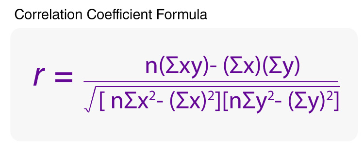
where n is the number of pairs of data. The population correlation coefficient is represented by ρ (the lowercase Greek letter rho, pronounced “row”).
Calculating a Correlation Coefficient (Words and Symbols)
- Find the sum of the x-values. ([latex]\sum x[/latex])
- Find the sum of the y-values. ([latex]\sum y[/latex])
- Multiply each x-value by its corresponding y-value and find the sum.([latex]\sum xy[/latex])
- Square each x-value and find the sum. ([latex]\sum x^{2}[/latex])
- Square each y-value and find the sum. ([latex]\sum y^{2}[/latex])
- Use these five sums and n to calculate the correlation coefficient.
- Interpret the correlation coefficient r.
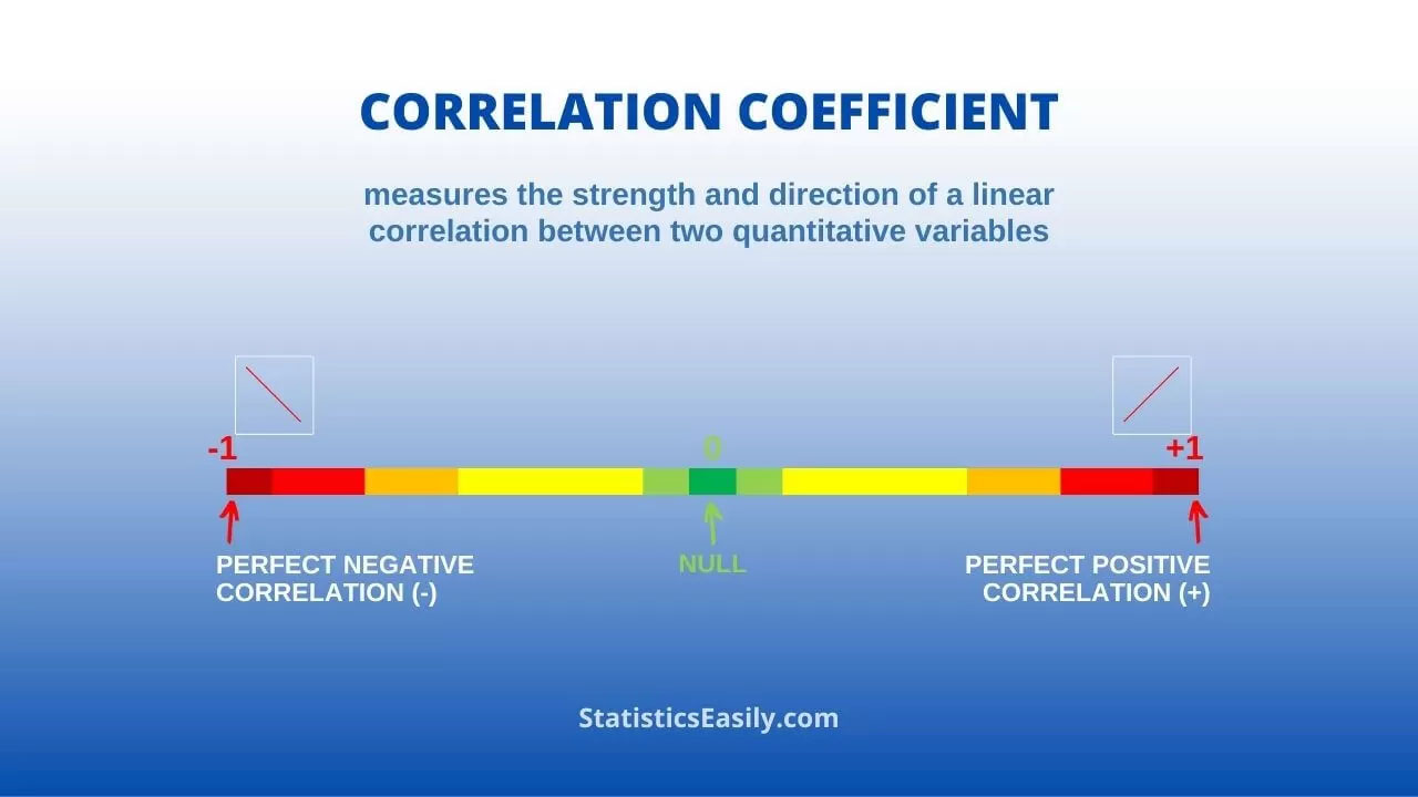
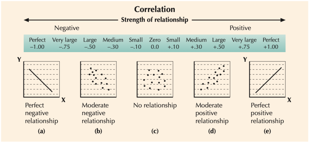
Figure 4 below shows that the range of the correlation coefficient is -1 to 1, inclusive. When x and y have a strong positive linear relationship, r is close to 1. When x and y have a strong negative relationship, r is close to -1. When x and y have a perfect positive linear correlation or perfect negative linear correlation, r is equal to 1 or -1, respectively. When there is no linear correlation, r is close to 0. Note: When r is close to 0, it does not mean that there is no relationship between x and y; it is just that there is no linear relationship.
| Size of Correlation | Interpretation |
| .90 to 1.00 (-.90 to -1.00) | Very high positive (negative) correlation |
| .70 to .90 (-.70 to -.90) | High positive (negative) correlation |
| .50 to .70 (-.50 to -.70) | Moderate positive (negative) correlation |
| .30 to .50 (-.30 to -.50) | Low positive (negative) correlation |
| .00 to .30 (.00 to -.30) | Little, if any, correlation |
In correlation, the statistician is interested in the degree of association between two variables. With the aid of the correlation coefficient known as Pearson’s r, it is possible to obtain a precise measure of both the strength—from .00 to 1.00—and direction—positive versus negative—of a relationship between two variables that have been measured at the interval level. Levin and Fox (2006) state that if a statistician “has taken a random sample of scores, he or she may also compute a t ratio to determine whether x and y exist in the population, and is not due merely to sampling error.”
It is only appropriate to use Pearson’s correlation if your data “passes” four assumptions that are required for Pearson’s correlation to give you a valid result. The four assumptions[8] are:
- Assumption #1: Your two variables should be measured at the interval or ratio level (i.e., they are continuous). Examples of variables that meet this criterion include intelligence (measured using IQ score), exam performance (measured from 0 to 100), weight (measured in kg), and so forth.
- Assumption #2: There is a linear relationship between the two variables. Suggest creating a scatterplot, where you can plot one variable against the other variable and then visually inspect the scatterplot to check for linearity. Your scatterplot may look something like one of the following:
- Assumption #3: There should be no significant outliers. Outliers are simply single data points within your data that do not follow the usual pattern (e.g., in a study of 100 students’ IQ scores, where the mean score was 108 with only a small variation between students, one student had a score of 156, which is very unusual, and may even put the person in the top 1% of IQ scores globally). The following scatterplots highlight the potential impact of outliers:
Pearson’s correlation coefficient, r, is sensitive to outliers, which can have a very large effect on the line of best fit and the Pearson correlation coefficient. Therefore, in some cases, including outliers in your analysis can lead to misleading results. Therefore, it is best if there are no outliers or they are kept to a minimum.
- Assumption #4: Your variables should be approximately normally distributed. In order to assess the statistical significance of the Pearson correlation, you need to have bivariate normality, but this assumption is difficult to assess, so a simpler method is more commonly used. This simpler method involves determining the normality of each variable separately.
6.2(b)(1). Significance Test for Correlation
The null hypothesis (H0) and alternative hypothesis (H1) of the significance test for correlation can be expressed in the following ways, depending on whether a one-tailed or two-tailed test is requested:
Two-Tailed Significance Test:
H0: ρ = 0 (the population correlation coefficient is 0; there is no association).
H1: ρ ≠ 0 (the population correlation coefficient is not 0; a nonzero correlation could exist).
One-Tailed Significance Test:
H0: ρ = 0 (the population correlation coefficient is 0; there is no association).
H1: ρ > 0 (the population correlation coefficient is greater than 0; a positive correlation could exist).
OR
H1: ρ < 0 (the population correlation coefficient is less than 0; a negative correlation could exist)
where ρ is the population correlation coefficient.

Correlation ≠ Causation
Correlation analysis measures a relationship or an association; it does not define the explanation or its basis. The purpose is to measure the closeness of the linear relationship between the defined variables. The correlation coefficient indicates how closely the data fit a linear pattern. One of the most frequent and serious misuses of correlation analysis is to interpret high causation between the variables. A correlation between variables does not automatically mean that the change in one variable is the cause of the change in the values of the other variable. Causation indicates that one event is the result of the occurrence of the other event, that is, there is a causal relationship between the two events.

When there is a significant correlation between two variables (such as meditation and stress reduction), Larson & Farber (2019) suggest that the statistician consider these possibilities:
- Is there a direct cause-and-effect relationship between the variables?
That is, does x cause y. For instance, consider the relationship between meditation and stress reduction. Today, people can be stressed from overwork, job security, information overload, and the increasing pace of life (Deshpande 2012)[9]. Meditation has been recommended and studied in relation to stress and has proven to be highly beneficial in alleviating stress and its effects (e.g., higher-order functions become stronger while lower-order brain activities decrease). A simple way of thinking about meditation is that it trains your attention to achieve a mental state of calm concentration and positive emotions.
It is reasonable to conclude that an increase in meditation (x) can result in lower levels of stress (y), showing a negative linear correlation.
- Is there a reverse cause-and-effect between the variables?
That is, does y cause x? For instance, do lower levels of stress (y) decrease one’s interest in meditation (x)? These variables have a positive linear correlation. It is possible to conclude that lower levels of stress affect one’s desire to meditate.
- Is it possible that the relationship between the variables can be caused by a third variable or perhaps a combination of several other variables?
The meditation-stress relationship can be confounded by other factors, such as age, gender, race/ethnicity, income, zip code, religious beliefs, spiritual health, well-being, parenting stress, prior trauma experiences, etc. Variables that have an effect on the variables in a study but are not included in the study are called lurking variables.
- Is it possible that the relationship between two variables may be a coincidence?
A coincidence has been defined as a “surprising concurrence of events, perceived as meaningfully related, with no apparent causal connection.” (Spiegelhalter 2012)[10] There are several research studies by Harvard University, UCLA Health, and others showing the efficacy of meditation in reducing stress and anxiety; thus, the relationship does not seem to be coincidental.
Impact of Racial Microaggressions on Mental Health:
Applying an Equity Lens
Racial microaggressions are defined as “brief and commonplace daily verbal, behavioral, and environmental indignities, whether intentional or unintentional, that communicate hostile, derogatory, negative racial slights and insults to the target person or group.” (Sue et al. 2007)[11] Nadal et al. (2014)[12] conducted a correlation and linear regression analysis to test the hypothesis that racial microaggressions would have a negative correlation with mental health. Results from the study suggest that:
(1) there is a negative significant relationship between racial microaggressions and mental health: individuals who perceive and experience microaggressions in their lives are likely to exhibit negative mental health symptoms, such as depression, anxiety, a negative view of the world, and a lack of behavioral control;
(2) specific types of microaggressions may be correlated with negative mental health symptoms, namely depression and a negative view of the world; and
(3) different Black, Latina/o, Asian, and multiracial participants may experience a greater number of microaggressions than White participants, and there are no significant differences in the total amount of microaggressions among Black, Latina/o, Asian, and multiracial participants.
Additionally, Carter, Kirkinis, & Johnson (2019)[13] found strong relationships between race-based traumatic stress and trauma symptoms as per the Trauma Symptom Checklist-40. This indicates that race-based traumatic stress is significantly related to trauma reactions (e.g., disassociation, anxiety, depression, sexual problems, and sleep disturbance), especially in instances where individuals have confirmed that negative race-based experiences are stressful.
Now Try It Yourself
6.3 Regression Analysis
In your algebra course, you learned that two variables are sometimes related in a deterministic way, meaning that given a value for one variable, the value of the other variable is exactly determined by the first without any error, as in the equation y = 60x for converting x from minutes to hours. However, in statistics, there is a focus on probabilistic models, which are equations with a variable that is not determined completely by the other variable.
Regression is closely allied with correlation in that we are concerned with specifying the nature of the relationship between two or more variables. We specify one variable as dependent (response) and one (or more) as independent (explanatory), where one or more variables are believed to influence the other. For example, stress reduction is dependent, and meditation is independent.
In regression analysis, a mathematical equation is used to predict the value of the dependent variable (denoted Y) on the basis of the independent variable (denoted X). Regression equations are frequently used to project the impact of the independent variable X beyond its range in the sample.
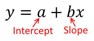
The term a is called the Y-intercept. It refers to the expected level of Y when X = 0. The term b is called the slope (or the regression coefficient) for X. This represents the amount that Y changes (increases or decreases) for each change of one unit in X.
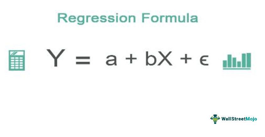
Finally, e is called the error term or disturbance term. It represents the amount of Y that cannot be accounted for by a and bX.
6.3(a) Finding the Equation of a Regression Line
After verifying that the linear correlation between two variables is significant, the next step is to determine the equation of the line that best models the data. This line is called the regression line, whose equation is used to predict the value of Y for a given value of X. A regression line, also called a line of best fit, is the line for which the sum of the squares of the residuals is a minimum.
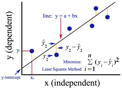
A residual is the difference between the observed y-value of a data point and the predicted y-value on the regression line for the x-coordinate of the data point. A residual is positive when the data point is above the line, negative when the point is below the line, and zero when the observed y-value equals the predicted y-value. (Larson & Farber 2019).
The equation of a regression line for an independent variable X and a dependent variable Y is
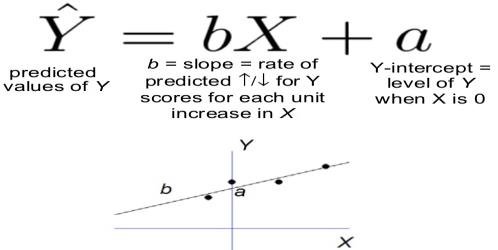
where ŷ (pronounced y-hat) is the predicted Y-value for a given X-value. The slope b and Y-intercept a are given by
Slope
[latex]b=r\tfrac{S_{Y}}{S_{X}}[/latex]
where r is the linear correlation coefficient, Sy is the standard deviation of the y values, and Sx is the standard deviation of the x-values.
Y-intercept
[latex]a=\bar{Y}-b\bar{X}[/latex]
Before you calculate the regression line, you will need the following values:
- The mean of the x values ([latex]\bar{x}[/latex])
- The mean of the y values ([latex]\bar{y}[/latex])
- The standard deviation of x values (Sx)
- The standard deviation of y values (Sy)
- Correlation between x and y (r coefficient)
Now start by working out the slope, which represents the change in y over the change in x. To calculate the slope for a regression line, divide the standard deviation of y values by the standard deviation of x values and then multiply this by the correlation between x and y.
To find the y-intercept, you must then multiply the slope by the mean of the x values and then subtract this result from the mean of the y values. The y-intercept is an important part of the regression equation but never as substantively important as the slope.
Round both the slope and y-intercept to three significant digits.
6.3(b). Requirements for Regression
Triola (2011) reports the following requirements or conditions that must be met to perform a regression analysis:
- The sample of paired data (x, y) is a random sample of quantitative data.
- Visual examination of the scatter plot shows that the points approximate a straight-line pattern. Making a scatter plot may show that the relationship between two variables is linear. If the relationship looks linear, then use correlation and regression to describe the relationship between the two variables.
- Outliers can have a strong effect on the regression equation, so remove any outliers if they are known to be errors. Consider the effects of any outliers that are not known errors.
- For each fixed value of x, the corresponding values of y have a normal distribution.
- For the different fixed values of x, the distributions of the corresponding y-values all have the same standard deviation.
- For the different fixed values of x, the distributions of the corresponding y-values have means that lie along the same straight line.
6.3(c). Prediction Errors
When the correlation is perfect (r = +1 or -1), all the points lie precisely on the regression line, and all the Y values can be predicted perfectly on the basis of X.
In the more usual case, the line only comes close to the actual points (the stronger the correlation, the closer the fit of the points to the line).
The difference between the points (observed data) and the regression line (the predicted values) is the error or disturbance term (e)-[latex]e=Y-\hat{Y}[/latex]
The predictive value of a regression line can be assessed by the magnitude of the error term.
The larger the error, the poorer the regression line as a prediction device. (Levin & Fox 2006)
6.3(d). Variation About a Regression Line: The Coefficient of Determination
There are three types of variation about a regression line. They are:
- Total Deviation = y1 – ȳ. The sum of the explained and unexplained variance is equal to the total variation.
- Explained Deviation = ŷ – ȳ. The explained variation can be explained by the relationship between x and y.
- Unexplained Deviation = y1 – ŷi. The unexplained variation cannot be explained by the relationship between x and y and is due to other factors.
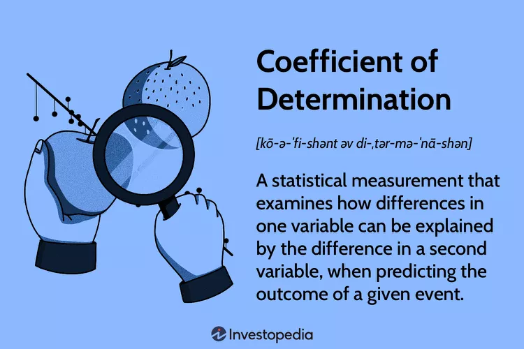
You already know how to calculate the correlation coefficient r. The square of this coefficient is called the coefficient of determination.
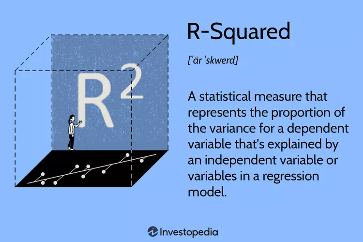
It is equal to the ratio of the explained variation to the total variation. It is important that the coefficient of determination is interpreted correctly. The coefficient of determination or R squared method is the proportion of the variance in the dependent variable that is predicted from the independent variable. It indicates the level of variation in the given data set.
Here are some guiding principles when interpreting the coefficient of determination:
- The coefficient of determination is the square of the correlation (r). Thus it ranges from 0 to 1.
- If R2 is equal to 0, then the dependent variable cannot be predicted from the independent variable.
- If R2 is equal to 1, then the dependent variable can be predicted from the independent variable without any error.
- If R2 is between 0 and 1, then it indicates the extent to which the dependent variable can be predictable. For example, an r2 of .810 means that 81% of the variation in y can be explained by the relationship between x and y.
- The coefficient of non-determination is 1 – R2.
Evidence-Based Regression Analysis on Homeless Shelter Stays in Boston, MA:
Applying an Equity Lens
Researchers at Bentley University, Hao, Garfield & Purao (2022)[14], conducted a study to identify determinants that contribute to the length of a homeless shelter stay. The source of data was the Homeless Management Information Systems from Boston, MA, which contained 44,197 shelter stays for 17,070 adults between January 2014 and May 2018. Statistical and regression analyses show that factors that contribute to the length of a homeless shelter stay include being female, a senior, disabled, Hispanic, or being Asian, or Black. A significant fraction of homeless shelter stays (76%) are experienced by individuals with at least one of three disabilities: physical disability, mental health issues, or substance use disorder. Recidivism also contributes to longer homeless shelter stays.
This finding aligns with prior studies that have shown that women stay in homeless programs significantly (74%) longer than men. This is concerning, as other work has reported that the rise in the number of unsheltered homeless women (12%) is outpacing that of unsheltered homeless men (7%). These findings also have cost implications. The per-person cost for first-time homeless women is about 97% higher than for men because of a higher need to provide privacy. Addressing women’s homelessness status by decreasing the length of their homeless shelter stays can, therefore, also reduce the overall cost of homeless shelters.
Now Try It Yourself
Chapter 6: Summary
Correlation and regression analyses are two of the author’s favorite statistical procedures.
Correlation quantifies the strength of the linear relationship between a pair of variables, whereas regression expresses the relationship in the form of an equation. Correlation is a single statistic, whereas regression produces an entire equation. Both quantify the direction and strength of the relationship between two numerical variables. When the correlation (r) is negative, the regression slope (b) will be negative. When the correlation is positive, the regression slope will be positive. The correlation squared (r2) has special meaning in simple linear regression. It represents the proportion of variation in Y explained by X.
Correlation is a more concise (single value) summary of the relationship between two variables than regression is. As a result, many pairwise correlations can be viewed together at the same time in one table. Regression provides a more detailed analysis which includes an equation that can be used for prediction and/or optimization.
- The Supreme Court of the United States is the nation’s highest federal court. It is the final interpreter of federal law, including the U.S. Constitution. ↵
- . The AAMC is a nonprofit association dedicated to improving the health of people everywhere through medical education, health care, medical research, and community collaborations. Its members are all 157 U.S. medical schools accredited by various governing bodies; approximately 400 teaching hospitals and health systems, including the Department of Veteran Affairs medical centers; and more than 70 academic societies. ↵
- Association of American Medical Colleges (2022). AAMC Leads Amicus Brief in Support of Consideration of Race in Higher Education Admissions. https://www.aamc.org/news/press-releases/aamc-leads-amicus-brief-support-consideration-race-higher-education-admissions. Retrieved on July 5, 2023. ↵
- Association of American Medical Colleges (2022). AAMC Deeply Disappointed of SCOTUS Decision on Race-Conscious Admissions. https://www.aamc.org/news/press-releases/aamc-deeply-disappointed-scotus-decision-race-conscious-admissions. Retrieved on July 5, 2023. ↵
- MSNBC Interview with Dr. Uche Blackstock and Dr. David J. Skorton, President and CEO of the Association of American Medical Colleges. https://www.msnbc.com/ali-velshi/watch/-it-s-life-or-death-for-black-communities-how-the-affirmative-action-ruling-could-impact-patients-of-color-in-the-u-s-1865431738. Retrieved on July 5, 2023. ↵
- In modern discourse, the justices of the Court are often categorized as having conservative, moderate, or liberal philosophies of law and of judicial interpretation. ↵
- Wikipedia (2023). Ideological Leanings of the United States Supreme Court justices. https://en.wikipedia.org/wiki/Ideological_leanings_of_United_States_Supreme_Court_justices. Retrieved on July 6, 2023. ↵
- Laerd Statistics. Pearson’s Product Moment Correlation Using SPSS Statistics. https://statistics.laerd.com/spss-tutorials/pearsons-product-moment-correlation-using-spss-statistics.php. Retrieved on July 11, 2023. ↵
- Deshpande RC (2012). A Healthy Way to Handle Workplace Stress Through Yoga, Meditation, and Soothing Humor. International Journal of Environmental Sciences, Volume 2, No. 4. ↵
- Spiegelhalter D (2012). Coincidences: What are the Chances of Them Happening? BBC: Future. https://www.bbc.com/future/article/20120426-what-a-coincidence#:~:text=We%20should%20perhaps%20begin%20by,with%20no%20apparent%20causal%20connection%E2%80%9D. Retrieved on July 14, 2023. ↵
- Sue DW, Capodilupo CM, Torino GC, Bucceri JM, Holder AMB, Nadal KL & Esquilin M (2007). Racial Microaggressions in Everyday Life: Implications for Clinical Practice. American Psychologist, 62, 271-286. ↵
- Nadal KL, Wong Y, Griffin K & Hamit S (2014). The Impact of Racial Microaggressions on Mental Health Counseling Implications for Clients of Color. Journal of Counseling and Development, January. ↵
- Carter RT, Kirkinis K & Johnson V (2019). Relationship Between Trauma Symptoms and Race-Based Traumatic Stress. Traumatology, September 9. ↵
- Hao H, Garfield M & Purao S (2022). The Determinants of Length of Homeless Shelter Stays: Evidence-Based Regression Analyses. International Journal of Public Health, 28, January. ↵
