
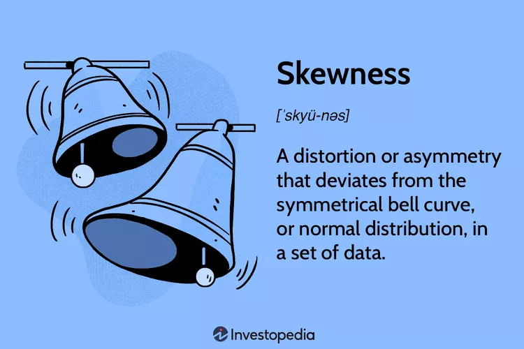
2 Descriptive Statistics
“If you never collect data, you will never know the specifics of a problem.”
James Bell, W. Haywood Burns Institute
Learning Outcomes
- Statistics and Data Analytics
- Descriptive Statistics
- Inferential Statistics
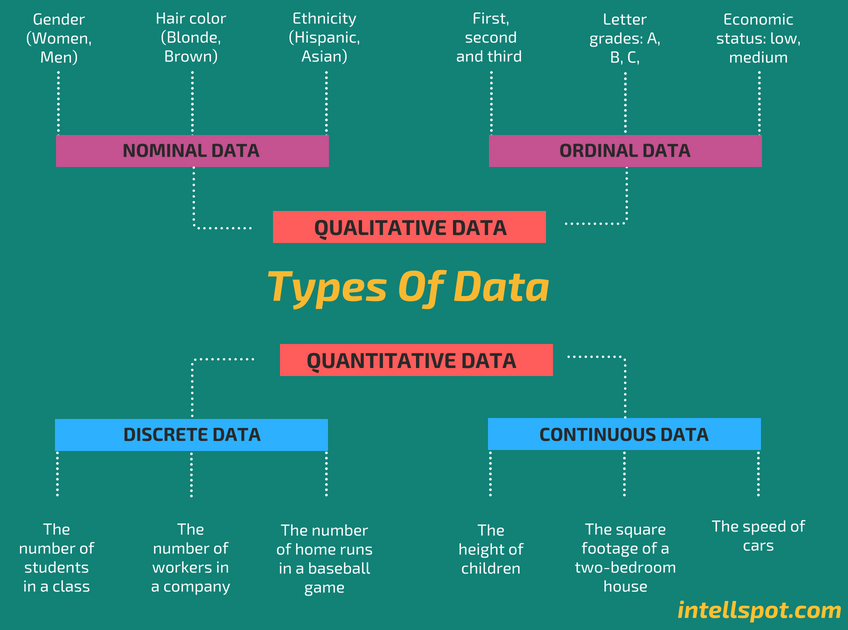
- Quantitative vs. Qualitative Data
- Measures of Central Tendency
- Measures of Variability
- The Normal Distribution: A Symmetric Curve
- The Skewed Distribution: A Non-Symmetric Curve
This chapter focuses on the first step in any data-equity project: exploring the data set using descriptive statistics. Descriptive statistics are specific methods used to calculate, describe, and summarize collected data, such as equity-minded data, in a logical, meaningful, and efficient way (Vetter 2017)[1]. Descriptive statistics are reported numerically, and/or graphically. According to Vetter, valid and reliable descriptive statistics can answer basic yet important questions about a data set, namely: Who, What, Why, When, Where, How, and How Much?
In contrast, inferential statistics involve making an inference or decision about a population based on results obtained from a sample of that population (De Muth 2008)[2]. This chapter focuses solely on descriptive statistics, while inferential statistics will be introduced in another chapter. Both descriptive and inferential statistics form the two broad arms of statistics.
Descriptive statistics help facilitate “data visualization” and, as such, are a starting point for analyzing a data set. A data set can consist of a number of observations on a range of variables. In statistical research, a variable is defined as a characteristic or attribute of an object of study. Data is a specific measurement of a variable. Data is generally divided into two categories: quantitative or numerical data, and qualitative or non-numerical data. Data can be presented in one of four different measurement scales: nominal, ordinal, interval, or ratio.
There are a variety of ways that statisticians use to describe a data set:
- Exploratory data analysis uses graphs and numerical summaries to describe the variables and their relationship to each other. In Section 2.1, you will learn how to organize a data set by grouping the data into intervals called classes and forming a frequency distribution.
- Center of the Data uses measures of central tendency to locate the middle or center of a distribution where most of the data tends to be concentrated. The three best known measures of central tendency used by statisticians are discussed in Section 2.2: the mean, median and mode.
- Spread of the Data uses measures of variability to describe how far apart data points lie from each other and from the center of the distribution. Section 2.3 discusses the four most common measures of variability: range, interquartile range, variance, and standard deviation.
- Shape of the Data can be either symmetrical (the normal distribution) or skewed (positive or negative). Section 2.4 reveals how the shape of the distribution can easily be discernible through graphs.
- Fractiles or Quantiles of the Data uses measures of position that partition, or divide, an ordered data set into equal parts: first, second, and third quartile; percentiles; and the standard score (z-score). A fractile is a point where a specified proportion of the data lies below that point. Section 2.5 discusses how fractiles are used to specify the position of a data point within a data set.
In addition to using the above statistical procedures, the data disaggregation process can be applied to identify equity gaps. Disaggregation means breaking down data into smaller groupings, such as income, gender, and racial/ethnic groupings. Disaggregating data can reveal deprivations or inequalities that may not be fully reflected in aggregated data.
The National Center for Mental Health Promotion and Youth Violence Prevention provides two examples of the importance of disaggregating data into smaller subpopulations (National Center Brief 2012)[3]. One area where data disaggregation is commonly used is to show disproportionate minority contact, such as the number of times a minority youth is involved with the court system. In fact, the Office of Juvenile Justice and Delinquency Prevention (OJJDP) uses a specific indicator (Relative Rate Index) to show if there are differences in arrest rates or court sentences, for example, between racial/ethnic groups that are not explained by simple differences in population numbers. A similar step was taken by the Department of Health and Human Services (HHS) as part of the Affordable Care Act. Disaggregated data can be used to see if there are meaningful differences by subpopulations in who is accessing mental services and what treatments are successful.
In descriptive statistics, a particular group of interest (or target group) can be disaggregated by certain characteristics, such as, race, ethnicity, gender, age, socio-economic status, disability, education level, employment in different sectors (e.g., health care, biotechnology, cybersecurity), salary levels, and other different factors. Disaggregating data is viewed as a critical first step while embarking on the equity-minded journey. According to the Annie E. Casey Foundation (2020), “disaggregating data and presenting it in a meaningful way can help bring attention and commitment to the solving of social and racial equity problems.”[4]
2.1 Frequency Distribution
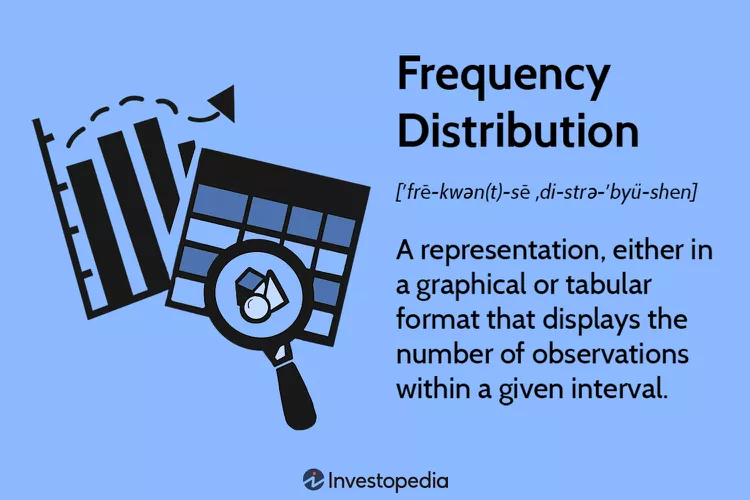
After data has been collected, the next step is to organize the data in a meaningful, intelligible way. One of the most common methods to organize data is to construct a frequency distribution–a graphical representation of the number of observations in each category on the measurement scale. It is the organization of raw data in table form, using classes and frequency.
At a minimum, a frequency table contains two columns: one listing categories on the scale of measurement (x) and another for frequency (f). The sum of the frequencies should equal n.
A third column can be used for the proportion (p) where p=f/n. The sum of the p column should equal 1.00. A fourth column can display the percentage of the distribution corresponding to each x value. The percentage is found by multiplying p times 100. The sum of the percentage column is 100%. Table 1 below is an example of a four-column frequency distribution of data provided by the Federal Bureau of Prisons, as of May 13, 2023:
| Total | 158,890 | 1.00 | 100% |
| Race | Frequency (Number of Inmates) | Proportion (p) | Percentage (%) |
| White | 91,302 | .58 | 58% |
| Black | 61,151 | .39 | 39% |
| Native American | 4,165 | .02 | 2% |
| Asian | 2,272 | .01 | 1% |
When a frequency distribution table lists all of the individual categories (x values), it is called a regular frequency distribution (see Table 1). When a set of data covers a wide range of values, a group frequency distribution is used, as shown in Table 2.
| Total | 158,890 | 1.00 | 100% |
| Age Range | Frequency (Number of Inmates) | Proportion (p) | Percentage (%) |
| Under 18 | 5 | .00 | 0% |
| 18-21 | 1,548 | .01 | 1% |
| 22-25 | 7,444 | .047 | 4.7% |
| 26-30 | 18,617 | .117 | 11.7% |
| 31-35 | 26,905 | .169 | 16.9% |
| 36-40 | 28,129 | .177 | 17.7% |
| 41-45 | 26,576 | .167 | 16.7% |
| 46-50 | 18,826 | .118 | 11.8% |
| 51-55 | 12,954 | .082 | 8.2% |
| 56-60 | 8,436 | .053 | 5.3% |
| 61-65 | 5,035 | .032 | 3.2% |
| Over 65 | 4,415 | .028 | 2.8% |
Steps for constructing a frequency table for grouped quantitative data:
Step 1: Sort the data in ascending order to calculate the range (minimum and maximum values) for the particular variable of interest.
Step 2: Divide the range or group of values into class intervals. Intervals should cover the range of observations without gaps or overlaps.
Step 3: Create class width to create groups. All class intervals must be the same width.
Step 4: Determine the frequency for each group.
After the data have been organized into a frequency distribution, they can be presented in graphical form. The visual picturization can be used to discuss an equity issue, reinforce a critical point of view, or summarize a data set.
A frequency distribution can be plotted on the x-y plane. On the x-axis is the class intervals of the variable (attribute or characteristics) and on the y-axis is the frequency—the number of observations in a class interval. A plotted frequency distribution conveys the shape of the distribution whether it is the expected standard distribution like the normal distribution or some other known distribution.
2.2 Center of the Data: Measures of Central Tendency
A variable may have several distinct values. A basic step in exploring data is getting a “typical value” for each variable: an estimate of where most of the data is located, that is, its central tendency. Statisticians often use the term, estimate, to draw a distinction between what is seen from the data and the theoretical or true exact state of affairs (Bruce, Bruce & Gedeck 2020)[5].
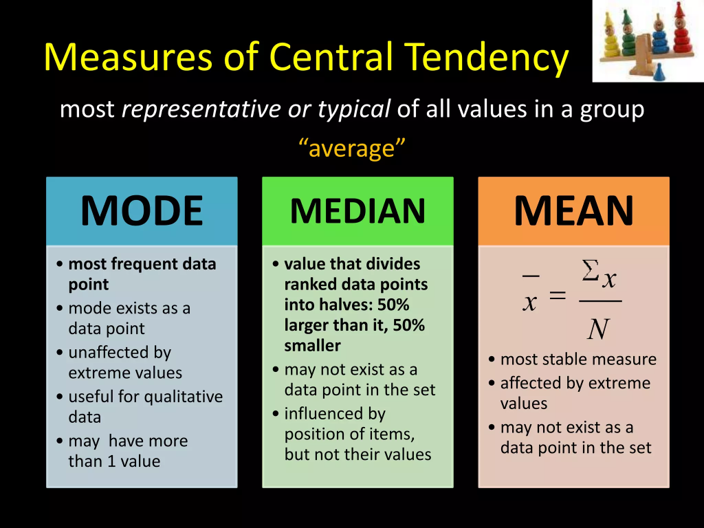
The three most commonly used measures of central tendency are:
Mean: The average, or typical value of the data set.
Median: The number in the middle of the data set.
Mode: The number most frequently found in the data set.
2.2(a) Mean: The most basic estimate of location is the mean, or average. It is generally considered the best measure of central tendency and the most frequently used one. Each individual point exerts a separate and independent effect on the value of the mean. The mean can be used to calculate the average of quantitative variables and not qualitative (categorical) variables.
There are two commonly used methods to calculate the average: simple mean and the weighted mean. The simple mean is the sum of values (such as total number of ages of an inmate prison population) divided by the number of values (total number of inmates). There are two steps for calculating the mean ([latex]\bar{x}[/latex]):
[latex]\bar{x}=(\sum x_{i})/n[/latex]
Step 1: Add all of the values in the data set together ([latex]\sum x_{i}[/latex]).
Step 2: Divide the sum by the number of values (n).
Example of How the Mean is Used for Justice-Involved Populations : According to the United States Sentencing Commission, as of January 2022, there are 153,079 offenders incarcerated in the federal bureau of prisons. Their average age is 41 years: 21.6% are 50 years or older; 6.7% are 60 years or older.
The Incarceration-Health Relationship for Justice-Involved Populations:
Applying an Equity Lens
The United States has the highest incarceration rate in the world (565 per 100,000 residents)[6]—the highest in its imprisonment history. About two out of three offenders are people of color, African American (34.6%) and Hispanic (31.8%), even though individuals of color make up only one-quarter (26%) of the total population (U.S. National Supplement Prison Study 2014)[7].
From a health equity perspective, “incarceration is viewed as a structural determinant of one’s health that also worsens population health. People who are incarcerated are more likely than the general population to experience a chronic condition or acquire an infectious disease. Communities with high rates of incarceration are more likely to experience poor mental health outcomes. Families of people who are incarcerated experience community fragmentation and disruption of social ties that negatively impact mental and familial health” (Peterson & Brinkley-Rubinstein 2021)[8].
Sawyer & Wagner (2023) adds to this health equity perspective, “At least 1 in 4 people who go to jail will be arrested again within the same year — often those dealing with poverty, mental illness, and substance use disorders, whose problems only worsen with incarceration. Most importantly, jail and prison environments are in many ways harmful to mental and physical health. Decades of research show that many of the defining features of incarceration are stressors linked to negative mental health outcomes: disconnection from family, loss of autonomy, boredom and lack of purpose, and unpredictable surroundings. Inhumane conditions, such as overcrowding, solitary confinement, and experiences of violence also contribute to the lasting psychological effects of incarceration, including the PTSD-like Post-Incarceration Syndrome.”
The second type of mean is the weighted mean which you calculate by multiplying each data value x by a specified weight w and dividing their sum by the sum of the weights. A weighted mean is a kind of average. Instead of each data point contributing equally to the final mean, some data points contribute more “weight” than others. Often, these weights are percentages but must be converted to decimals when multiplying to the relevant data point, x.
2.2(b) Median: The median is the value that occupies the middle position once data has been sorted from smallest to largest. It divides the frequency distribution exactly into two halves. Fifty percent of observations in a distribution have scores at or below the median; thus, the median is the 50th percentile. Depending on whether the number of observations (n) is odd or even, the median can be calculated in two ways. If the number of scores, n, is odd the median is the value of the (n + l)/2 score. If n is even, there is no single middle value: the median is the average of the scores n/2 and (n/2) + 1. The median can be calculated for ratio, interval, and ordinal variables. It is great for data sets with outliers.
Steps for calculating the median:
Step 1: Arrange the number of values from smallest to largest (i.e., ascending order).
Step 2: Determine if n, the number of scores, is odd or even. If n is odd the median is the value of the (n + l)/2 score. If n is even, there is no single middle value: the median is the average of the scores n/2 and (n/2) + 1.
Example: The median for a data set that is even (n=4): 3, 5, 7, 9 is calculated as (5+7)/2=6.
Below is an example of how the median is used to compare the economic or income-based wealth of subpopulations.
Applying the Equity Lens Economic Justice:
A Component of Social Justice
According to the 2021 Racism and Racial Inequities in Health Report by the Blue Cross Blue Shield of Massachusetts Foundation[9], “Among Boston-area residents, White households have a median net worth of $247,500, while the median net worth for Black and Hispanic households is $12,000 or less, with U.S.-born Black households having a median net worth of $8 and Dominican households having a median net worth of $0. Also, Hispanic and Black people in Massachusetts are less likely to own their homes than White and Asian people. Homeownership is a key source of household stability, as well as a primary pathway for building wealth.” (page 1)
Research shows that countries/states/metropolitan areas with a greater degree of socioeconomic inequality show greater inequality in health status. According to the Boston Review (2000)[10], “We have long known that the more affluent and better educated members in our society tend to live longer and have healthier lives. Inequality, in short, seems to be bad for our health… a study (1998) across U.S. metropolitan areas found that areas with high income inequality had an excess of death compared to areas with low inequality. This excess was very large, equivalent in magnitude to all deaths due to heart disease.”
Furthermore, a more recent 2023 study published in the Journal of the American Medical Association (JAMA), showed that “because so many Black people die young — with many years of life ahead of them — their higher mortality rate from 1999 to 2020 resulted in a cumulative loss of more than 80 million years of life compared with the White population. Although the nation made progress in closing the gap between White and Black mortality rates from 1999 to 2011, that advance stalled from 2011 to 2019. In 2020, the enormous number of deaths from COVID-19–which hit Black Americans particularly hard–erased two decades of progress.” (Szabo 2023)[11]
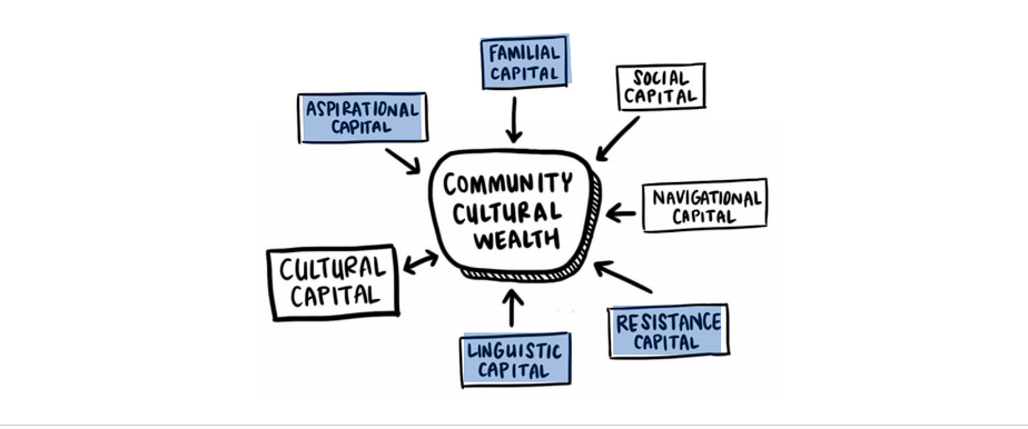
Economic wealth is different from cultural wealth, which is the reservoir of personal and community resources an individual may have beyond their income or accumulated financial wealth. Challenging traditional definitions of wealth, Dr. Tara J. Yosso (2005)[12] coined the term community cultural wealth as “an array of knowledge, skills, abilities and contacts possessed and used by communities of color to survive and resist racism.” Yosso’s model includes six forms of cultural capital:
- Aspirational capital (ability to maintain hope despite barriers of inequality).
- Linguistic capital (communication skills: facial effect, tone, volume, rhythm).
- Familial capital (wisdom and stories drawn from families in communities).
- Navigational capital (skills and abilities to navigate throughout social institutions).
- Resistance capital (historical legacy in securing equal rights and collective freedom).
- Social capital (using contacts like community-based organizations to gain access and navigate other social institutions).
2.2(c) Mode: The mode is the value that occurs most frequently in the data. Some data sets may not have a mode, while others may have more than one mode. A distribution of scores can be unimodal, bimodal, or even polymodal. In a bimodal distribution, the taller peak is called the major mode and the shorter one is the minor mode (Manikandan 2011)[13]. The mode is the preferred measure when data are measured in a nominal scale.
2.2(d) Comparing the Mean, Median and Mode
The relative position of the three measures of central tendency (mean, median, and mode) depends on the shape of the distribution. All three measures are identical in a normal distribution (a symmetrical bell-shaped curve). The mean is most representative of the scores in a symmetrical distribution. As the distribution becomes more asymmetrical (skewed), the mean becomes less representative of the scores it supposedly represents.
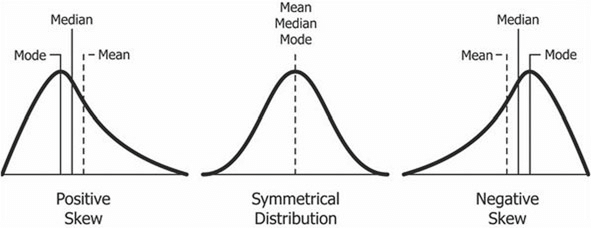
Compared to the mean, which uses all observations, the median depends only on the values in the center of the sorted data. The median is seen as a robust estimate of location since it is not influenced by outliers (extreme cases); in contrast, the mean is sensitive to outliers.
A useful test of skewness is to calculate the values of the mean, median, and mode. If their values are quite different, the use of the mean is not recommended since the distribution is skewed. The median will often be more representative of such scores (Kelly & Beamer 1986).
Now Try It Yourself: Food Insecurity is a Math Problem
2.3 Spread of the Data: Measures of Variability
The simplest useful numerical description of a distribution requires both a measure of center (mean, median and mode) and a measure of spread. Variability refers to how “spread out” the data points or values are in a distribution. Variability, spread, and dispersion are synonymous terms.
There are four main measures of variability: range, interquartile range (IQR), standard deviation and variance.
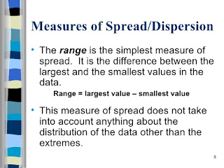
2.3(a) Range is the simplest measure of variability to calculate. It is the difference between the highest and lowest values of a data set; the result of subtracting the minimum value from the maximum value.
Problem
The term “alternative medicine” means any form of medicine that is outside the mainstream of western or conventional medicine as practiced by the majority of physicians, in hospitals, etc. Well-known examples of alternative medicine are homeopathy, osteopathy, and acupuncture. During the 11-year period (2013-2023), the alternative medicine industry revenue (in billions) was 21.7 (2013), 22.4 (2014), 23.6 (2015), 24.5 (2016), 25.7 (2017), 27.2 (2018), 28.8 (2019), 28.5 (2020), 30 (2021), 30.1 (2022), and 30.6 (2023). What is the range of the industry revenue?
Answer
30.6 – 21.7 = 8.9 billion dollars.
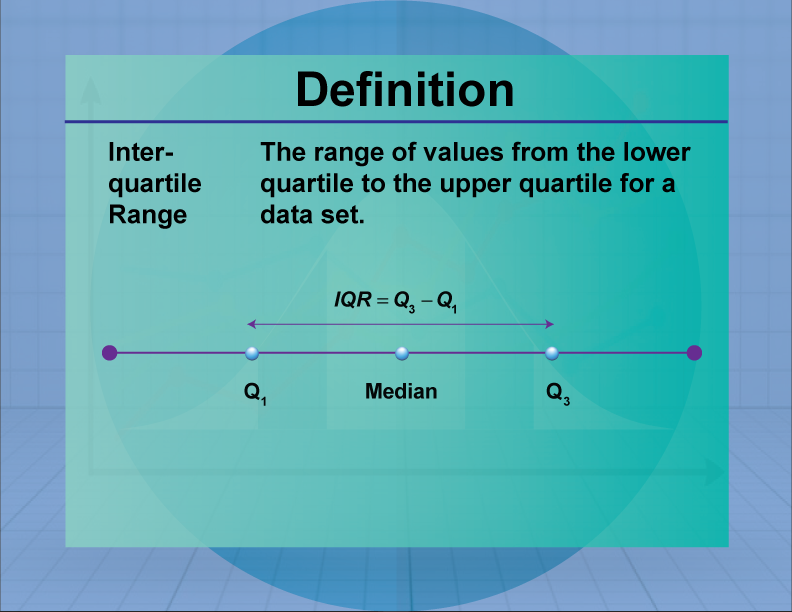
2.3(b) Interquartile Range (IQR) is the range of the middle half (50%) of the scores in the distribution. It is computed as: IQR = 75th percentile – 25th percentile, that is, the region between the 75th and 25th percentile (50% of the data).
Using the previous data on Alternative Medicine Industry Revenue, the IQR can be found in three steps:
Step 1: Order the data from least to greatest.
Step 2: Find the median for the entire data set. Answer: 27.5
Step 3: Find the median for the upper (30) and lower (23.6) portions of the data.
Now, to get a quick summary of both center and spread, combine all five numbers. The five-number summary of a distribution consists of the smallest observation (minimum), the first quartile (25th percentile), the median (50th percentile), the third quartile (75th percentile), and the largest observation (maximum), written from smallest to largest. Applying the five-number summary to the previous example on the Alternative Medicine Industry Revenue:
| Minimum | Q1 | Median | Q3 | Maximum |
| $21.7B | $23.6B | $27.5B | $30B | $30.6B |
Study Tip: When the data set is small, the distribution may be asymmetric or the data set may include extreme values. In this case, it is better to use the interquartile range rather than the standard deviation.
2.3(c) Standard Deviation (SD) is the average amount of variability of the data set, informing how dispersed the data is from the center, specifically, the mean. It tells, on average, how far each value lies from the mean. The standard deviation is always greater than or equal to 0. A high standard deviation implies that the values are generally far from the mean, while a low standard deviation indicates that the values are clustered closer to the mean. When the standard deviation is equal to zero, the data set has no variation, and all data points have the same values.
A standard deviation close to zero indicates that data points are close to the mean, whereas a high or low standard deviation indicates data points are respectively above or below the mean.
Steps for calculating the sample standard deviation for ungrouped data are:
Step 1: Find the mean of the sample data set. [latex]\bar{x}=(\sum x_{i})/n[/latex]
Step 2: Find the deviation of each data point. [latex](x-\bar{x})[/latex]
Step 2: Square each deviation. [latex](x-\bar{x})^{2}[/latex]
Step 3: Add in order to get the sum of squares. [latex]SS_{x}=(x-\bar{x})^{2}[/latex]
Step 4: Divide by n-1 to get the sample variance. [latex]s^{x}=(x-\bar{x})^{2}/(n-1))[/latex]
Step 5: Find the square root of the variance to get the sample standard deviation. Take the Square root of the formula in Step 4.
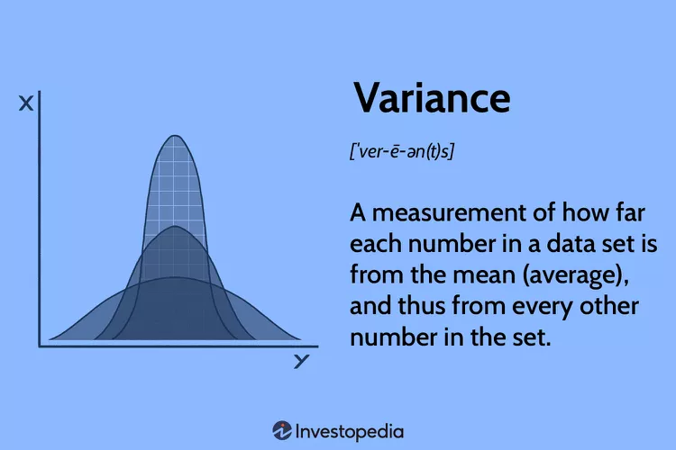
2.3(d) Variance is the measure of dispersion of the observations or scores around the sample mean. It is the average squared deviations from the mean. The sample variance is used to calculate the variability in a given sample. As mentioned in chapter 1, a sample is a set of observations/scores that are pulled from a population and can completely represent it. The reason dividing by n-1 corrects the bias is because we are using the sample mean, instead of the population mean, to calculate the variance. The sample variance, on average, is equal to the population variance.
The variance and its square root, the standard deviation, are two reliable interval-level measures of variability that are employed by statisticians in generalizing from a sample to a population.
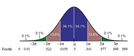
Study Tip: Know that: (1) the greater the variability around the mean of the distribution, the larger the mean deviation, range, and variance; (2) the variance is usually larger than the standard deviation; (3) the mean deviation, standard deviation, and variance all assume interval data; and (4) the so-called normal range within which approximately two-thirds of all scores fall is within one standard deviation above and below the mean.
Now Try It Yourself
2.4 Shape of the Data: Normal Distribution and Skewed Distributions
Measures of central tendency speak to the matter of distribution shapes. The normal distribution (or the normal curve) is a set of observations that clusters in the middle and tapers off to the left (negative) and to the right (positive). The decreasing amounts are evenly distributed to the left and right of the curve. When a variable follows a normal distribution, the histogram is bell-shaped and symmetric, and the best measures of central tendency and dispersion are the mean and the standard deviation.
Contrasting with the normal distribution are skewed distributions where data is not evenly distributed and the mean deviates from the peak of the distribution. Skew type (positive or negative) is determined by the elongated tail of a skewed distribution. Positively skewed distributions have data clustering on the left side with extreme values on the right side that pull the tail out to the positive side of the number line. Positively skewed distributions are common in criminal justice and criminology research. Negatively skewed distributions are signaled by a tail extending to negative infinity. Scores are sparse on the left-hand side, and they increase in frequency on the right-side of the distribution.
To sum it up, a positive skew distribution is one in which there are many values of a low magnitude and a few values of extremely high magnitude, while a negative skew distribution is one in which there are many values of a high magnitude with a few values of very low magnitude.
Skewed Distributions:
Applying the Equity Lens
Right Skewed Variables: Income and monetary wealth are classic examples of right skewed distributions. Most people earn a modest amount, but some millionaires and billionaires extend the right tail into very high values. Another example of a right skewed distribution is the intersectionality of race-age-incarceration rates: Black males who are in their twenties and thirties have the highest incarceration rate of any age and racial/ethnic group of any justice-involved population.
Left Skewed Variables: According to the Council on Social Work Education, the purpose of social work is actualized through its quest for social and economic justice, the prevention of conditions that limit human rights, the elimination of poverty, and the enhancement of the quality of life for all persons, locally and globally. In the past, the Social Work Values Inventory (SWVI) was available to baccalaureate programs to evaluate students’ changes in adherence to basic social work values over time as they complete academic studies. The scales of the SWVI measures three domains: confidentiality, self-determination, and social justice. The scales approximate a normal distribution, with the exception of the social justice scale which is skewed to the left. A left skew on this scale means that proportionately more students tend to have liberal views on social justice rather than conservative views.
2.5 Fractiles and Quantiles of Data (Measures of Position)
When data is arranged in ascending or descending order, it can be divided into various parts by different values. The median, quartiles, deciles, percentiles, and other partition values are collectively called quantiles or fractiles—terms sometimes used interchangeably. However, there are some subtle differences between the two. Fractile refers to any of the equal parts into which a population can be divided according to the value of a particular variable. Quantile, on the other hand, refers to any of the equal divisions of a frequency distribution that represent the values of the variable. All quantiles are percentages. A fractile is a type of quantile that divides a dataset into equal parts based on a given percentage.
In visual terms, a fractile is the point on a probability density curve so that the area under the curve between that point and the origin (i.e., zero) is equal to a specified fraction. For example, a fractile of .5 cuts the sample in one-half or .75 cuts off the bottom three-quarters of a sample. A fractile xp for p greater than .5 is called an upper fractile, and a fractile xp for p less than 0.5 is called a lower fractile.
Besides fractiles (any percentage), the other types of quantiles are:
Percentiles (100%)
Values that divide a distribution into a hundred equal parts. There are 99 percentiles denoted as P1, P2…,P99.
Deciles (10%)
Values that divide a distribution into ten equal parts. There are nine deciles D1, D2…,D9.
Quartiles (25%)
Values that divide a distribution into four equal parts. There are three quartiles denoted by Q1, Q2, and Q3.
Median (50%)
Values that divide a distribution into two equal parts, that is, the top 50% from the bottom 50%.
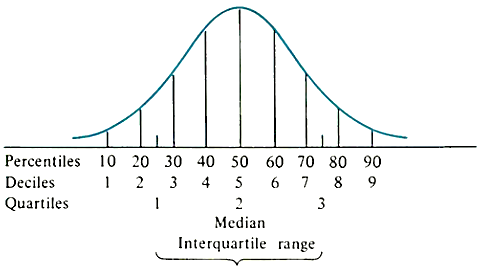
Equivalents: Percentiles, Deciles and Quartiles
The median can be expressed as Q2 = D5 = P50.
Q1 = D2.5 = P25.
Q3 = D7.5 = P75.
Study Tips: Fractiles are useful for understanding the distribution of data, particularly when the data is skewed. By comparing the fractiles of two different data sets, one can see how they differ in terms of central tendency and spread. The 95th fractile of the data set is often used as a threshold for identifying outliers. The top 10% of earners in the United States are in the 90th fractiles of the income distribution.
Quantiles are used in statistics to analyze probability distributions (chapter 3). The bottom 5% of earners in the United States are in the first quantile of the income distribution.
Chapter 2: Summary
The main point of this entire OER book is that you cannot achieve equity without investing in data disaggregation. We have started in this chapter to learn how to “peel the onion” so to speak by seeing beyond the surface and splitting large, general categories into more specific groups. As we shift information from broad categories to reflect people’s actual experiences, we are helping to ensure that populations who have been historically excluded are more visible. Without the process of disaggregation of data, policies are dramatically misinformed and mask disparities. “If we continue to fail in our data methods by lumping together racial and ethnic groups, we will continue to erase the experiences of communities and mask how are they faring and, in turn, negatively affect how government and philanthropic resources are allocated, how services are provided, and how groups are perceived or stigmatized.” (Kauh 2021)[14]
In the next chapter, we will learn about probability distributions to expose you more to social issues through a mathematical lens.
Thank you for your persistence and openness to exploring real data and critically thinking about the injustices that certain groups face in their everyday lives.
- Vetter, T (2017). Descriptive Statistics: Reporting the Answers to the 5 Basic Questions of Who, What, Why, When, Where and a Sixth, So What? Anesthesia and Analgesia, 2017 (Nov); 125(5): 1797-1802. ↵
- De Muth, JE (2008). Preparing for the First Meeting with a Statistician. American Journal of Health-System Pharmacy. Dec 15; 65(24): 2358-66. ↵
- National Center Brief (2012). The Importance of Disaggregating Student Data. The National Center for Mental Health Promotion and Youth Violence Prevention, April. ↵
- Annie E. Casey Foundation (2020). By the Numbers: A Race for Results Case Study-Using Disaggregated Data to Inform Policies, Practices, and Decision-Making. Baltimore, MD. ↵
- Bruce P, Bruce A, & Gedeck P (2020). Practical Statistics for Data Scientists. O’Reilly Media, Inc., Sebastopol, CA. ↵
- Sawyer W & Wagner P (2023). Mass Incarceration: The Whole Pie 2023. Prison Policy Initiative. https://www.prisonpolicy.org/reports/pie2023.html. Retrieved on May 27, 2023. ↵
- New America Analysis of the U.S. Department of Education (2014). National Supplement Prison Study: 2014. National Center for Education Statistics, U.S. Program for the International Assessment of Adult Competencies PIAAC 2012/2014 Household Survey (public use file). ↵
- Peterson M & Brinkley-Rubinstein L (2021). Incarceration is a Health Threat. Why Isn’t It Monitored Like One? Health Affairs Forefront. https://www.healthaffairs.org/content/forefront/incarceration-health-threat-why-isn-t-monitored-like one. Retrieved on May 22, 2023. ↵
- Anthony S, Boozang P, Elam L, McAvey K, & Striar A (2021). Racism and Racial Inequalities in Health: A Data-Informed Primer of Health Disparities in Massachusetts. Manatt Health Strategies, LLC. ↵
- Daniels N, Kennedy B, & Kawachi I (2020). Social Justice is Good for Our Health: How Greater Economic Equality Would Promote Public Health. Boston Review. https://www.bostonreview.net/forum/norman-daniels-bruce-kennedy-ichiro-kawachi-justice-good-our-health/ Retrieved on May 29, 2023. ↵
- Szabo, L (2023). Study Reveals Staggering Toll of Being Black in America: 1.6 Million Excess Deaths Over 22 years. https://www.nbcnews.com/health/health-news/study-reveals-staggering-toll-black-america-16-million-excess-deaths-2-rcna84627 Retrieved on May 29, 2023. ↵
- Yosso TJ (2005). Whose Culture Has Capital? A Critical Race Theory Discussion of Community Cultural Wealth. Race Ethnicity and Education, Volume 8, Issue 1, pages 69-91. ↵
- Manikandan S (2011). Measures of Central Tendency: Median and Mode. Postgraduate Corner. Journal of Pharmacology and Pharmacotherapeutics, July-September 2011, Vol 2, Issue 3. ↵
- Kauh TJ, Read JG & Scheitler (2021). The Critical Role of Racial/Ethnic Data Disaggregation for Health Equity. Population Research and Policy Review, 40, 1-7(2021). ↵
