
Principle: Consider Context
Data feminism asserts that data are not neutral or objective. They are the products of unequal social relations, and this context is essential for conducting accurate, ethical analysis.
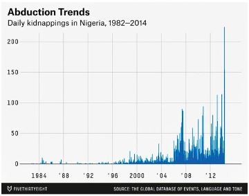
In April 2014, 276 young women were kidnapped from their high school in the town of Chibok in northern Nigeria. Boko Haram, a militant terrorist group, claimed responsibility for the attacks. The press coverage, both in Nigeria and around the world, was fast and furious. SaharaReporters.com challenged the government’s ability to keep its students safe. CNN covered parents’ anguish. The Japan Times connected the kidnappings to the increasing unrest in Nigeria’s northern states. And the BBC told the story of a girl who had managed to evade the kidnappers. Several weeks after this initial reporting, the popular blog FiveThirtyEight published its own data-driven story about the event, titled “Kidnapping of Girls in Nigeria Is Part of a Worsening Problem.”[1] The story reported skyrocketing rates of kidnappings. It asserted that in 2013 alone there had been more than 3,608 kidnappings of young women. Charts and maps accompanied the story to visually make the case that abduction was at an all-time high (figure 6.1).
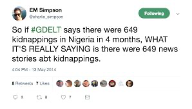
Shortly thereafter, the news website had to issue an apologetic retraction because its numbers were just plain wrong. The outlet had used the Global Database of Events, Language and Tone (GDELT) as its data source. GDELT is a big data project led by computational social scientist Kalev Leetaru. It collects news reports about events around the world and parses the news reports for actors, events, and geography with the aim of providing a comprehensive set of data for researchers, governments, and civil society. GDELT tries to focus on conflict—for example, whether conflict is likely between two countries or whether unrest is sparking a civil war—by analyzing media reports. However, as political scientist Erin Simpson pointed out to FiveThirtyEight in a widely cited Twitter thread, GDELT’s primary data source is media reports (figure 6.2).[2] The project is not at a stage at which its data can be used to make reliable claims about independent cases of kidnapping. The kidnapping of schoolgirls in Nigeria was a single event. There were thousands of global media stories about it. Although GDELT de-duplicated some of those stories to a single event, it still logged, erroneously, that hundreds of kidnapping events had happened that day. The FiveThirtyEight report had counted each of those GDELT pseudoevents as a separate kidnapping incident.
The error was embarrassing for FiveThirtyEight, not to mention for the reporter, but it also helps to illustrate some of the larger problems related to data found “in the wild.” First, the hype around “big data” leads to projects like GDELT wildly overstating the completeness and accuracy of its data and algorithms. On the website and in publications, the project leads have stated that GDELT is “an initiative to construct a catalog of human societal-scale behavior and beliefs across all countries of the world, connecting every person, organization, location, count, theme, news source, and event across the planet into a single massive network that captures what’s happening around the world, what its context is and who’s involved, and how the world is feeling about it, every single day.”[3] That giant mouthful describes no small or impotent big data tool. It is clearly Big Dick Data.
Big Dick Data is a formal, academic term that we, the authors, have coined to denote big data projects that are characterized by patriarchal, cis-masculinist, totalizing fantasies of world domination as enacted through data capture and analysis. Big Dick Data projects ignore context, fetishize size, and inflate their technical and scientific capabilities.[4] In GDELT’s case, the question is whether we should take its claims of big data at face value or whether the Big Dick Data is trying to trick funding organizations into giving the project massive amounts of research funding. (We have seen this trick work many times before.)
The GDELT technical documentation does not provide any more clarity as to whether it is counting media reports (as Simpson asserts) or single events. The database FiveThirtyEight used is called the GDELT Event Database, which certainly makes it sound like it’s counting events. The GDELT documentation states that “if an event has been seen before it will not be included again,” which also makes it sound like it’s counting events. And a 2013 research paper related to the project confirms that GDELT is indeed counting events, but only events that are unique to specific publications. So it’s counting events, but with an asterisk. Compounding the matter, the documentation offers no guidance as to what kinds of research questions are appropriate to ask the database or what the limitations might be. People like Simpson who are familiar with the area of research known as event detection, or members of the GDELT community, may know to not believe (1) the title of the database, (2) the documentation, and (3) the marketing hype. But how would outsiders, let alone newcomers to the platform, ever know that?
We’ve singled out GDELT, but the truth is that it’s not very different from any number of other data repositories out there on the web. There are a proliferating number of portals, observatories, and websites that make it possible to download all manner of government, corporate, and scientific data. There are APIs that make it possible to write little programs to query massive datasets (like, for instance, all of Twitter) and download them in a structured way.[5] There are test datasets for network analysis, machine learning, social media, and image recognition. There are fun datasets, curious datasets, and newsletters that inform readers of datasets to explore for journalism or analysis.[6] In our current moment, we tend to think of this unfettered access to information as an inherent good. And in many ways, it is kind of amazing that one can just google and download data on, for instance, pigeon racing, the length of guinea pig teeth, or every single person accused of witchcraft in Scotland between 1562 and 1736—not to mention truckloads and truckloads of tweets.[7]
And though the schooling on data verification received by FiveThirtyEight was rightly deserved, there is a much larger issue that remains unaddressed: the issue of context. As we’ve discussed throughout this book, one of the central tenets of feminist thinking is that all knowledge is situated. A less academic way to put this is that context matters. When approaching any new source of knowledge, whether it be a dataset or dinner menu (or a dataset of dinner menus), it’s essential to ask questions about the social, cultural, historical, institutional, and material conditions under which that knowledge was produced, as well as about the identities of the people who created it.[8] Rather than seeing knowledge artifacts, like datasets, as raw input that can be simply fed into a statistical analysis or data visualization, a feminist approach insists on connecting data back to the context in which they were produced. This context allows us, as data scientists, to better understand any functional limitations of the data and any associated ethical obligations, as well as how the power and privilege that contributed to their making may be obscuring the truth.
Situating Data on the Wild Wild Web
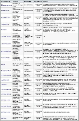
The major issue with much of the data that can be downloaded from web portals or through APIs is that they come without context or metadata. If you are lucky you might get a paragraph about where the data are from or a data dictionary that describes what each column in a particular spreadsheet means. But more often than not, you get something that looks like figure 6.3.
The data shown in the figure—open budget data about government procurement in São Paulo, Brazil—do not look very technically complicated. The complicated part is figuring out how the business process behind them works. How does the government run the bidding process? How does it decide who gets awarded a contract? Are all the bids published here, or just the ones that were awarded contracts? What do terms like competition, cooperation agreement, and terms of collaboration mean to the data publisher? Why is there such variation in the publication numbering scheme? These are only a few of the questions one might ask when first encountering this dataset. But without answers to even some of these questions—to say nothing of the local knowledge required to understand how power is operating in this particular ecosystem—it would be difficult to even begin a data exploration or analysis project.
This scenario is not uncommon. Most data arrive on our computational doorstep context-free. And this lack of context becomes even more of a liability when accompanied by the kind of marketing hype we see in GDELT and other Big Dick Data projects. In fact, the 1980s version of these claims is what led Donna Haraway to propose the concept of situated knowledge in the first place.[9] Subsequent feminist work has drawn on the concept of situated knowledge to elaborate ideas about ethics and responsibility in relation to knowledge-making.[10] Along this line of thinking, it becomes the responsibility of the person evaluating that knowledge, or building upon it, to ensure that its “situatedness” is taken into account. For example, information studies scholar Christine Borgman advocates for understanding data in relation to the “knowledge infrastructure” from which they originate. As Borgman defines it, a knowledge infrastructure is “an ecology of people, practices, technologies, institutions, material objects, and relationships.”[11] In short, it is the context that makes the data possible.
Ironically, some of the most admirable aims and actions of the open data movement have worked against the ethical urgency of providing context, however inadvertently. Open data describes the idea that anyone can freely access, use, modify, and share data for any purpose. The open data movement is a loose network of organizations, governments, and individuals. It has been active in some form since the mid-2000s, when groups like the Open Knowledge Institute were founded and campaigns like Free Our Data from the Guardian originated to petition governments for free access to public records.[12] The goals are good ones in theory: economic development by building apps and services on open data; faster scientific progress when researchers share knowledge; and greater transparency for journalists, citizens, and residents to be able to use public information to hold governments accountable. This final goal was a major part of the framing of former US president Obama’s well-known memorandum on transparency and open government.[13] On his very first day in office, Obama signed a memorandum that directed government agencies to make all data open by default.[14] Many more countries, states, and cities have followed suit by developing open data portals and writing open data into policy. As of 2019, seventeen countries and over fifty cities and states have adopted the International Open Data Charter, which outlines a set of six principles guiding the publication and accessibility of government data.[15]
In practice, however, limited public funding for technological infrastructure has meant that governments have prioritized the “opening up” part of open data—publishing spreadsheets of things like license applications, arrest records, and flood zones—but lack the capacity to provide any context about the data’s provenance, let alone documentation that would allow the data to be made accessible and usable by the general public. As scholar Tim Davies notes, raw data dumps might be good for starting a conversation, but they cannot ensure engagement or accountability.[16] The reality is that many published datasets sit idle on their portals, awaiting users to undertake the intensive work of deciphering the bureaucratic arcana that obscures their significance. This phenomenon has been called zombie data: datasets that have been published without any purpose or clear use case in mind.[17]
Zombies might be bad for brains, but is zombie data really a problem? Wired magazine editor Chris Anderson would say, emphatically, “No.” In a 2008 Wired article, “The End of Theory,” Anderson made the now-infamous claim that “the numbers speak for themselves.”[18] His main assertion was that the advent of big data would soon allow data scientists to conduct analyses at the scale of the entire human population, without needing to restrict their analysis to a smaller sample. To understand his claim, you need to understand one of the basic premises of statistics.
Statistical inference is based on the idea of sampling: that you can infer things about a population (or other large-scale phenomenon) by studying a random and/or representative sample and then mapping those findings back on the population (or phenomenon) as a whole. Say that you want to know who all of the 323 million people in the US will vote for in the coming presidential election. You couldn’t contact all of them, of course, but you could call three thousand of them on the phone and then use those results to predict how the rest of the people would likely vote. There would also need to be some statistical modeling and theory involved, because how do you know that those three thousand people are an accurate representation of the whole population? This is where Anderson made his intervention: at the point at which we have data collected on the entire population, we no longer need modeling, or any other “theory” to first test and then prove. We can look directly at the data themselves.
Now, you can’t write an article claiming that the basic structure of scientific inquiry is obsolete and not expect some pushback. Anderson wrote the piece to be provocative, and sure enough, it prompted numerous responses and debates, including those that challenge the idea that this argument is a “new” way of thinking in the first place (e.g., in the early seventeenth century, Francis Bacon argued for a form of inductive reasoning, in which the scientist gathers data, analyzes them, and only thereafter forms a hypothesis).[19] One of Anderson’s major examples is Google Search. Google’s search algorithms don’t need to have a hypothesis about why some websites have more incoming links—other pages that link to the site—than others; they just need a way to determine the number of links so they can use that number to determine the popularity and relevance of the site in search results. We no longer need causation, Anderson insists: “Correlation is enough.”[20] But what happens when the number of links is also highly correlated with sexist, racist, and pornographic results?
The influence of racism, sexism, and colonialism is precisely what we see described in Algorithms of Oppression, information studies scholar Safiya Umoja Noble’s study of the harmful stereotypes about Black and Latinx women perpetuated by search algorithms such as Google’s. As discussed in chapter 1, Noble demonstrates that Google Search results do not simply correlate with our racist, sexist, and colonialist society; that society causes the racist and sexist results. More than that, Google Search reinforces these oppressive views by ranking results according to how many other sites link to them. The rank order, in turn, encourages users to continue to click on those same sites. Here, correlation without context is clearly not enough because it recirculates racism and sexism and perpetuates inequality.[21]
There’s another reason that context is necessary for making sense of correlation, and it has to do with how racism, sexism, and other forces of oppression enter into the environments in which data are collected. The next example has to do with sexual assault and violence. If you do not want to read about these topics, you may want to skip ahead to the next section.
In April 1986, Jeanne Clery, a student at Lehigh University, was sexually assaulted and murdered in her dorm room. Her parents later found out that there had been thirty-eight violent crimes at Lehigh in the prior three years, but nobody had viewed that as important data that should be made available to parents or to the public. The Clerys mounted a campaign to improve data collection and communication efforts related to crimes on college campuses, and it was successful: the Jeanne Clery Act was passed in 1990, requiring all US colleges and universities to make on-campus crime statistics available to the public.[22]
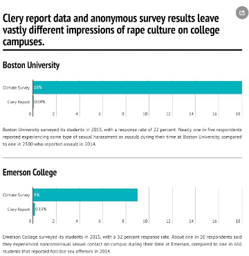
So we have an ostensibly comprehensive national dataset about an important public topic. In 2016, three students in Catherine’s data journalism class at Emerson College—Patrick Torphy, Michaela Halnon, and Jillian Meehan—downloaded the Clery Act data and began to explore it, hoping to better understand the rape culture that has become pervasive on college campuses across the United States.[23] They soon became puzzled, however. Williams College, a small, wealthy liberal arts college in rural Massachusetts, seemed to have an epidemic of sexual assault, whereas Boston University (BU), a large research institution in the center of the city, seemed to have strikingly few cases relative to its size and population (not to mention that several high-profile sexual assault cases at BU had made the news in recent years).[24] The students were suspicious of these numbers, and investigated further. After comparing the Clery Act data with anonymous campus climate surveys (figure 6.4), consulting with experts, and interviewing survivors, they discovered, paradoxically, that the truth was closer to the reverse of the picture that the Clery Act data suggest. Many of the colleges with higher reported rates of sexual assault were actually places where more institutional resources were being devoted to support for survivors.[25]
As for the colleges with lower numbers, this is also explained by context. The Clery Act requires colleges and universities to provide annual reports of sexual assault and other campus crimes, and there are stiff financial penalties for not reporting. But the numbers are self-reported, and there are also strong financial incentives for colleges not to report.[26] No college wants to tell the government—let alone parents of prospective students—that it has a high rate of sexual assault on campus. This is compounded by the fact that survivors of sexual assault often do not want to come forward—because of social stigma, the trauma of reliving their experience, or the resulting lack of social and psychological support. Mainstream culture has taught survivors that their experiences will not be treated with care and that they may in fact face more harm, blame, and trauma if they do come forward.[27]
There are further power differentials reflected in the data when race and sexuality are taken into account. For example, in 2014, twenty-three students filed a complaint against Columbia University, alleging that Columbia was systematically mishandling cases of rape and sexual violence reported by LGBTQ students. Zoe Ridolfi-Starr, the lead student named in the complaint, told the Daily Beast, “We see complete lack of knowledge about the specific dynamics of sexual violence in the queer community, even from people who really should be trained in those issues.”[28]
Simply stated, there are imbalances of power in the data setting—to use the phrase coined by Yanni Loukissas that we discussed in chapter 5—so we cannot take the numbers in the dataset at face value. Lacking this understanding of power in the collection environment and letting the numbers “speak for themselves” would tell a story that is not only patently false but could also be used to reward colleges that are systematically underreporting and creating hostile environments for survivors. Deliberately undercounting cases of sexual assault leads to being rewarded for underreporting. And the silence around sexual assault continues: the administration is silent, the campus culture is silent, the dataset is silent.[29]
Raw Data, Cooked Data, Cooking
As demonstrated by the Emerson College students, one of the key analytical missteps of work that lets “the numbers speak for themselves” is the premise that data are a raw input. But as Lisa Gitelman and Virginia Jackson have memorably explained, data enter into research projects already fully cooked—the result of a complex set of social, political, and historical circumstances. “‘Raw data’ is an oxymoron,” they assert, just like “jumbo shrimp.”[30] But there is an emerging class of “data creatives” whose very existence is premised on their ability to context-hop—that is, their ability to creatively mine and combine data to produce new insights, as well as work across diverse domains. This group includes data scientists, data journalists, data artists and designers, researchers, and entrepreneurs—in short, pretty much everyone who works with data right now. They are the strangers in the dataset that we spoke of in chapter 5.
Data’s new creative class is highly rewarded for producing work that creates new value and insight from mining and combining conceptually unrelated datasets. Examples include Google’s now defunct Flu Trends project, which tried to geographically link people’s web searches for flu symptoms to actual incidences of flu.[31] Or a project of the Sun Sentinel newspaper, in Fort Lauderdale, Florida, which combined police license plate data with electronic toll records to prove that cops were systematically and dangerously speeding on Florida highways.[32] Sometimes these acts of creative synthesis work out well; the Sun Sentinel won a Pulitzer for its reporting and a number of the speeding cops were fired. But sometimes the results are not quite as straightforward. Google Flu Trends worked well until it didn’t, and subsequent research has shown that Google searches cannot be used as 1:1 signals for actual flu phenomena because they are susceptible to external factors, such as what the media is reporting about the flu.[33]
Instead of taking data at face value and looking toward future insights, data scientists can first interrogate the context, limitations, and validity of the data under use. In other words, one feminist strategy for considering context is to consider the cooking process that produces “raw” data. As one example, computational social scientists Derek Ruths and Jürgen Pfeffer write about the limitations of using social media data for behavioral insights: Instagram data skews young because Instagram does; Reddit data contains far more comments by men than by women because Reddit’s overall membership is majority men. They further show how research data acquired from those sources are shaped by sampling because companies like Reddit and Instagram employ proprietary methods to deliver their data to researchers, and those methods are never disclosed.[34] Related research by Devin Gaffney and J. Nathan Matias took on a popular corpus that claimed to contain “every publicly available Reddit comment.”[35] Their work showed the that the supposedly complete corpus is missing at least thirty-six million comments and twenty-eight million submissions.
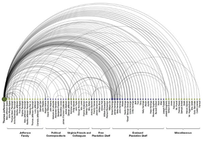
Exploring and analyzing what is missing from a dataset is a powerful way to gain insight into the cooking process—of both the data and of the phenomenon it purports to represent. In some of Lauren’s historical work, she looks at actual cooks as they are recorded (or not) in a corpus of thirty thousand letters written by Thomas Jefferson, as shown in figure 6.5.[36] Some may already know that Jefferson is considered the nation’s “founding foodie.”[37] But fewer know that he relied upon an enslaved kitchen staff to prepare his famous food.[38] In “The Image of Absence,” Lauren used named-entity recognition, a natural language processing technique, to identify the places in Jefferson’s personal correspondence where he named these people and then used social network analysis to approximate the extent of the relationships among them. The result is a visual representation of all of the work that Jefferson’s enslaved staff put into preparing his meals but that he did not acknowledge—at least not directly—in the text of the letters themselves.
On an even larger scale, computer scientists and historians at Stanford University used word embeddings—another machine learning technique—to explore gender and ethnic stereotypes across the span of the twentieth century.[39] Using several large datasets derived from sources such as the Google Books and the New York Times, the team showed how words like intelligent, logical, and thoughtful were strongly associated with men until the 1960s. Since that time, however, those words have steadily increased in association with women. The team attributed this phenomenon to the “women’s movement in the 1960s and 1970s,” making their work an interesting example of an attempt to quantify the impact of social movements. The paper is also notable for openly acknowledging how their methods, which involved looking at the adjectives surrounding the words man and woman, limited the scope of their analysis to the gender binary. Furthermore, the researchers did not try to assert that the data represent how women and men “are,” nor did they try to “remove the bias” so that they could develop “unbiased” applications in other domains. They saw the data as what they are—cultural indicators of the changing face of patriarchy and racism—and interrogated them as such.
So, how do we produce more work like this—work that understands data as already “cooked” and then uses that data to expose structural bias? Unfortunately for Chris Anderson, the answer is that we need more theory, not less. Without theory, survey designers and data analysts must rely on their intuition, supported by “common sense” ideas about the things they are measuring and modeling. This reliance on “common sense” leads directly down the path to bias. Take the case of GDELT. Decades of research has demonstrated that events covered by the media are selected, framed, and shaped by what are called “news values”: values that confirm existing images and ideologies.[40] So what is it really that GDELT is measuring? What events are happening in the world, or what the major international news organizations are focusing their attention on? The latter might be the most powerful story embedded in the GDELT database. But it requires deep context and framing to draw it out.
Refusing to acknowledge context is a power play to avoid power. It’s a way to assert authoritativeness and mastery without being required to address the complexity of what the data actually represent: the political economy of the news in the case of GDELT, entrenched gender hierarchies and flawed reporting environments in the case of the Clery data, and so on. But deep context and computation are not incompatible. For example, SAFElab, a research lab at Columbia run by scholar and social worker Desmond Patton, uses artificial intelligence to examine the ways that youth of color navigate violence on and offline. He and a team of social work students use Twitter data to understand and prevent gang violence in Chicago. Their data are big, and they’re also complicated in ways that are both technical and social. The team is acutely aware of the history of law enforcement agencies using technology to surveil Black people, for example, and acknowledges that law enforcement continues to do so using Twitter itself. What’s more, when Patton started his research, he ran into an even more basic problem: “I didn’t know what young people were saying, period.”[41] This was true even though Patton himself is Black, grew up in Chicago, and worked for years in many of these same neighborhoods. “It became really clear to me that we needed to take a deeper approach to social media data in particular, so that we could really grasp culture, context and nuance, for the primary reason of not misinterpreting what’s being said,” he explains.[42]
Patton’s approach to incorporating culture, context, and nuance took the form of direct contact with and centering the perspectives of the youth whose behaviors his group sought to study. Patton and doctoral student William Frey hired formerly gang-involved youth to work on the project as domain experts. These experts coded and categorized a subset of the millions of tweets, then trained a team of social work students to take over the coding. The process was long and not without challenges. It required that Patton and Frey create a new “deep listening” method they call the contextual analysis of social media to help the student coders mitigate their own bias and get closer to the intended meaning of each tweet.[43] The step after that was to train a machine learning classifier to automatically label the tweets, so that the project could categorize all of the millions of tweets in the dataset. Says Patton, “We trained the algorithm to think like a young African American man on the south side of Chicago.”[44]
This approach illustrates how context can be integrated into an artificial intelligence project, and can be done with an attention to subjugated knowledge. This term describes the forms of knowledge that have been pushed out of mainstream institutions and the conversations they encourage. To explain this phenomenon, Patricia Hill Collins gives the example of how Black women have historically turned to “music, literature, daily conversations, and everyday behavior” as a result of being excluded from “white male-controlled social institutions.”[45] These institutions include academia, or—for a recent example raised by sociologist Tressie McMillan Cottom—the op-ed section of the New York Times.[46] And because they circulate their knowledge in places outside of those mainstream institutions, that knowledge is not seen or recognized by those institutions: it becomes subjugated.
The idea of subjugated knowledge applies to other minoritized groups as well, including the Black men from Chicago whom Patton sought to understand. An approach that did not attend to this context would have resulted in significant errors. For example, a tweet like “aint kill yo mans & ion kno ya homie” would likely have been classified as aggressive or violent, reflecting its use of the word “kill.” But drawing on the knowledge provided by the young Black men they hired for the project, Frey and Patton were able to show that many tweets like this one were references to song lyrics, in this case the Chicago rapper Lil Durk. In other words, these tweets are about sharing culture, not communicating threats.[47]
In the case of SAFElab, as with all research projects that seek to make use of subjugated knowledge, there is also significant human, relational infrastructure required. Frey and Patton have built long-term relationships with individuals and organizations in the community they study. Indeed, Frey lives and works in the community. In addition, both Frey and Patton are trained as social workers. This is reflected in their computational work, which remains guided by the social worker’s code of ethics.[48] They are using AI to broker new forms of human understanding across power differentials, rather than using computation to replace human relationships. This kind of social innovation often goes underappreciated in the unicorn-wizard-genius model of data science. (For more on unicorns, see chapter 5.) As Patton says, “We had a lot of challenges with publishing papers in data science communities about this work, because it is very clear to me that they’re slow to care about context. Not that they don’t care, but they don’t see the innovation or the social justice impact that the work can have.”[49] Hopefully that will change in the future, as the work of SAFElab and others demonstrates the tremendous potential of combining social work and data science.
Communication Context
It’s not just in the stages of data acquisition or data analysis that context matters. Context also comes into play in the framing and communication of results. Let’s imagine a scenario. In this case, you are a data journalist, and your editor has assigned you to create a graphic and short story about a recent research study: “Disparities in Mental Health Referral and Diagnosis in the New York City Jail Mental Health Service.”[50] This study looks at the medical records of more than forty-five thousand first-time incarcerated people and finds that some groups are more likely to receive treatment, while others are more likely to receive punishment. More specifically, white people are more likely to receive a mental health diagnosis, while Black and Latinx people are more likely to be placed in solitary confinement. The researchers attribute some of this divergence to the differing diagnosis rates experienced by these groups before becoming incarcerated, but they also attribute some of the divergence to discrimination within the jail system. Either way, the racial and ethnic disparities are a product of structural racism.
Consider the difference between the two graphics shown in figure 6.6. The only variation is the title and framing of the chart.
Which one of these graphics would you create? Which one should you create? The first—Mental Health in Jail—represents the typical way that the results of a data analysis are communicated. The title appears to be neutral and free of bias. This is a graphic about rates of mental illness diagnosis of incarcerated people broken down by race and ethnicity. The people are referred to as inmates, the language that the study used. The title does not mention race or ethnicity, or racism or health inequities, nor does the title point to what the data mean. But this is where additional questions about context come in. Are you representing only the four numbers that we see in the chart? Or are you representing the context from which they emerged?
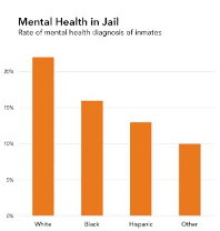

The study that produced these numbers contains convincing evidence that we should distrust diagnosis numbers due to racial and ethnic discrimination. The first chart does not simply fail to communicate that but also actively undermines that main finding of the research. Moreover, the language used to refer to people in jail as inmates is dehumanizing, particularly in the context of the epidemic of mass incarceration in the United States.[51] So, consider the second chart: Racism in Jail: People of Color Less Likely to Get Mental Health Diagnosis. This title offers a frame for how to interpret the numbers along the lines of the study from which they emerged. The research study was about racial disparities, so the title and content of this chart are about racial disparities. The people behind the numbers are people, not inmates. In addition, and crucially, the second chart names the forces of oppression that are at work: racism in prison.
Although naming racism may sound easy and obvious to some readers of this book, it is important to acknowledge that fields like journalism still adhere to conventions that resist such naming on the grounds that it is “bias” or “opinion.” John Daniszewski, an editor at the Associated Press, epitomizes this view: “In general our policy is to try to be neutral and precise and as accurate as we possibly can be for the given situation. We’re very cautious about throwing around accusations of our own that characterize something as being racist. We would try to say what was done, and allow the reader to make their own judgement.”[52]
Daniszewski’s statement may sound democratic (“power to the reader!”), but it’s important to think about whose interests are served by making racism a matter of individual opinion. For many people, racism exists as a matter of fact, as we have discussed throughout this book. Its existence is supported by the overwhelming empirical evidence that documents instances of structural racism, including wealth gaps, wage gaps, and school segregation, as well as health inequities, as we have also discussed. Naming these structural forces may be the most effective way to communicate broad context. Moreover, as the data journalist in this scenario, it is your responsibility to connect the research question to the results and to the audience’s interpretation of the results. Letting the numbers speak for themselves is emphatically not more ethical or more democratic because it often leads to those numbers being misinterpreted or the results of the study being lost. Placing numbers in context and naming racism or sexism when it is present in those numbers should be a requirement—not only for feminist data communication, but for data communication full stop.
This counsel—to name racism, sexism, or other forces of oppression when they are clearly present in the numbers—particularly applies to designers and data scientists from the dominant group with respect to the issue at hand. White people, including ourselves, the authors of this book, have a hard time naming and talking about racism. Men have a hard time naming and talking about sexism and patriarchy. Straight people have a hard time seeing and talking about homophobia and heteronormativity. If you are concerned with justice in data communication, or data science more generally, we suggest that you practice recognizing, naming, and talking about these structural forces of oppression.[53]
But our work as hypothetical anti-oppression visualization designers is not over yet. We might have named racism as a structural force in our visualization, but there are still two problems with the “good” visualization, and they hinge on the wording of the subtitle: People of Color Less Likely to Get Mental Health Diagnosis. The first problem is that this is starting to look like a deficit narrative, which we discuss in chapter 2—a narrative that reduces a social group to negative stereotypes and fails to portray them with creativity and agency. The second issue is that by naming racism and then talking about people of color in the title, the graphic reinforces the idea that race is an issue for people of color only. If we care about righting the balance of power, the choice of words matters as much as the data under analysis. In an op-ed about the language used to describe low-income communities, health journalist Kimberly Seals Allers affirms this point: “We almost always use a language of deficiency, calling them disadvantaged, under-resourced and under-everything else. … It ignores all the richness those communities and their young people possess: the wealth of resiliency, tenacity and grit that can turn into greatness if properly cultivated.”[54]
So let’s give it a third try, with the image in figure 6.7.
In this third version, we have retained the same title as the previous chart. But instead of focusing the subtitle on what minoritized groups lack, it focuses on the unfair advantages that are given to the dominant group. The subtitle now reads, White People Get More Mental Health Services. This avoids propagating a deficit narrative that reinforces negative associations and clichés. It also asserts that white people have a race, and that they derive an unfair advantage from that race in this case.[55] Finally, the title is proposing an interpretation of the numbers that is grounded in the context of the researchers’ conclusions on health disparities.
Restoring Context
Three iterations on a single chart title might feel excessive, but it also helps to underscore the larger point that considering context always involves some combination of interest and time. Fortunately, there is a lot of energy around issues of context right now, and educators, journalists, librarians, computer scientists, and civic data publishers are starting to develop more robust tools and methods for keeping context attached to data so that it’s easier to include in the end result.
For example, remember figure 6.3, that confusing chart of government procurements in São Paulo that we discussed earlier in this chapter? Gisele Craveiro, a professor at the University of São Paulo, has created a tool called Cuidando do Meu Bairro (Caring for My Neighborhood) to make that spending data more accessible to citizens by adding additional local context to the presentation of the information.[56] In the classroom, Heather Krause, a data scientist and educator, has developed the concept of the “data biography.”[57] Prior to beginning the analysis process, Krause asks people working with data, particularly journalists, to write a short history of a particular dataset and answer five basic questions: Where did it come from? Who collected it? When? How was it collected? Why was it collected? A related but slightly more technical proposal advocated by researchers at Microsoft is being called datasheets for datasets.[58] Inspired by the datasheets that accompany hardware components, computer scientist Timnit Gebru and colleagues advocate for data publishers to create short, three- to five-page documents that accompany datasets and outline how they were created and collected, what data might be missing, whether preprocessing was done, and how the dataset will be maintained, as well as a discussion of legal and ethical considerations such as whether the data collection process complies with privacy laws in the European Union.[59]
Another emerging practice that attempts to better situate data in context is the development of data user guides.[60] Bob Gradeck, manager of the Western Pennsylvania Regional Data Center, started writing data user guides because he got the same questions over and over again about popular datasets he was managing, like property data and 311 resident reports in Pittsburgh. Reports Gradeck, “It took us some time to learn tips and tricks. … I wanted to take the stuff that was in my head and put it out there with additional context, so other data users didn’t have to do it from scratch.”[61] Data user guides are simple, written documents that each contain a narrative portrait of a dataset. They describe, among other things, the purpose and application of the data; the history, format, and standards; the organizational context; other analyses and stories that have used the dataset; and the limitations and ethical implications of the dataset. This is similar to the work that data journalists are doing to compile datasets and then make them available for reuse. For example, the Associated Press makes comprehensive national statistics about school segregation in the United States available for purchase.[62] The spreadsheets are accompanied by a twenty-page narrative explainer about the data that includes limitations and sample story ideas.
These developments are exciting, but there is further to go with respect to issues of power and inequality that affect data collection environments. For example, professor of political science Valerie Hudson has worked for decades to trace the links between state security and the status of women. “I was interested in whether forms of oppression or subordination or violence against women were related to national, and perhaps international, instability and conflict,” she explains. She and geographer Chad Emmett started the project WomanStats as a modest Excel spreadsheet in 2001. It has since grown to a large-scale web database with over a quarter of a million data points, including over 350 variables ranging from access to health care to the prevalence of rape to the division of domestic labor.[63]
Notably, their sources are qualitative as well as quantitative. Says Hudson, “If you want to do research on women, you have to embrace qualitative data. There’s no two ways about it, because the reality of women’s lives is simply not captured in quantitative statistics. Absolutely not.”[64] At the present, WomanStats includes two types of qualitative variables: practice variables are composed from women’s reports of their lived experiences, and law variables are coded from the legal frameworks in a particular country. Indeed, the WomanStats codebook is a context nerd’s dream that outlines measurement issues and warns about the incompleteness of its own data, especially with respect to difficult topics.[65] In regard to the data that records reports of rape, for example—a topic upsetting enough to even consider, let alone contemplate its scale and scope in an entire country—the codebook states: “CAVEAT EMPTOR! Users are warned that this scale only reflects reported rape rates, and for many, if not most, countries, this is a completely unreliable indicator of the actual prevalence of rape within a society!”[66] Instead of focusing on a single variable, users are directed to WomanStats’s composite scales, like the Comprehensive Rape Scale, which look at reported prevalence in the context of laws, whether laws are enforced, reports from lived experience, strength of taboos in that environment, and so on.
So tools and methods for providing context are being developed and piloted. And WomanStats models how context can also include an analysis of unequal social power. But if we zoom out of project-level experiments, what remains murky is this: Which actors in the data ecosystem are responsible for providing context?
Is it the end users? In the case of the missing Reddit comments, we see how even the most highly educated among us fail to verify the basic claims of their data source. And datasheets for datasets and data user guides are great, but can we expect individual people and small teams to conduct an in-depth background research project while on a deadline and with a limited budget? This places unreasonable expectations and responsibility on newcomers and is likely to lead to further high-profile cases of errors and ethical breaches.
So is it the data publishers? In the case of GDELT, we saw how data publishers, in their quest for research funding, overstated their capabilities and didn’t document the limitations of their data. The Reddit comments were a little different: the dataset was provided by an individual acting in good faith, but he did not verify—and probably did not have the resources to verify—his claim to completeness. In the case of the campus sexual assault data, it’s the universities who are responsible for self-reporting, and they are governed by their own bottom line.[67] The government is under-resourced to verify and document all the limitations of the data.
Is it the data intermediaries? Intermediaries, who have also been called infomediaries, might include librarians, journalists, nonprofits, educators, and other public information professionals.[68] There are strong traditions of data curation and management in library science, and librarians are often the human face of databases for citizens and residents. But as media scholar Shannon Mattern points out, librarians are often left out of conversations about smart cities and civic technology.[69] Examples of well-curated, verified and contextualized data from journalism, like the Associated Press database on school segregation or other datasets available in ProPublica’s data store, are also promising.[70] The nonprofit Measures for Justice provides comprehensive and contextualized data on criminal justice and incarceration rates in the United States.[71] Some data intermediaries, like Civic Switchboard in Pittsburgh, are building their own local data ecosystems as a way of working toward sustainability and resilience.[72] These intermediaries who clean and contextualize the data for public use have potential (and have fewer conflicts of interest), but sustained funding, significant capacity-building, and professional norms-setting would need to take place to do this at scale.
Houston, we have a public information problem. Until we invest as much in providing (and maintaining) context as we do in publishing data, we will end up with public information resources that are subpar at best and dangerous at worst. This ends up getting even more thorny as the sheer quantity of digital data complicates the verification, provenance, and contextualization work that archivists have traditionally undertaken. Context, and the informational infrastructure that it requires, should be a significant focus for open data advocates, philanthropic foundations, librarians, researchers, news organizations, and regulators in the future. Our data-driven lives depend on it.
Consider Context
The sixth principle of data feminism is to consider context. The bottom line for numbers is that they cannot speak for themselves. In fact, those of us who work with data must actively prevent numbers from speaking for themselves because when those numbers derive from a data setting influenced by differentials of power, or by misaligned collection incentives (read: pretty much all data settings), and especially when the numbers have to do with human beings or their behavior, then they run the risk not only of being arrogantly grandiose and empirically wrong, but also of doing real harm in their reinforcement of an unjust status quo.
The way through this predicament is by considering context, a process that includes understanding the provenance and environment from which the data was collected, as well as working hard to frame context in data communication (i.e., the numbers should not speak for themselves in charts any more than they should in spreadsheets). It also includes analyzing social power in relation to the data setting. Which power imbalances have led to silences in the dataset or data that is missing altogether? Who has conflicts of interest that prevent them from being fully transparent about their data? Whose knowledge about an issue has been subjugated, and how might we begin to recuperate it? The energy around context, metadata, and provenance is impressive, but until we fund context, then excellent contextual work will remain the exception rather than the norm.
- See Mona Chalabi, “Kidnapping of Girls in Nigeria Is Part of a Worsening Problem,” FiveThirtyEight, May 8, 2014, https://fivethirtyeight.com/features/nigeria-kidnapping/. ↵
- You can see the whole thread on the archived version of Storify at https://web.archive.org/web/20140528062637/https://storify.com/AthertonKD/if-a-data-point-has-no-context-does-it-have-any-me, as well as on Simpson’s account directly: Erin Simpson (@charlie_simpson), “So if #GDELT says there were 649 kidnappings in Nigeria in 4 months, WHAT IT’S REALLY SAYING is there were 649 news stories abt kidnappings,” Twitter, May 13, 2014, 4:04 p.m., https://twitter.com/charlie_simpson/status/466308105416884225. ↵
- Kalev Leetaru, “The GDELT Project,” GDELT, accessed May 12, 2018, https://www.gdeltproject.org/. ↵
- We would like to make clear that our association of Big Dick Data with cis-masculinism is intended to call attention to how cis-heteropatriarchy currently works to dominate data studies, and not to offend or obscure the experiences of trans, gender non-conforming, non-binary, or intersex people. On the range of expressions of masculinity and the dicks that accompany them, see Amanda Phillips, “Dicks Dicks Dicks: Hardness and Flaccidity in (Virtual Masculinity),” Flow: A Critical Forum on Media and Culture, March 23, 2017, https://www.flowjournal.org/2017/11/dicks-dicks-dicks/. As an example of a critique of big data that does not rely upon the dick as signifier, see Jen Jack Gieseking, “Size Matters to Lesbians, Too: Queer Feminist Interventions into the Scale of Big Data,” Professional Geographer 70, no. 1 (2018): 150–156. We thank the members of the Data Feminism reading group for their feedback on this term, which has pushed us to clarify our commitments. ↵
- APIs allow a little program one writes to talk to other computers over the internet that are ready to receive data queries. Twitter, Zillow, and MOMA are some examples of large entities that have APIs available to programatically download data. ↵
- Here are some of our favorites: Dogs of Zurich (https://www.europeandataportal.eu/data/en/dataset/https-data-stadt-zuerich-ch-dataset-pd_stapo_hundenamen); UFO sightings (https://www.kaggle.com/NUFORC/ufo-sightings); all of the cartoon-based murals of Brussels (https://opendata.brussels.be/explore/dataset/comic-book-route/images/); Things Lost on the New York City subway system (http://advisory.mtanyct.info/LPUWebServices/CurrentLostProperty.aspx); and a list of abandoned shopping carts in Bristol (https://data.gov.uk/dataset/abandoned-shopping-trolleys-bristol-rivers). Some of the best of the newsletters include Data Is Plural, curated by Jeremy Singer-Vine, who is the data editor for Buzzfeed; and Numlock News, a daily email newsletter by Walt Hickey, which tries to provide some context around the numbers we see in the news. ↵
- "Scottish Witchcraft,” Data.world, May 18, 2017, https://data.world/history/scottish-witchcraft. ↵
- Trevor Muñoz and Katie Rawson, “Data Dictionary,” Curating Menus, 2016, accessed April 23, 2019, http://curatingmenus.org/data_dictionary/. ↵
- Haraway uses the phrase “unlocatable, and so irresponsible, knowledge claims.” Donna Haraway, “Situated Knowledges: The Science Question in Feminism and the Privilege of Partial Perspective,” Feminist Studies 14, no. 3 (Autumn 1988): 575–599, https://doi.org/10.2307/3178066. ↵
- For example, philosopher Lorraine Code argues that connecting knowledge to its specific biographic, historical, and geographic locations leads to “more responsible knowings.” Code, Ecological Thinking: The Politics of Epistemic Location (New York: Oxford University Press, 2006). ↵
- Christine L. Borgman, Big Data, Little Data, No Data: Scholarship in the Networked World (Cambridge, MA: MIT Press, 2015). ↵
- “Open Knowledge International.” Open Knowledge International. Accessed March 27, 2019. https://okfn.org/. The Guardian newspaper, out of the United Kingdom, launched the Free Our Data campaign in 2006 to petition government agencies to make public data available to taxpayers and companies for free. Among other things, they focused on geographic data collected by the Royal Ordnance Survey which had restrictive licenses on reuse by citizens. The campaign was largely successful: in 2010, the United Kingdom created the Open Government License and launched data.gov.uk, one of the first national data portals in the world. See Charles Arthur and Michael Cross, “Give Us Back Our Crown Jewels,” Guardian, March 9, 2006, https://www.theguardian.com/technology/2006/mar/09/education.epublic. ↵
- See Peter R. Orszag, “Memorandum for the Heads of Executive Departments and Agencies Re: Open Government Directive,” Washington, DC, Executive Office of the President, December 8, 2009, https://obamawhitehouse.archives.gov/sites/default/files/omb/assets/memoranda_2010/m10-06.pdf. ↵
- Although the movement under Obama was toward openness (Orszag, “Memorandum for the Heads of Executive Departments and Agencies Re: Open Government Directive”), the current administration has retreated from this position, according to a Sunlight Foundation audit, which found that “the Open Government Initiative, Open Government Partnership, and related programs, initiatives and partnerships across the federal government are being ignored, neglected or even forgotten in federal agencies.” Briana Williams, “Under Trump, U.S. Government Moves from /Open to /Closed,” Sunlight Foundation, January 24, 2018, https://sunlightfoundation.com/2018/01/24/under-trump-u-s-government-moves-from-open-to-closed/. ↵
- “The International Open Data Charter,” Open Data Charter, accessed March 27, 2019, https://opendatacharter.net/principles/. ↵
- Tim Davies, “Exploring Participatory Public Data Infrastructure in Plymouth,” Public Sector Blogs, September 11, 2017, https://www.publicsectorblogs.org.uk/2017/09/exploring-participatory-public-data-infrastructure-in-plymouth-tim-davies/. ↵
- Zombie data was named by Daniel Kaufmann, an economist with the Revenue Watch Institute. Joel Gurin, “Open Governments, Open Data: A New Lever for Transparency, Citizen Engagement, and Economic Growth,” SAIS Review of International Affairs 34, no. 1 (Winter 2014): 71–82. While the name is certainly evocative, it’s also important to acknowledge the history of zombies, which can be traced to seventeenth-century Haiti as a response to the incursion of slavery. As Mike Mariani helpfully summarizes, enslaved Haitians “believed that dying would release them back to lan guinée, literally Guinea, or Africa in general, a kind of afterlife where they could be free.” But “those who took their own lives wouldn’t be allowed to return to lan guinée. Instead, they’d be condemned to skulk the Hispaniola plantations for eternity, an undead slave at once denied their own bodies and yet trapped inside them—a soulless zombie.” See Mariani, “The Tragic, Forgotten History of Zombies,” Atlantic, October 28, 2015, https://www.theatlantic.com/entertainment/archive/2015/10/how-america-erased-the-tragic-history-of-the-zombie/412264/. ↵
- See Chris Anderson, “The End of Theory: The Data Deluge Makes the Scientific Method Obsolete,” Wired, June 23, 2008, https://www.wired.com/2008/06/pb-theory/. ↵
- Fulvio Mazzocchi makes the connection between Bacon and big data in “Could Big Data Be the End of Theory in Science?,” EMBO reports 16, no. 10 (2015): 1250–1255. While Bacon’s Novum Organum (1620) was indeed a masterful work that influenced centuries of scientists, he was not alone in his promulgation of a (proto) scientific method. Margaret Cavendish (1623–1717), for example, was an author of both natural philosophy (as scientific theory was known at the time) and science fiction. In fact, her scientific treatise, Observations upon Experimental Philosophy, was published alongside her science fiction text, The Blazing World (1666), and together they worked to challenge the domination of science by men—a reality even in the seventeenth century. ↵
- Historian Matthew Jones has written an intellectual history of this line of thinking and demonstrates how it has led to a computational “culture of predictive utility” in which prediction is prized above other possible measures of success. See Jones, “How We Became Instrumentalists (Again),” Historical Studies in the Natural Sciences 48, no. 5 (November 5, 2018): 673–684. ↵
- Safiya Umoja Noble, Algorithms of Oppression: How Search Engines Reinforce Racism (New York: NYU Press, 2018), 80–81. ↵
- See https://clerycenter.org/policy-resources/the-clery-act/. The data include separate and specific numbers on sexual assault, dating violence, domestic violence, and stalking. It includes sexual assault incidents experienced by women, men, and nonbinary people. ↵
- The term rape culture was coined by second-wave feminists in the 1970s to denote a society in which male sexual violence is normalized and pervasive, victims are blamed, and the media exacerbates the problem. Rape culture includes jokes, music, advertising, laws, words, and images that normalize sexual violence. In 2017, following the election of a US president who joked about sexual assault on the campaign trail and the exposé of Harvey Weinstein’s predatory behavior in Hollywood, high-profile women began speaking out against rape culture with the #MeToo hashtag. #MeToo, a movement started over a decade ago by activist Tarana Burke, encourages survivors to break their silence and build solidarity to end sexual violence. ↵
- In 2012, two members of BU’s hockey team were charged with sexual assault, and a report by the university found that the team had created a “culture of sexual entitlement.” See Mary Carmichael, “Graphic Details Emerge from BU Hockey Panel Reports,” Boston Globe, September 6, 2012, https://www.boston.com/news/local-news/2012/09/06/graphic-details-emerge-from-bu-hockey-panel-reports. ↵
- The students’ full story is excellent. You can read it here: Patrick Torphy, Michaela Halnon, and Jillian Meehan, “Reporting Sexual Assault: What the Clery Act Doesn’t Tell Us,” Atavist, April 26, 2016, https://cleryactfallsshort.atavist.com/reporting-sexual-assault-what-the-clery-act-doesnt-tell-us. ↵
- Sixteen staff members at the US Department of Education are devoted to monitoring the more than seven thousand higher-education institutions in the country, so it is unlikely that underreporting by an institution would be discovered, except in very high-profile cases. See Michael Stratford, “Clery Fines: Proposed vs. Actual,” Inside HigherEd, July 17, 2014, https://www.insidehighered.com/news/2014/07/17/colleges-often-win-reduction-fines-federal-campus-safety-violations. For example, the Sandusky Case at Penn State involved systematic sexual abuse of young boys by a football coach, and the university was subsequently fined $2.4 million for failing to properly report and disclose these crimes. ↵
- In this context, one might consider the decision of Christine Blasey Ford to testify about her assault by (now) US Supreme Court Justice Brett Kavanaugh. Coming forward involved relinquishing her privacy and reliving her trauma multiple times over, on a national stage. ↵
- Abigail Golden, “Is Columbia University Mishandling LGBT Rape Cases?,” Daily Beast, April 30, 2014, https://www.thedailybeast.com/is-columbia-university-mishandling-lgbt-rape-cases?ref=scroll. ↵
- Sara Ahmed has written powerfully on the violent effects of this silencing of assault victims. “Silence enables the reproduction of the culture of harassment and abuse. When we don’t speak about violence we reproduce violence. Silence about violence is violence,” she explains. Ahmed, “Speaking Out,” Feministkilljoys (blog), June 2, 2016, https://feministkilljoys.com/2016/06/02/speaking-out/. ↵
- Lisa Gitelman and Virginia Jackson, “Introduction,” in “Raw Data” Is an Oxymoron (Cambridge, MA: MIT Press, 2013), 2. Here they are following a statement from information studies scholar Geoffrey Bowker, “Raw data is both an oxymoron and a bad idea; to the contrary, data should be cooked with care,” as quoted in Memory Practices in the Sciences (Cambridge, MA: MIT Press, 2005). The dichotomy between “raw” and “cooked,” in turn, owes its source to the renowned structural anthropologist Claude Levi-Strauss. His famous book, The Raw and the Cooked (1964), analogizes the process of transforming nature into culture as akin to the process of transforming raw food into cooked. Your false binary and hidden hierarchy alarm bells should already be going off; and indeed, much of the work of the feminist theory of the early 1970s was to challenge this false dichotomy, as well as the assumptions (and examples) that it rested upon. See Lévi-Strauss, trans. John Weightman and Doreen Weightman, The Raw and the Cooked: Introduction to a Science of Mythology, vol. 1 (New York: Harper & Row, 1969). ↵
- “Google Flu Trends,” accessed August 6, 2019, https://www.google.org/flutrends/about/. ↵
- Sally Kestin and John Maines, “Cops among Florida’s Worst Speeders, Sun Sentinel Investigation Finds,” Sun Sentinel, February 11, 2012. ↵
- A brilliant idea—to try to link searches for flu symptoms to actual cases of the flu to see if one could predict where the next outbreak would be—Google Flu Trends seemed to work for the first couple years. Then, in the 2012–2013 flu season, Google estimated more than double the flu cases that the CDC did. This discrepancy was possibly due to media panic about swine flu, to Google updating its technology to include recommendations, or perhaps to something else. These are the dangers of prioritizing prediction and utility over causation and context: it all works temporarily, until something in the environment changes. See David Lazer, Ryan Kennedy, Gary King, and Alessandro Vespignani, “The Parable of Google Flu: Traps in Big Data Analysis,” Science 343, no. 6176 (2014): 1203–1205. ↵
- In the paper “Tampering with Twitter’s Sample API,” Jürgen Pfeffer, Katja Mayer, and Fred Morstatter demonstrate how the opacity of sampling done by platforms makes the data vulnerable to manipulation. Pfeffer, Mayer, and Morstatter, “Tampering with Twitter’s Sample API,” EPJ Data Science 7, no. 1 (December 19, 2018). ↵
- Gaffney and Matias found that the supposedly complete corpus is missing at least thirty-six million comments and twenty-eight million submissions. At least fifteen peer-reviewed studies have used the dataset for research studies on topics like politics, online behavior, breaking news, and hate speech. Depending on what the researchers used the corpus for, the missing data may have affected the validity of their results. Devin Gaffney, and J. Nathan Matias, “Caveat Emptor, Computational Social Science: Large-Scale Missing Data in a Widely-Published Reddit Corpus,” PLOS ONE 13, no. 7 (July 6, 2018). ↵
- Lauren F. Klein, “The Image of Absence: Archival Silence, Data Visualization, and James Hemings,” American Literature 85, no. 4 (Winter 2013): 661–688. ↵
- The title of a book by Dave Dewitt, The Founding Foodies: How Washington, Jefferson, and Franklin Revolutionized American Cuisine (Naperville, IL: Sourcebooks, 2010). ↵
- The subject of Adrian Miller’s The President’s Kitchen Cabinet: The Story of the African Americans Who Have Fed Our First Families, from the Washingtons to the Obamas (Chapel Hill: University of North Carolina Press, 2017) and of Lauren’s more academic book on the subject, An Archive of Taste: Race and Eating in the Early United States (Minneapolis: University of Minnesota Press, 2020). ↵
- See Nikhil Garg, Londa Schiebinger, Dan Jurafsky, and James Zou, “Word Embeddings Quantify 100 Years of Gender and Ethnic Stereotypes,” Proceedings of the National Academy of Sciences 115, no. 16 (2018): E3635–E3644. ↵
- In 1970, Daniel Halloran and colleagues wrote, “Events will be selected for news reporting in terms of their fit or consonance with pre-existing images—the news of the event will confirm earlier ideas.” James Dermot Halloran, Philip Ross Courtney Elliott, and Graham Murdock, Demonstrations and Communication: A Case Study (London: Penguin Books, 1970). ↵
- Desmond Patton, interview by Catherine D’Ignazio, August 30, 2018. ↵
- Patton, interview by D’Ignazio. ↵
- This method is described in detail in their paper: William R. Frey, Desmond U. Patton, Michael B. Gaskell, and Kyle A. McGregor, “Artificial Intelligence and Inclusion: Formerly Gang-Involved Youth as Domain Experts for Analyzing Unstructured Twitter Data,” Social Science Computer Review (2018). ↵
- Patton, interview by D’Ignazio. ↵
- Collins, Black Feminist Thought. ↵
- See “Tressie McMillan Cottom—Upending Stereotypes of Black Womanhood with ‘Thick,’” The Daily Show with Trevor Noah, video, 7:20, January 21, 2019, https://www.youtube.com/watch?v=EYNu6yvv8HU. ↵
- Context is crucial for understanding social media conversations. This becomes a particularly fraught problem once we start automating meaning-making with techniques like sentiment analysis and quantitative text analysis. Language and image meanings shift and change quickly, often based on local knowledge, culture, and circumstances. Mariana Giorgetti Valente, director of the Brazilian nonprofit InternetLab, gives the example of a 2010 attack on a gay man in São Paulo in which he was hit on the head with a neon lamp. The image of a lamp then became used in hate speech online. When somebody would subsequently speak out in support of gay rights on Brazilian social media, trolls would post a lamp to communicate a threat of violence. But how would a machine-learning classifier understand that an image of a lamp is a threat without knowing this local context? Valente and InternetLab are collaborating with IT for Change in India to see how they can incorporate context into the detection of hate-speech and anti-hate-speech practices online. Mariana Valente, interview by Catherine D’Ignazio, March 11, 2019. ↵
- One of the principles of this code is that “social workers recognize the central importance of human relationships.” As new codes of ethics are developed for emerging work in machine learning and artificial intelligence, it may be useful to look toward those fields, like social work, that have long-standing histories and specific language for navigating social inequality. In a blog post, Catherine adapted the National Association of Social Workers Code of Ethics and replaced social worker with data scientist as a way of speculating about whether design and technical fields might ever be able to deal so explicitly with concepts of justice and oppression. Catherine D’Ignazio, “How Might Ethical Data Principles Borrow from Social Work?,” Medium, September 2, 2018, https://medium.com/@kanarinka/how-might-ethical-data-principles-borrow-from-social-work-3162f08f0353. ↵
- Patton, interview by D’Ignazio. ↵
- Fatos Kaba, Angela Solimo, Jasmine Graves, Sarah Glowa-Kollisch, Allison Vise, Ross Macdonald, Anthony Waters, et al., “Disparities in Mental Health Referral and Diagnosis in the New York City Jail Mental Health Service,” American Journal of Public Health 105, no. 9 (September 2015): 1911–1916. ↵
- Prison reform advocate and formerly incarcerated person Eddie Ellis states that terms like prisoner, inmate, convict, and felon “are no longer acceptable for us and we are asking people to stop using them.” See Eddie Ellis, “Language,” Prison Studies Project, accessed July 29, 2019, http://prisonstudiesproject.org/language/. ↵
- Pete Vernon, “Dancing around the Word ‘Racist’ in Coverage of Trump,” Columbia Journalism Review, September 25, 2017, https://www.cjr.org/covering_trump/trump-racism.php. ↵
- As a nonhypothetical example of this, see the recent interactive feature from the New York Times, “Extensive Data Shows Punishing Reach of Racism for Black Boys,” which models much of this advice in both naming racism and reflecting the findings of the study that served as the basis for the report. See https://www.nytimes.com/interactive/2018/03/19/upshot/race-class-white-and-black-men.html. ↵
- Kimberly Seals Allers, “What Privileged Kids—and Parents—Can Learn from Low-Income Youth,” Washington Post, March 2, 2018. ↵
- How might we focus less attention on minoritized groups’ disadvantages and more attention on dominant groups’ unearned privileges? For example, instead of focusing on the women that are “missing” from data science and AI, perhaps we should be focusing on the overabundance of men in data science and AI who don’t see it as a problem worth their time and energy (because the system works for them). ↵
- See Gisele S. Craveiro and Andrés M. R. Martano, “Caring for My Neighborhood: A Platform for Public Oversight,” in Agent Technology for Intelligent Mobile Services and Smart Societies (Berlin: Springer, 2014), 117–126. ↵
- See Heather Krause, “Data Biographies: Getting to Know Your Data,” Global Investigative Journalism Network, March 27, 2017, https://gijn.org/2017/03/27/data-biographies-getting-to-know-your-data/. ↵
- Timnit Gebru, Jamie Morgenstern, Briana Vecchione, Jennifer Wortman Vaughan, Hanna Wallach, Hal Daumeé III, and Kate Crawford, “Datasheets for Datasets,” ArXiv.org, July 9, 2018. ↵
- Likewise, James Zou and Londa Schiebinger advocate for standardized metadata to accompany AI training datasets that spells out demographics, geographic limitations, and relevant definitions and collection practices. Zou and Schiebinger, “AI Can Be Sexist and Racist—It’s Time to Make It Fair,” Nature, July 18, 2018, https://www.nature.com/articles/d41586-018-05707-8. ↵
- “Data User Guides,” accessed August 6, 2019, http://www.wprdc.org/data-user-guides/. ↵
- Emerson Engagement Lab, “Civic Data Ambassadors: Module 2 Video 3—Civic Data Guides,” video, 6:25, March 18, 2018, https://vimeo.com/260650894. ↵
- ”School Segregation Data,” ProPublica, December 2017, https://www.propublica.org/datastore/dataset/school-segregation-charter-district-data. ↵
- WomanStats.org is solely focused on the status of women and does not collect any indicators on nonbinary people. ↵
- Valerie Hudson, interview with Catherine D’Ignazio, January 31, 2019. ↵
- “Codebook,” WomanStats, accessed March 27, 2019, http://www.womanstats.org/new/codebook/. ↵
- “Codebook,” http://www.womanstats.org/new/codebook/. ↵
- Moreover, if one of the goals is transparency and accountability, the institutions in power often have strong incentives to not provide context, so the data setting is rife with conflicts of interest. Indeed, Gebru and colleagues foresee challenges to publishers specifying ethical considerations on their datasheets because they may perceive it as exposing themselves to legal and public relations risks. See Gebru et al., “Datasheets for Datasets.” ↵
- Ricardo Ramírez, Balaji Parthasarathy, and Andrew Gordon, “From Infomediaries to Infomediation at Public Access Venues: Lessons from a 3-Country Study,” in Proceedings of the Sixth International Conference on Information and Communication Technologies and Development: Full Papers, vol. 1 (New York: ACM, 2013), 124–132. ↵
- Shannon Mattern, “Public In/Formation,” Places Journal, November 2016, https://placesjournal.org/article/public-information/. ↵
- “ProPublica Data Store,” ProPublica, accessed August 6, 2019, https://www.propublica.org/datastore/. ↵
- See https://measuresforjustice.org/. ↵
- Aaron Brenner et al., “Civic Switchboard,” accessed August 6, 2019, https://civic-switchboard.github.io/. ↵
